


Digital Translation
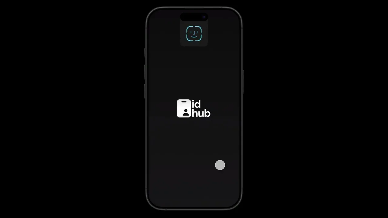
id-hub
Improved an old project that focused on taking physical cards found in a wallet and putting them in a digital space. Added organization, security, and usability.
Turning physical to digital with an identification app, then returning and improving my initial design.
The problem I faced on this project was creating a digital version of a driver's license that was more efficient and practical than a physical copy. I aimed for the product to be not just a digital license but also useful for various purposes, such as age verification. In my research, I highlight the challenges and opportunities associated with this translation. I will also discuss how I improved my initial design to be more versatile and to support many forms of identification, including passports, residence passes, insurance cards, and more.
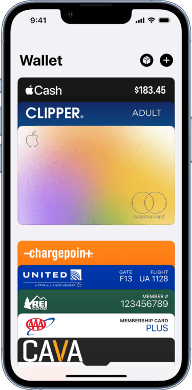
Apple Wallet has interesting organization, maybe it can be improved.
The different forms of identification and payment cards within the Apple Wallet are supposed to resemble a physical wallet. The cards themselves have clear rectangular shapes that create a sense of depth and structure when shifting between the cards. The only problem is that now that identification is introduced, there are issues of organization that arise. Just like a physical wallet, the Apple Wallet faces a problem of having a wide variety of different cards placed into one singular space, without any clear distinction between them. With multiple payment cards and identification cards, organization is important to keep the user efficient when accessing this wallet, especially the way the Apple Wallet is organized.
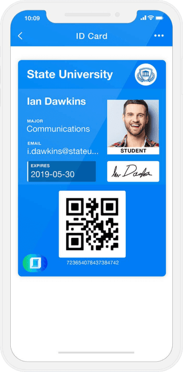
ID123 strays away from physicality, but could use some security features.
The application that ID123 developed begins to stray away from the physical representation of cards within the digital space and pushes the boundaries of how many forms of identification can be included besides a driver's license. Although they only seem to focus on identification rather than payment like Apple Wallet does, there are still several identifications a user can include and need to access while within the application. While the designs offer more in terms of information presented while looking at an identification, there doesn’t seem to be any forms of blatant security features other than a user's signature. The design itself seems replicable and easily forged, although it strays away from physical features.
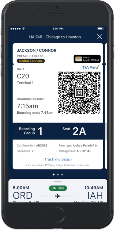
United Airlines has subtle physical traits, but I want to keep pushing those boundaries.
When designing a digital translation of something physical, I wanted to take a look at close similarities of other instances, such as a digital boarding pass. You can have a physical boarding pass ticket and a digital one, and they both do very similar things, although expressed through totally different mediums.
When it comes to the digital version of the boarding pass, the United app has some subtle elements of translating a physical boarding pass into a digital space. The slight dips at the top near the name and the card structure give off a physical aspect. But other than that, there really are no defining features that blatantly show a physical element.
Security Problem
Measures must be in place to protect the identity of the user.
Security Solution
Time out alerts to prevent unwanted access with an unattended device and interactive features to prevent forgery.
Organization Problem
The user might have a hard time keeping track of different identification cards.
Organization Solution
Creating an organization system for identification and simple ways to toggle between full ID and Age ID.
Usability Problem
Using a physical copy needs to feel redundant to the digital.
Usability Solution
Simple interactions to make access less complicated, and QR or Barcode scanning options for easy translations.
The goal is to make the first reaction of a user to use the digital wallet rather than the physical one.
The goal of this product is to be more efficient than a physical identification; the first reaction of the user is to go for their phone rather than their wallet when they need to present their information. With that in mind, I’m trying to create a secure and efficient way to access personal information, whether that’s a driver's license, school identification, or some other form.
My initial design was a good start, but looking at it now, there was a lot of design fluff and structural areas to improve upon.
The initial design was able to improve upon the concepts introduced in the comparative analysis; however, there are still some issues that can be improved upon. There are some unnecessary textural elements that are present supposedly for branding that we can do without. The organization didn't account for edge cases for having tons of different cards. The usability of the identification screen was good, but there needed to be better text hierarchy. Finally, the security measures were nice to have, but they could be improved upon to be more interesting and better utilized in a real scenario. Ultimately, this is a good start, but there's always room for improvement, as we see further below.
Ideating on bringing physical traits into a digital space. The hub needed to handle a larger number of cards, and the ID flow needed a better hierarchy of information.
To start improving the initial design, I started thinking about new ways to organize a larger number of cards within the product. I also started to ideate on the ways I can enhance the physicality of the product by adding indents in cards or folders. Then I thought about how I can improve the hierarchy of the State ID flow and how to bring those same concepts of physical cards to that as well.
Improving the structure of the organization to handle a larger card amount, while keeping the previous features, like editing cards. Then, improving the hierarchy of information in the State ID.
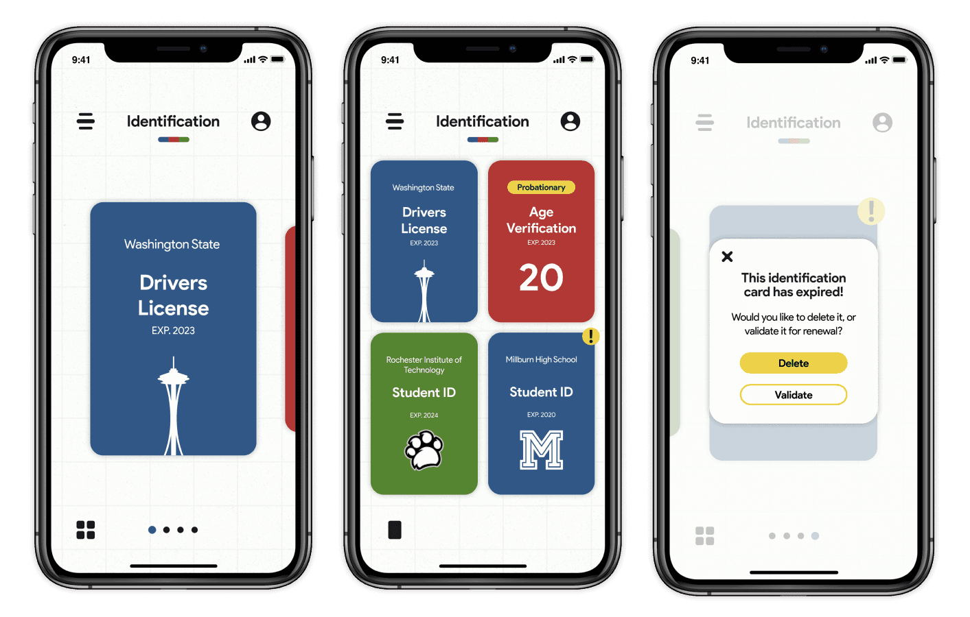
Based on my sketches, there are two main components of this new design that I had to ideate on: the hub and the actual State ID. Choosing a folder method for organizing cards, these cards would be separated into certain folders based on their purpose. If they didn't fall into the first four categories, they would be sorted into miscellaneous. This design improves upon the previous design in that it can handle a lot more cards being organized. Similar to the Apple Wallet, the previous design stacked the cards in a horizontal scroll, or a grid view with a vertical scroll. This can end up being hard to scroll through without a proper indication of how the cards are sorted. A user can open the folders, edit the current cards, and open specific cards that lead into a new flow, like the NY State ID, which is the second component of the design.
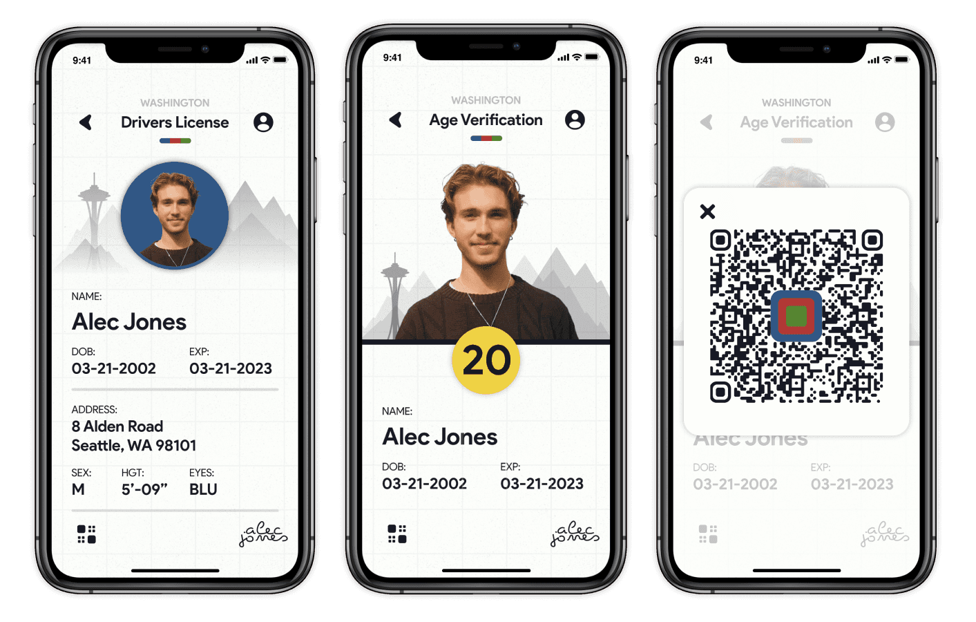
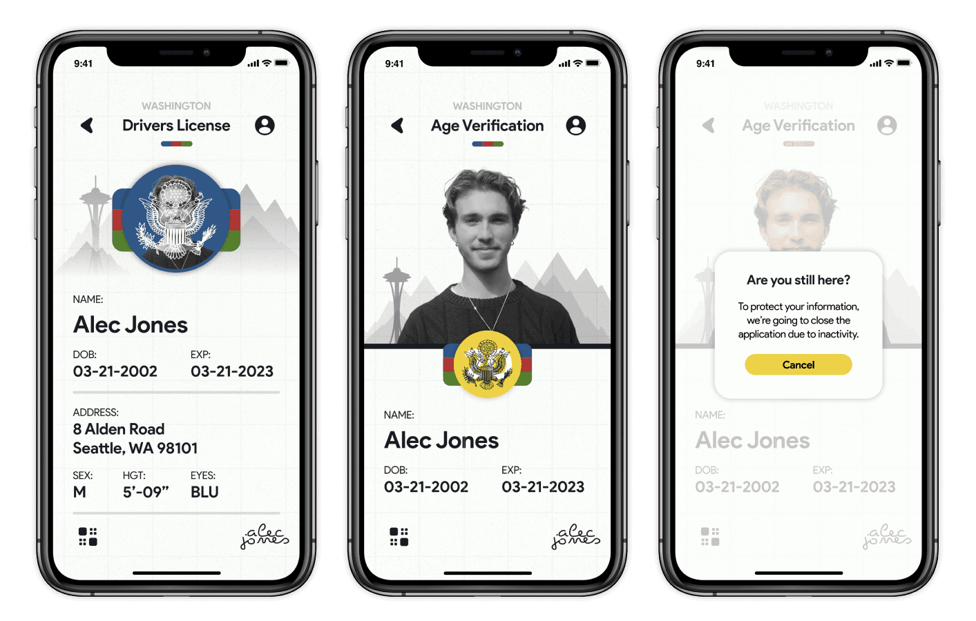
The NY State ID has three main screens: the main view of all of the identification details, a barcode screen for scanning, and an age verification screen where the user can view their restricted age for entering bars and other use cases. Similar to the previous design, there will be improved security features to promote the authenticity of the identification and inactivity timing out to protect the user's personal information.
Revisiting the solution statements from earlier and applying the core principles of organization, usability, and security within my product.
When I started to lay out the structure of this new website for Vonova, I wanted to make a plan that would accommodate both the planned content sections and user interaction. I was very interested in providing amazing visuals and interactions that made the story of Vonova enjoyable and digestible. I landed on the initial layout of elements resembling both a user flow and a site map. While a website like this doesn't have a lot of intense user error prevention and in-depth flows, I could still use the high-level flow to plan content sectioning and how a user navigates it. It ended up helping me plan the site map and particular user flows from one page to another. For access to the full diagram and the rest of my initial research, click the button below to be taken to my FigJam file.
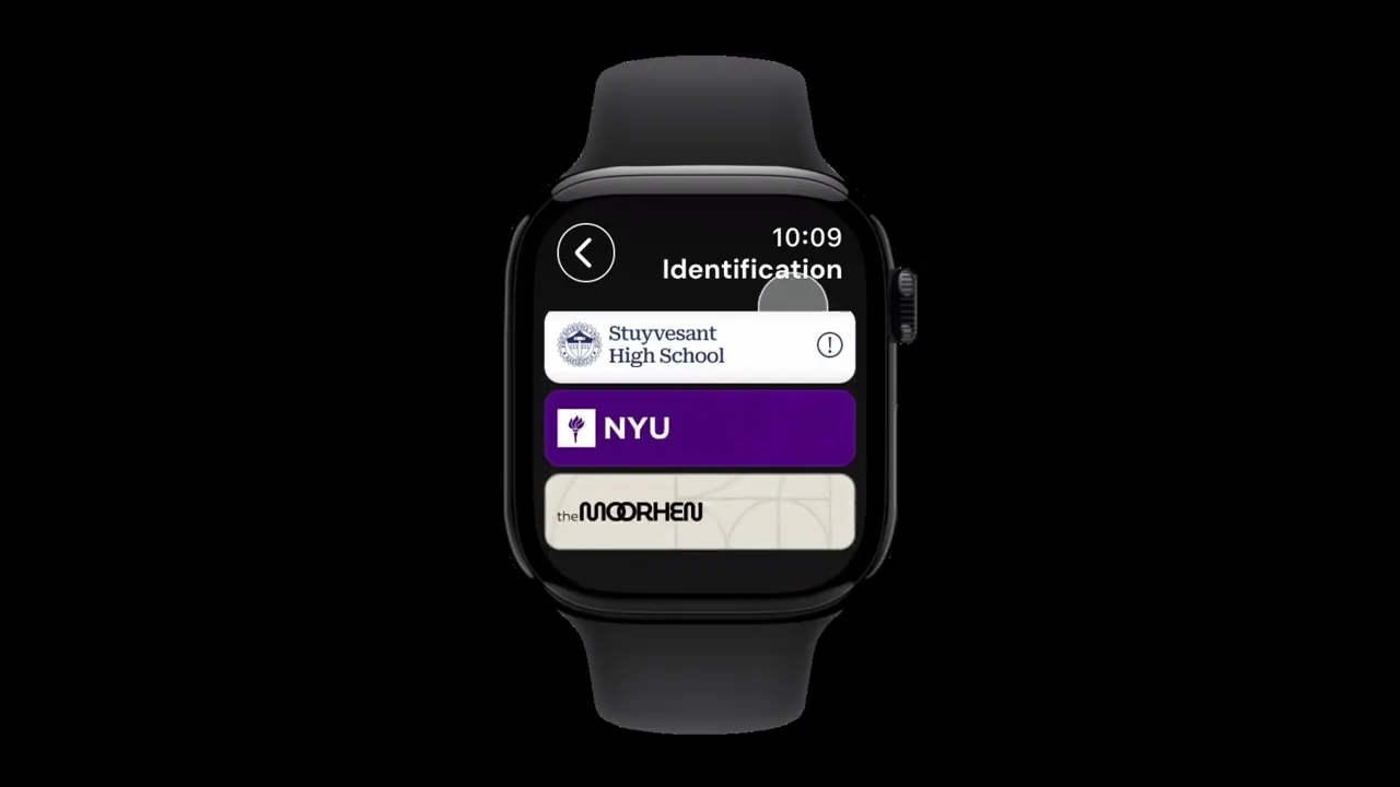
Organization within the app can mainly be seen in the card hub, where users can access their cards in different sections, delete expired cards, reorder them, and select ones that have extended interactivity.
The main hub houses all of a user's cards within a number of sections to promote the organization of cards based on their purpose. The sections that have cards are shown to have contents like a physical folder. In terms of user control in keeping the space organized, they are able to quickly delete cards that have been flagged for expiration as well as delete cards on their own will. In addition to deleting, they can reorder cards based on preferred priority. Cards like the NYID may have extended interaction beyond a tap-to-scan feature; the NYID specifically will open up into a new flow.
Usability is highlighted by the intuitive physicality of cards as well as the quick interactions in the NYID flow. Changing between the full ID view, age verification, and barcode scanning is quick and easy.
The physicality of the cards adds a sense of familiarity to the interface and makes moving through the hub feel intuitive. Below you can see the screens for the NYID flow as well, the default view shows the entire sum of information on the identification. In addition to that, there are two additional screens that can be accessed for quick information or scanning. The barcode is the same code on the back of IDs, and the age verification can be used in certain use cases, like entering bars, etc.
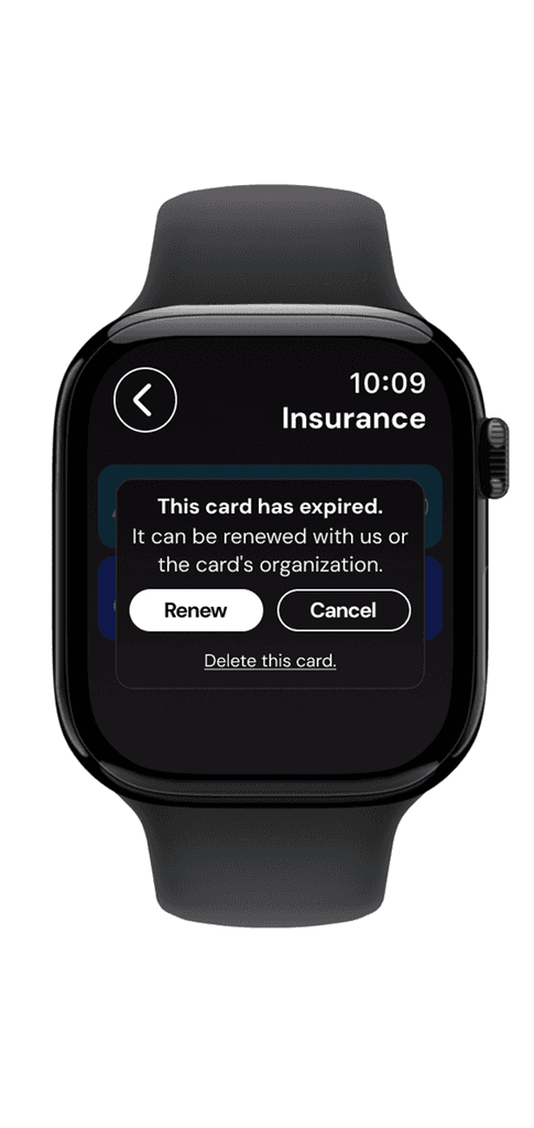
Security is very important in an application like this in order to protect user data. That's why there are features that include face identification, authenticity animations, and time-outs for inactivity.
The initial loading screen includes face recognition to protect the contents of the app from others. Within the hub, there are opportunities to link these cards to the established organizations, making the transfer of information safe and fast. Within the NYID, there's an authenticity animation in order to avoid forgery of identification, as well as security measures to combat inactivity, such as a time-out prompt.
Prototype Takeaways
It was a lot of fun, not only improving the initial design of this project but also prototyping physical transitions all within Figma. I'm definitely happy with the final product and can see how I've come a long way from my initial design. I should do this more often.
Prototype Link
You can go through the linear flow of this prototype by using the button below to be taken to the file.
Why stop at a mobile design? This could also be powerful when attached at the wrist, that's why I decided to reformat my designs for mobile to fit on an Apple Watch.
It took a lot of remeasuring and making sure the interactions were large enough, but I was able to bring my mobile design to life on the Apple Watch. For the most part, the watch design is very similar to the mobile; there are still cards, organization methods, and security measures. It took some work to condense a lot of the content to fit on such a small screen. I was surprised to see just how small and yet so large buttons and text had to be to work on a device like this. Some of the content was reordered to fit on the watch, such as the NYID. The age verification is the default screen, and the listing of the extended information is accessible through a button.


Prototype Takeaways
This felt a lot different than prototyping for mobile due to the small size and smaller interactions. However, I was able to produce a prototype that still had the physicality from the mobile prototype at a smaller size on the Apple Watch.
Prototype Link
You can go through the linear flow of this prototype by using the button below to be taken to the file.
Pushing an initial design in a newly improved direction with added device mockups was fulfilling.
Pushing this digital translation of identifications in a newly improved direction was a fulfilling experience, especially as I introduced refined layouts and incorporated different device mockups that helped bring the concept to life. Seeing the design evolve from the initial into something more polished and realistic clarified the organization, usability, and security principles I set out to solve for.