

Website Redesign
Vonova
Partnered with a rising MedTech startup to redesign their current website, focusing more on their mission and story. Built with Framer.
Redesigning the way Vonova conveys their story and visualizing how they treat brain ailments, while wearing multiple hats.
The focus of this project was to redesign the current website for Vonova, a rising MedTech startup that focuses on providing a revolutionary alternative to accessing the brain without invasive surgery. Not only was I challenged as a UX Designer, but also as a project manager. My client wanted to not only refresh their website but also convey their story and how they aim to provide a new method of treating brain ailments. In order to do this, I developed engaging ways for users to learn about Vonova.


I took inspiration from generic health products in digital spaces, applying their ideas of structure and layout.
I began my research into this new area by looking at existing design inspiration for generic health products. Even though I was adhering to specific branding guidelines, the structure and layout of the website is something I was responsible for solving. Some takeaways from my visual inspirations include:
Providing organized information is always important, and it can be paired with some intuitive interactions to add more engagement.
Blending between type and graphic elements can add depth to different sections of a page.
Unique information structures can create a seamless flow to different sections.
Even smaller sectional components can have engaging interaction.
From my inspiration references, I gathered takeaways that can inform the rest of my research.
Referencing the structure of these examples will improve the way that users engage with the information presented to them.
Clear sectioning of elements improves how the user flows through a page.
Understanding how to make larger intractable elements versatile and responsive.


Taking a look at references supplied by my client and taking notes on how the information and visual content is applied.
My client provided me several references they were interested in replicating in terms of content structure and information. They felt these examples gave great insight into the direction they wanted to take their story in terms of a narrative structure. I took a deeper look into these examples and derived some analysis takeaways:
Information provided on these websites varies dramatically in terms of content types (i.e. videos, interactive elements).
Visual content mostly provides clear representations of the product.
Branding style and overuse of visual elements often distract from key information.
Information architecture displays key information in infographic structures.
Many sections of information just contain walls of text.
I then thought of usages that I could pull from these references that I was supplied.
Interactive infographic elements can do a better job at telling the story rather than walls of text, but too many overpowering visuals will become distracting and unattractive.
Finding balance in these two key elements will be important in designing a well structured solution for Vonova.
There are many different modes of paginating information in these examples. I believe that in this case, less is better.


Competitive Analysis 0.1
Precision's website has sleek UI that’s supported by interesting scrolling interactions. There’s a lot of visual media that doesn’t feel out of place and adds to the overall user experience as well as the understanding of the product. There also isn’t too much write-up; it seems like the visuals do a lot of the explaining in place of the written descriptions. In terms of unique interaction besides things like buttons, there’s the scroll animations and video controls. Some of the scroll animations feel fluid in some places and then slightly jarring in others. There is also a lack of cohesive information hierarchy with varying heading sizes and areas where there are no headings at all.
Pros:
Minimalistic visual UI supports the product visuals.
Smooth scroll creates a flow that pieces sections together.
Simple navigation structure that is able to highlight all key aspects of the company, from the product to manufacturing to the people.
Write-up is clear and precise without too much excessive information.
Cons:
Some responsiveness issues that affect animations and cut off content.
Possible accessibility issues with light text on light backgrounds.
Publications and Press section could possibly be organized differently rather than being an extensive list that eats at scroll time.


Competitive Analysis 0.2
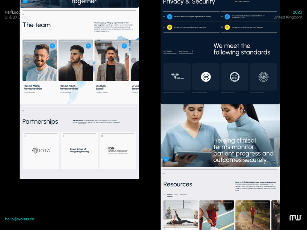
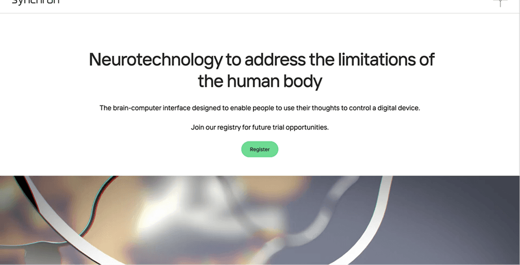
Synchron's website has a lot of good information and interaction to offer about their product but none of it is on the first page. The landing page doesn't seem to engage a user's attention because product visuals remain below the fold. Once you start exploring their well maintained navigation, you start to find the interesting visuals and interactions that could be more responsive. They seem to separate a lot of information across multiple pages which can be helpful in some cases but more detrimental in others. For example, the challenges page is separated from the solution and doesn’t showcase what the patient hopes to gain despite the challenges. In addition to that, it seems that the challenges page focuses on the problems with the product without offering solutions to those problems.
Pros:
Intuitive interactions working with visuals to create unique experiences in learning about the technology.
Simple and clean UI focuses on the information regarding the product.
Navigation is organized based on content and showcases clean animations.
Cons:
Excessive pages make content feel separated from each other rather than cohesive.
Visual information without interaction doesn’t seem prioritized.
Interactive sections cause mobile browsers to slow down; this could be because of the scroll animation.


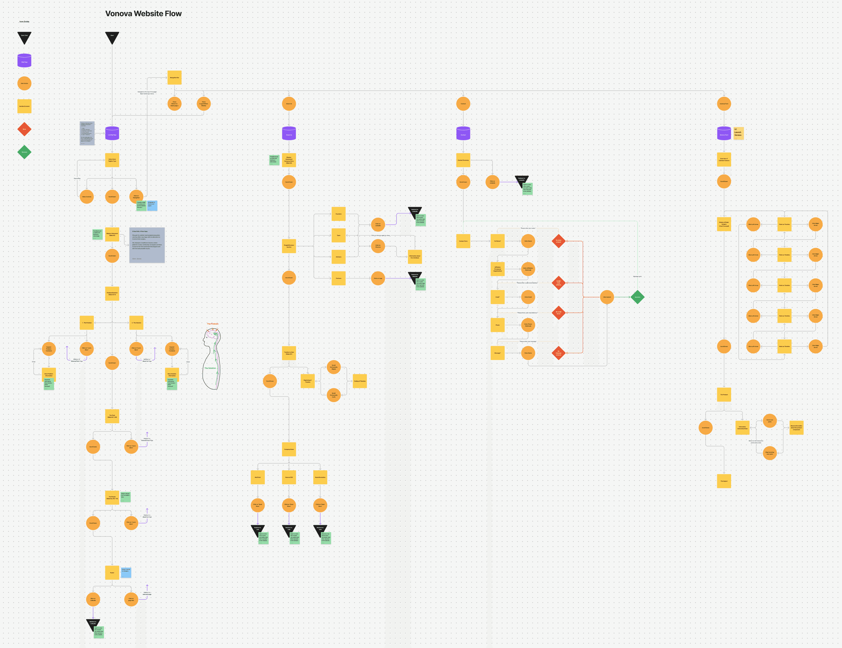
I made a blend of a site map and user flow to accommodate my planning for the website. It helped me visualize structural components and interactions.
When I started to lay out the structure of this new website for Vonova, I wanted to make a plan that would accommodate both the planned content sections and user interaction. I was very interested in providing amazing visuals and interactions that made the story of Vonova enjoyable and digestible. I landed on the initial layout of elements resembling both a user flow and a site map. While a website like this doesn't have a lot of intense user error prevention and in-depth flows, I could still use the high-level flow to plan content sectioning and how a user navigates it. It ended up helping me plan the site map and particular user flows from one page to another. For access to the full diagram and the rest of my initial research, click the button below to be taken to my FigJam file.
Visualizing textual and interactive content at different device widths, making sure I can plan for a responsive and functional design.
After laying out the groundwork with my site map, I started to visualize the sections for each page on this new website. I focused on visualizing content and how it can be responsive at different device widths. With an ambition to have multiple interactive elements, I had to make sure they were functional across several platforms. Three main widths were used to plan how the content would behave responsively. Although the content on the final product was slightly different, I still planned out functionality and content for future versions.


High fidelity wireframes helped guide the implementation of the design in Framer.
Combining the takeaways from the user flow and the sketches, I started to lay out the high fidelity wireframes that would guide my layout and structure decisions for each page. Not only was I wireframing for different pages, but the different device widths to ensure a plan for handling responsive widths. Although the final output was slightly different after client feedback and project scope, many of the content and component structures remained the same.


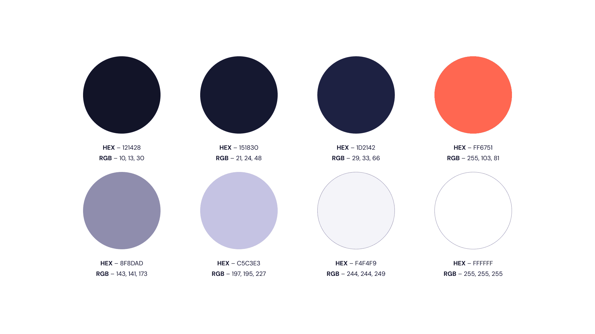
Building upon existing branding guidelines to fit a digital format with client approval. Creating more variation in type and color helps me create a diverse visual hierarchy.
Vonova already has guidelines for their brand that include typefaces, colors, and graphic elements that would be paired with their brand image. I already had a starting point for what the website would look like from that information. However, there wasn't a lot of information about how they would apply that to digital interfaces and devices. I decided to expand on their branding guidelines with the approval of the client and create more variation in their type elements and color palette that could benefit future iterations. These expanded guidelines helped me derive the type to be used at different scales and color to create a more diverse visual hierarchy. For more insight into my wireframing and expanded guidelines, click the button below to go to my Figma file.

After applying the Vonova brand guidelines to the design in Framer, I produced the final product.
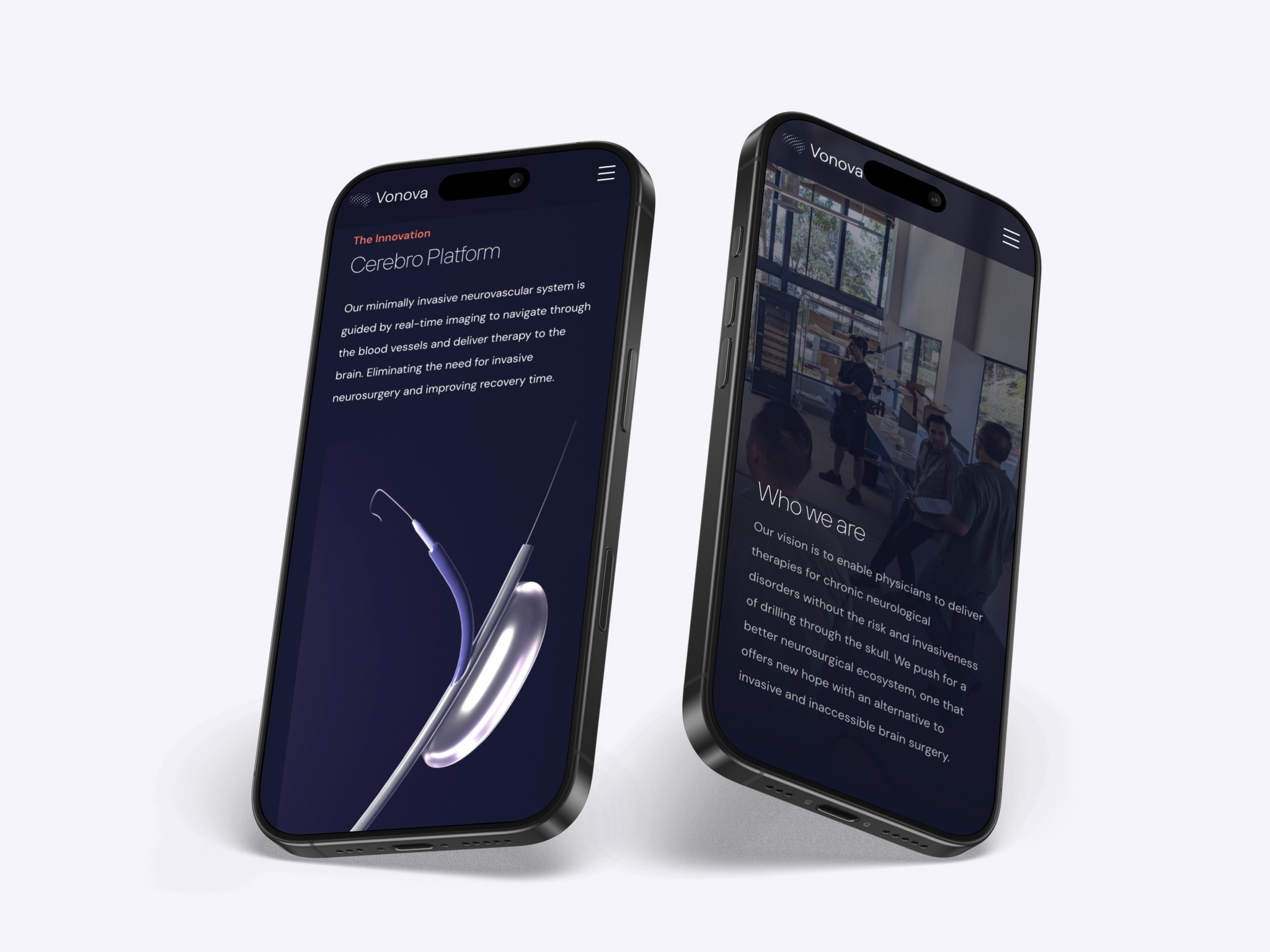
After designing in Framer to build out several interactive components and using the amazing visual assets built by Microverse Studios, I was able to produce the redesign of Vonova's website. Below are visual takeaways from the website and comments about the design components and visuals.

Upon entering the website, users are met with the captivating demo reel of Vonova's solution to invasive brain surgery, designed by Microverse Studios.

It was imperative to the client to highlight Vonova's solution to invasive brain surgery as well as the problem itself. In this interactive component, users can read more about the issues of current treatments and how Vonova solves their challenges.

It was just as important to highlight the people behind the technology as well as the tech itself. With visual components highlighting the talent behind the tech, users can get a better understanding about Vonova's mission and people.

There are always new updates about Vonova and their innovative technology. I brought attention to those news articles and videos with this slideshow component.

The team needed to be showcased individually, highlighting their talents. Through dropdowns, I was able to organize individuals with their respective information and headshots.

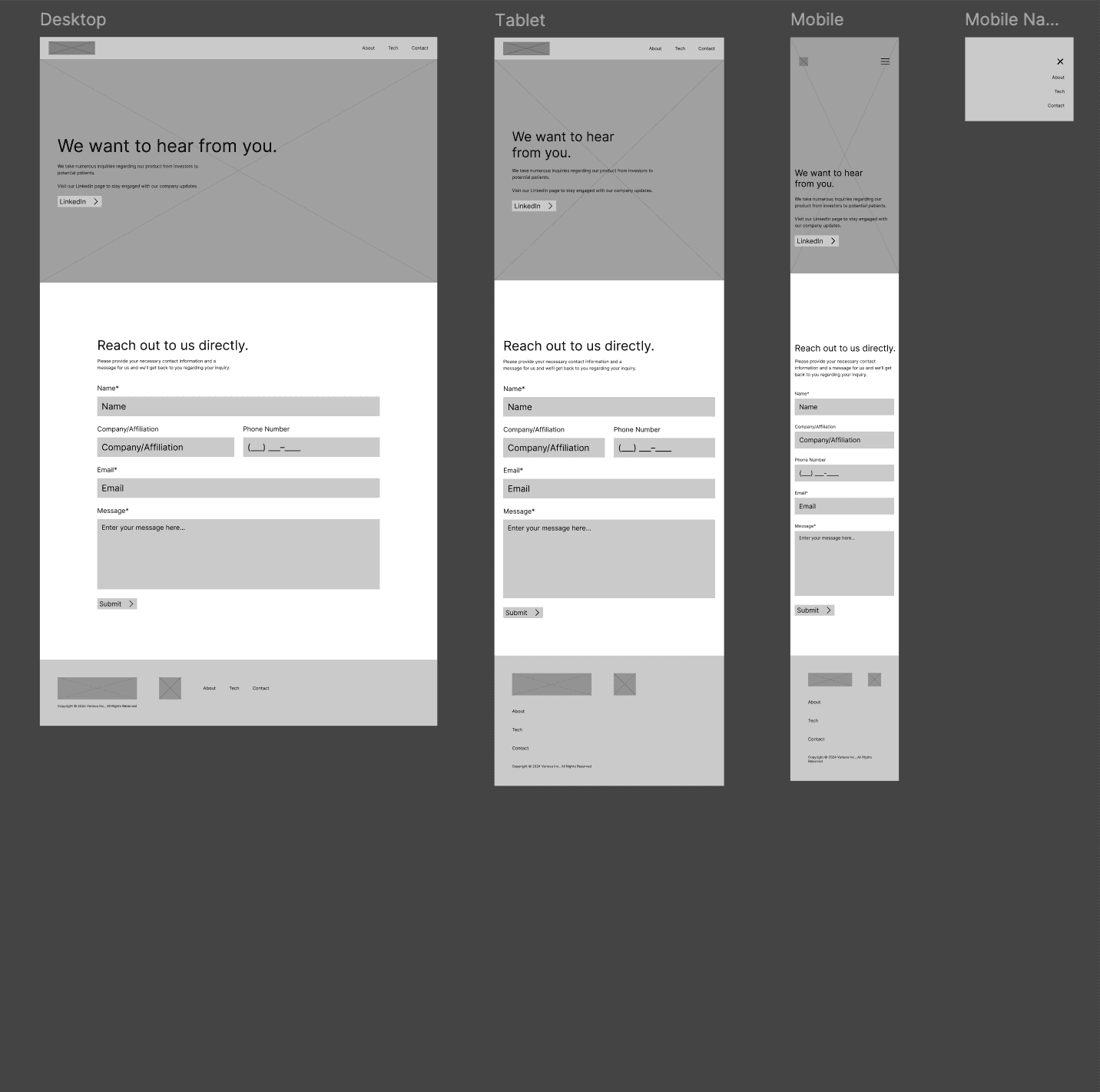
Finally, there's a space for investors and potential patients to reach out to the company to inquire about the technology built by Vonova.

Project Takeaways
For this project, I became more than the UX design lead. While working with my client, I consulted, partnered with third-party vendors, project managed the timeline for launch, and outlined plans for future versions. While still leveraging user centric design principles and focusing on engaging interaction, I extended my reach to other cross-functional areas.

Website Link
The newly redesigned Vonova website is now live! You can explore my design and learn more about the company by clicking the button below.