Over the summer of 2023, I had the amazing opportunity to go to Alaska and immediately felt inspired to create something with the newly announced Figma Variables. For this project, I wanted to create a prototype for a fictional transportation service centered around bush and tailwheel plane flights around different locations in Alaska. Not only would I make a prototype for this service using Figma Variables to get a fully interactive and customizable experience, but I wanted to also develop a design system that expanded on the interactive elements I made and document them in an adaptable and thorough system.
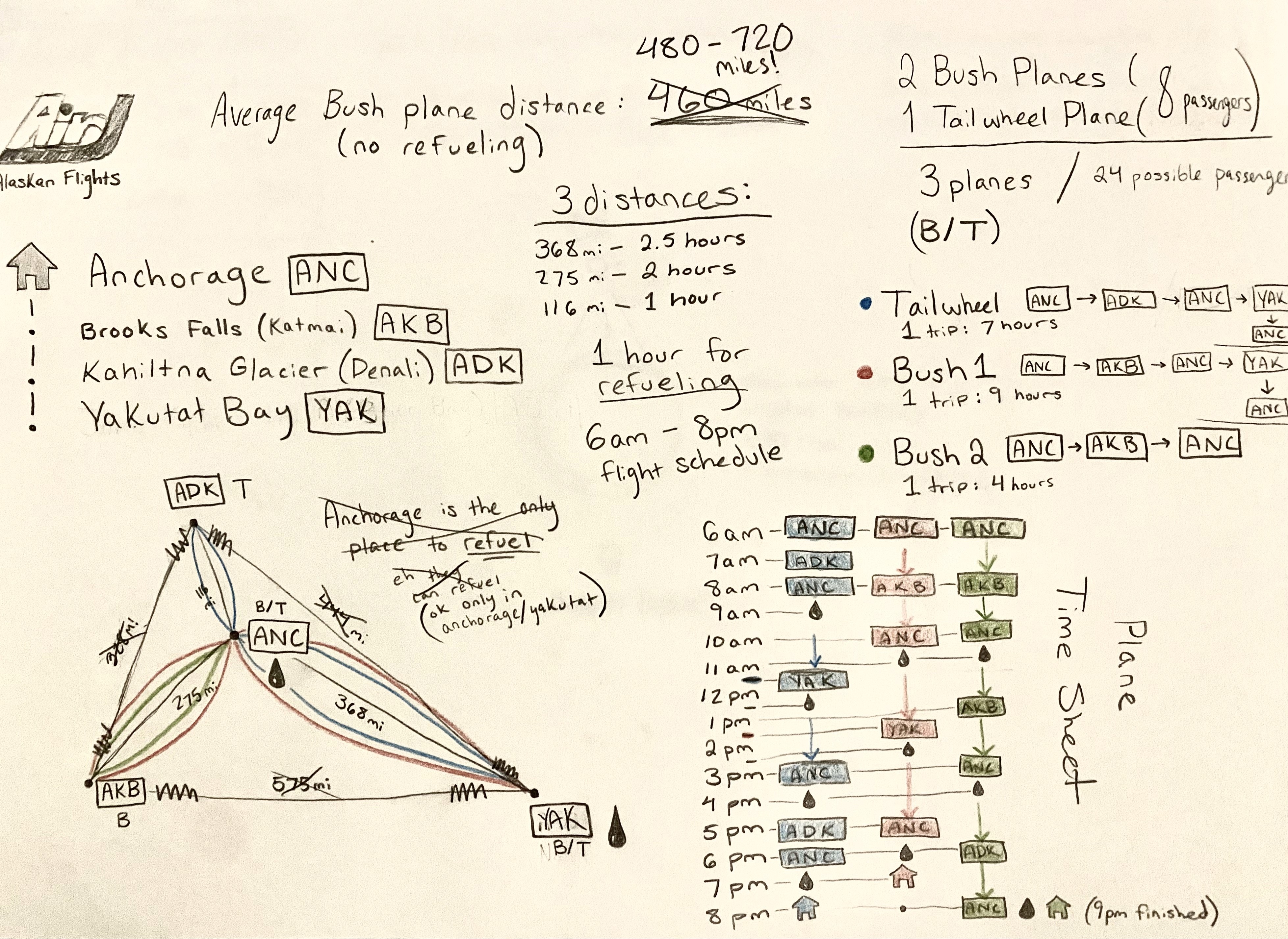
I know just as much about air traffic and flight paths as the next designer: slim to none. So I decided to research the specs of my planes that would be servicing four different locations in Alaska, Anchorage, Kahiltna Glacier, Brooks Falls, and Yakutat Bay. With my locations chosen and the distance between them measured, I started planning the flight paths of three different planes that would travel between 1-2.5 hours each flight. Based on the locations I chose, I needed two bush planes to land in water and one tailwheel plane that can land on the ground. Some locations serviced both planes while others did not. With this initial planning and research done, I then constructed a solid timesheet below that I could bring into my variable system.
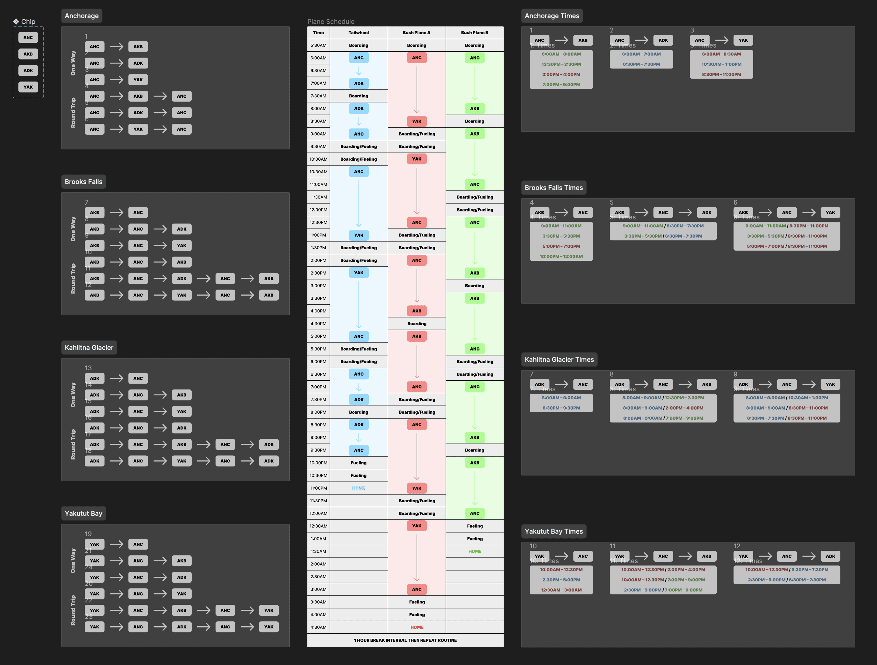
With the plan of the flight path created, I then started a more in depth timesheet that gave me the exact times my planes were fueling, boarding, departing, and finally arriving. On the left of the image, I listed out all of the possible flight combinations that included one way and round trip variations. Then I visualized the flights through the timesheet in the center where I accounted the location of the three separate planes from 5:30AM to 4:30AM the next day. I decided that my starting point should be Anchorage and that all planes start and end there each day. With the timesheet complete, I gathered all of the possible time intervals of the flights so I could reference them as I began bringing them in as variables.
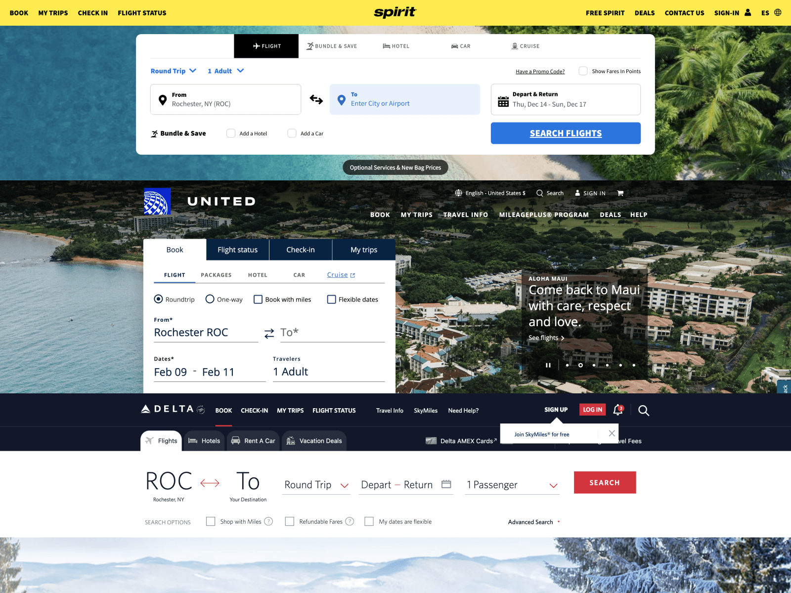
When I was first thinking about the user flow of ordering these plane tickets, I looked at a couple of big flight services like United, Delta, and Spirit. Using these references, I started building out my variable system to reflect the different pieces of user information I needed to record such as the date they leave and their return date. Overall, these service references helped me with the way I needed to structure my information system. I was able to lay out the steps that my user will take in purchasing tickets for a flight of their choice.
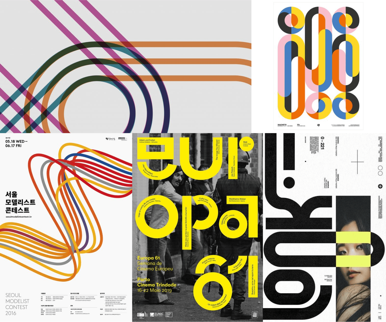
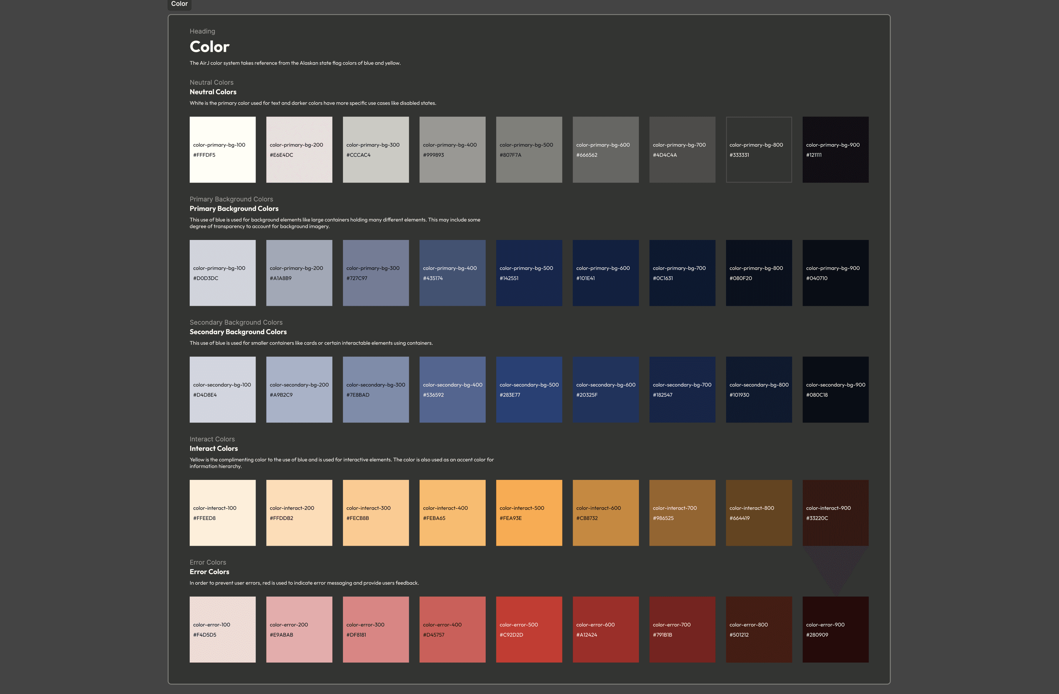
Going into designing the different screens during the flow, I knew I wanted to use a color palette of blue and yellow to resemble the state flag of Alaska and continue the brand's connection to the state. I looked at a lot of inspiration centered around the use of lines that I was able to incorporate into my design. I also wanted to use the images that I took myself while I was in Alaska to add a layer of personality to my project. With the combination of line design, my own images, and the color palette I settled on, I was able to produce a satisfying solution for my prototype.
For access to the full diagram, click here to view.
With the research I conducted for my own flight schedule and the structure and content of other air travel service websites, I derived a user flow for scheduling a flight and then purchasing those tickets. This flow only follows a user as they select scheduling aspects like location, date, trip type, and passenger count. Then the flow handles the payment tunnel for purchasing tickets for the selected flight. Each section contains the aspects that lead into the next one properly. For example, having the trip type selection on the first page determines how the next screen is established because the user needs to select the dates of travel. If the user selects "one way", the date picker for the return date is no longer necessary because it's a round trip. Understanding these intertwining functionalities and having this flow established will benefit me as I construct wireframes that will serve as the base of my final designs.
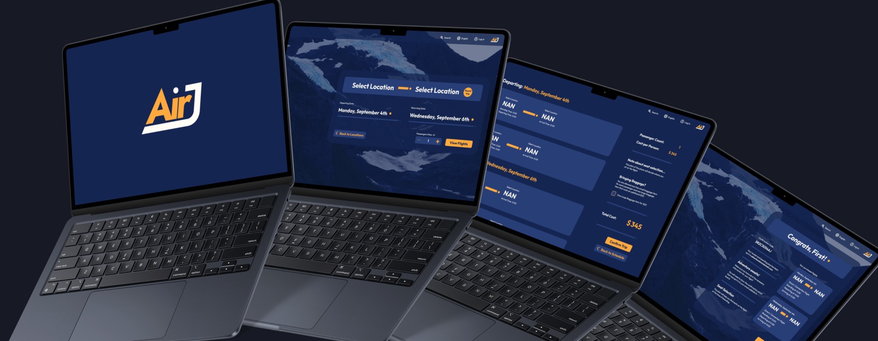
With the references of different air travel websites and the supporting user flow diagram I developed, I constructed the screens I outlined in the user flow containing all of the necessary interactions needed for proper data collection from the user. I go into each screen in more detail under the "Final Screens" section below.
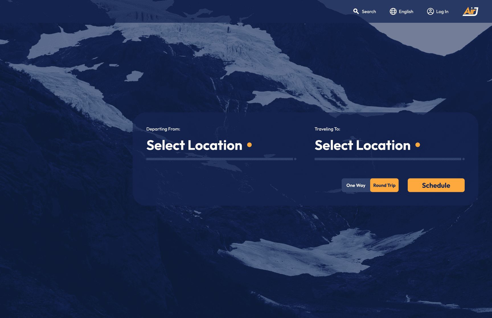
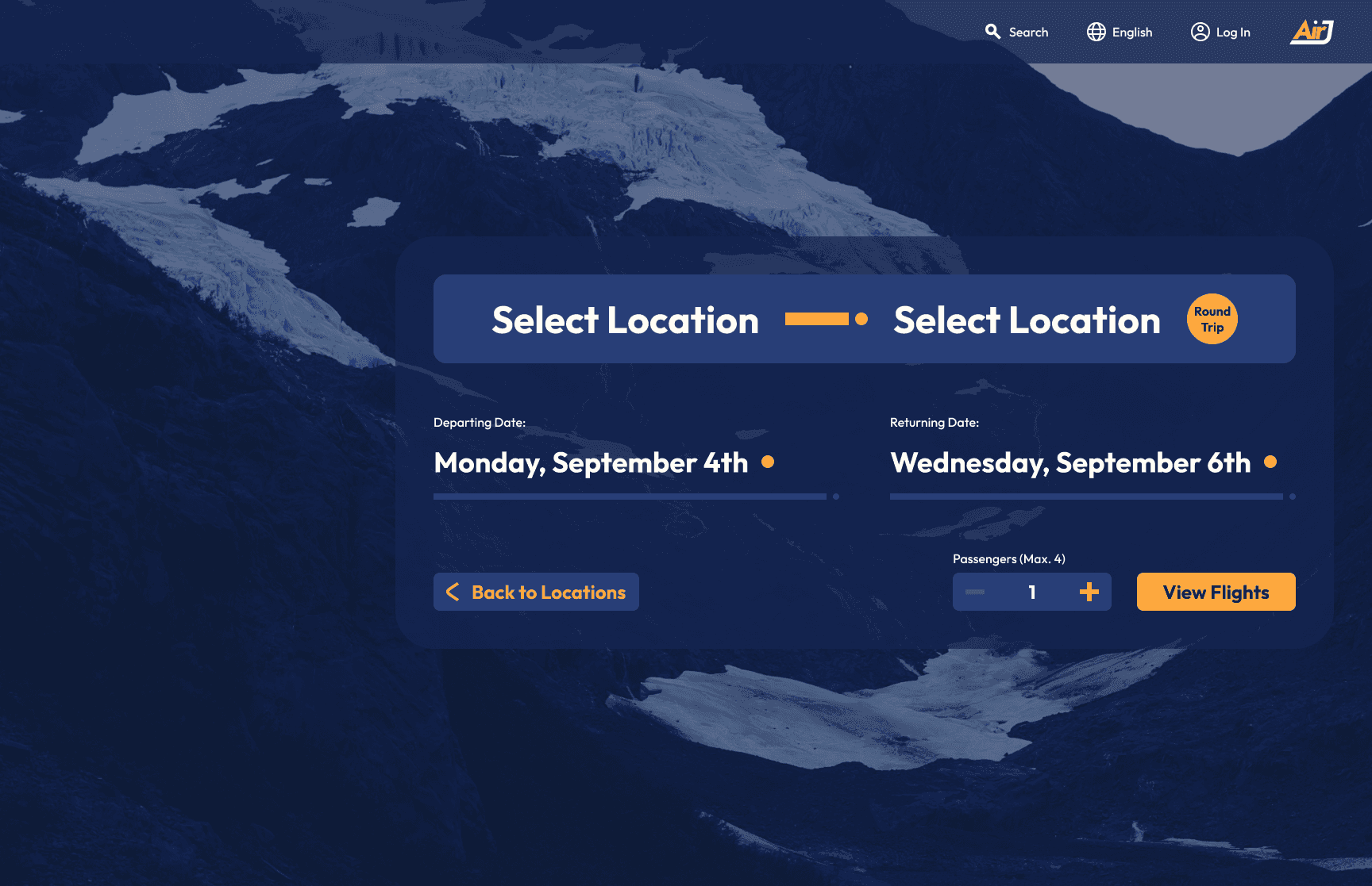
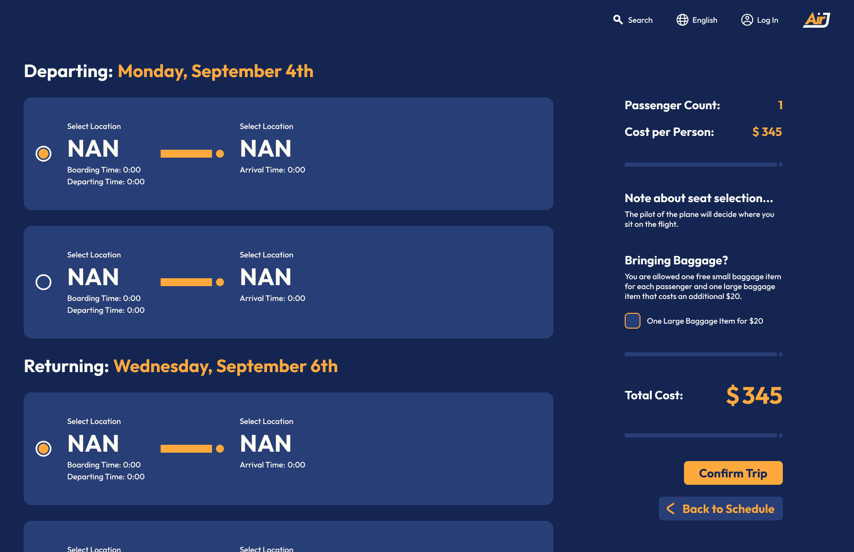
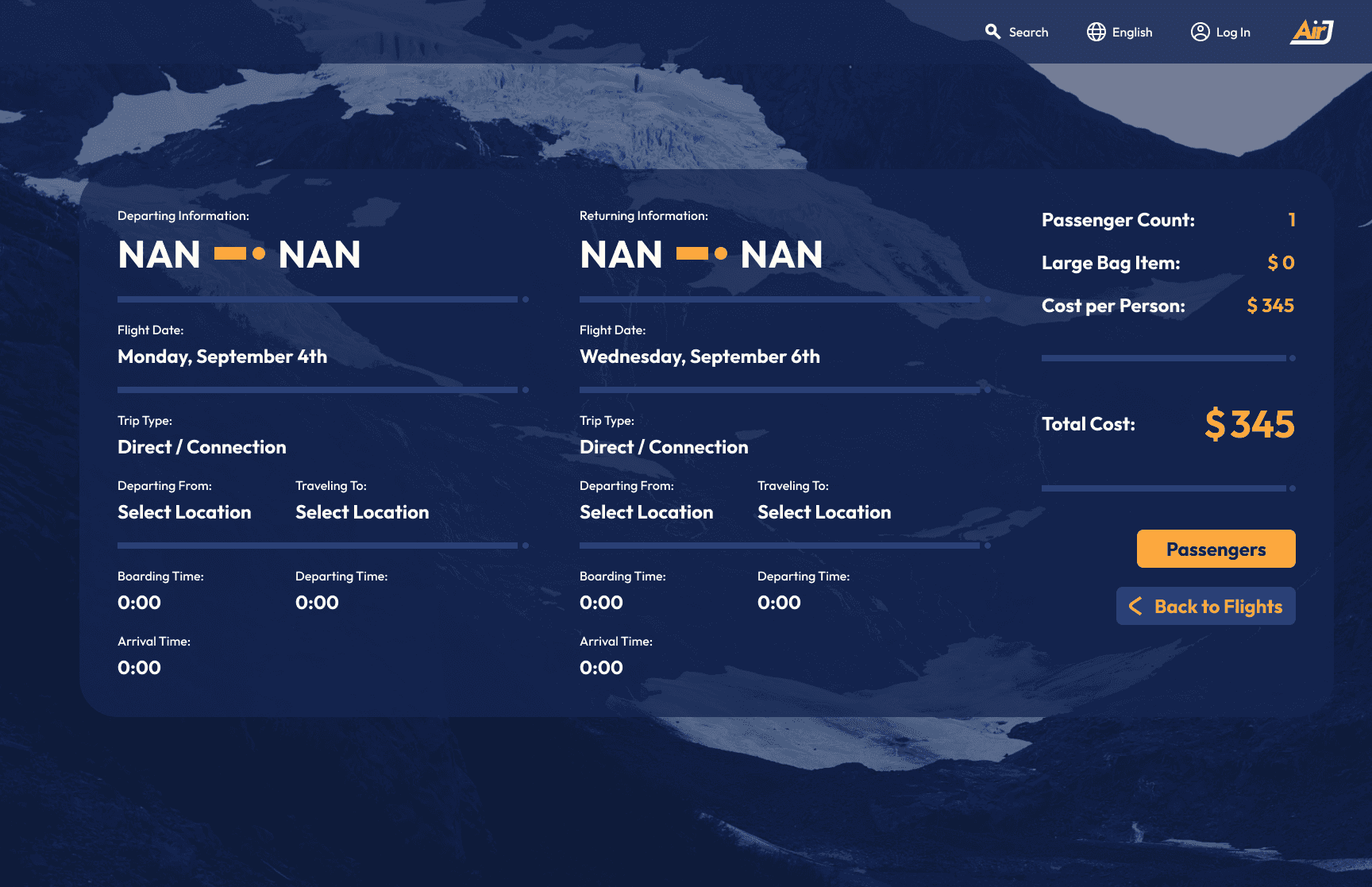
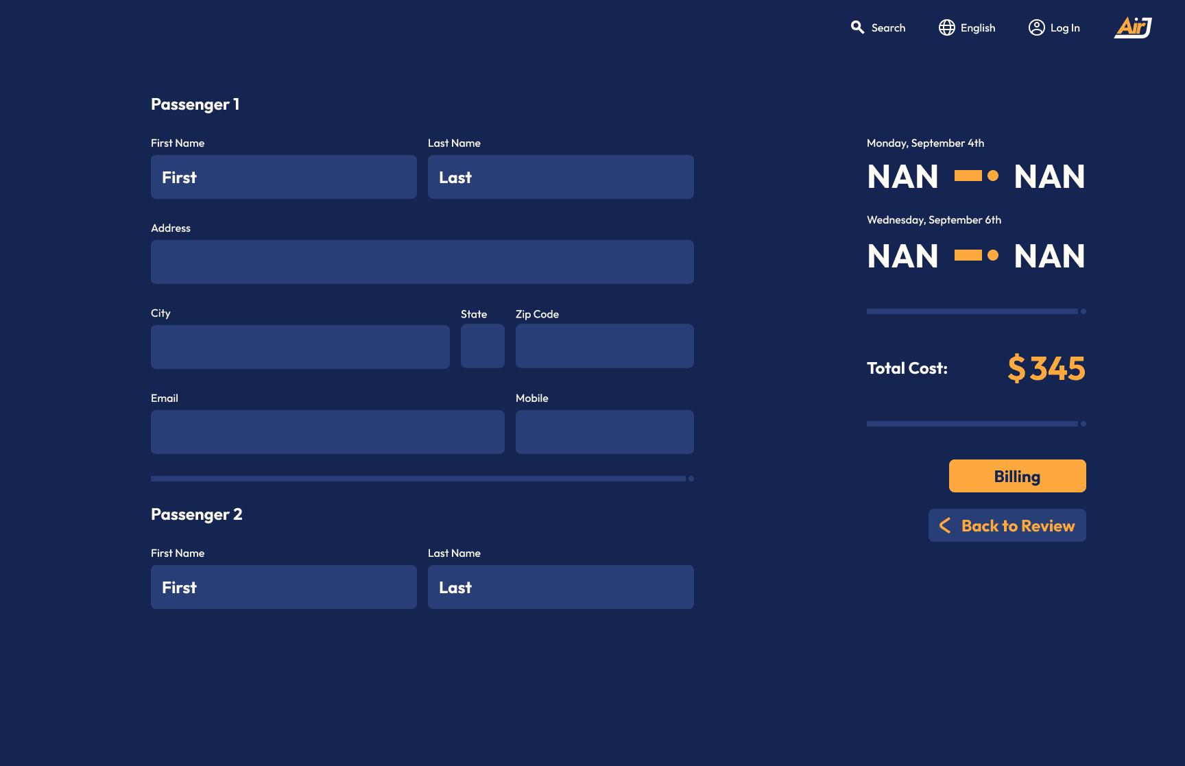
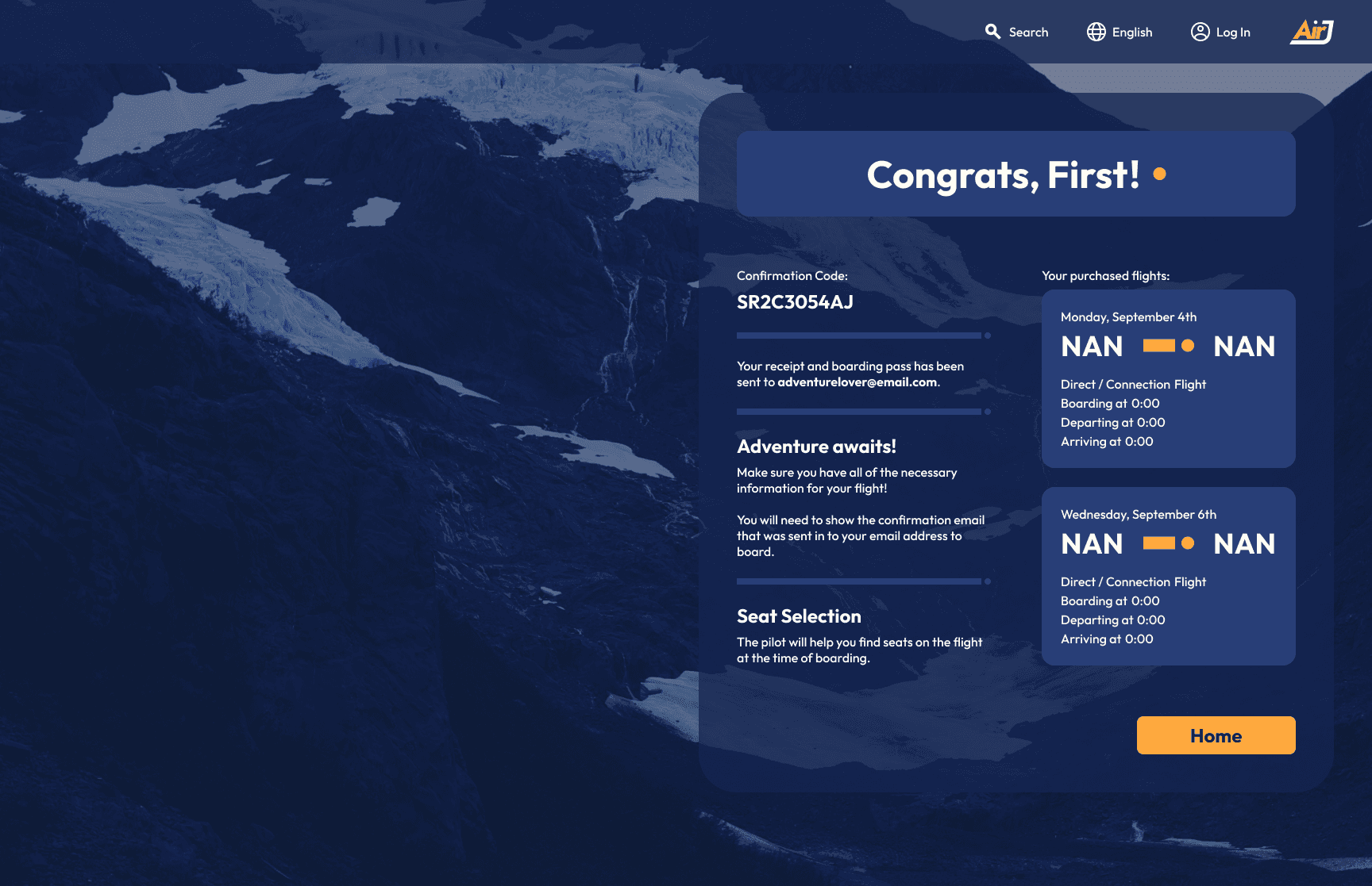
If you look closely at some of these screens, you'll notice some weird instances of values like "NAN" or "0:00". As a user's going through the flow, they select things such as their departing location that alter these variables and cater them to the users experience. With the use of Figma Variables, I was able to compose a working prototype that can take tons of different user combinations to make the prototype more immersive. Below are more in depth explanations of each screen.
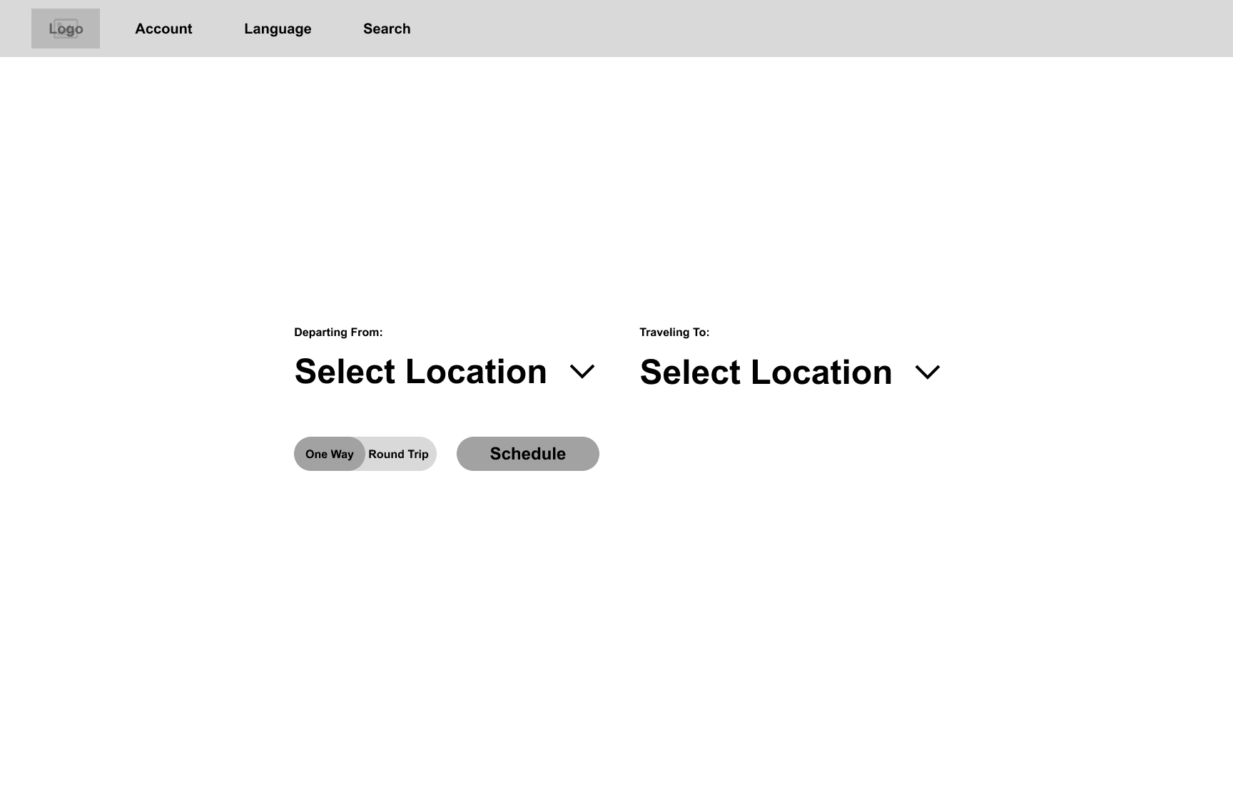
At this screen, the user familiarizes themselves with the prominent form of interaction at the center of the screen that can take two important forms of user input. First, select two locations they're traveling between and the whether it's a one-way trip or a round trip. Then they can continue to schedule the flight.
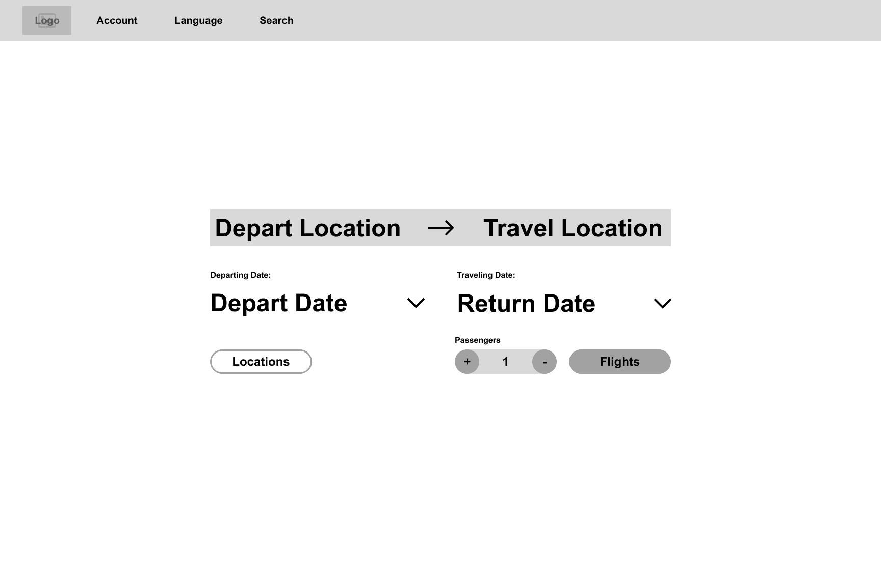
This is where the user then gives their flight a date from a date picker. They are also able to choose how many people are going on this flight anywhere from 1 to 4. Finally, they're free to view the corresponding flights for the information they entered.
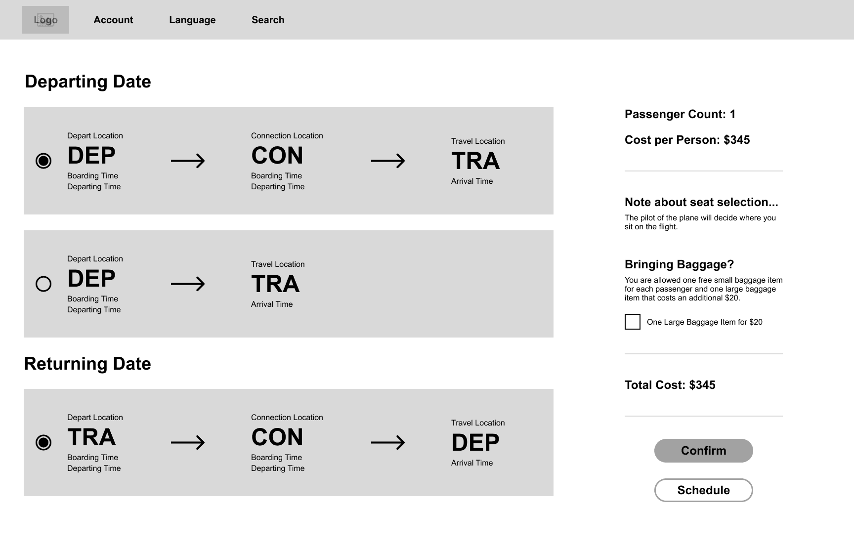
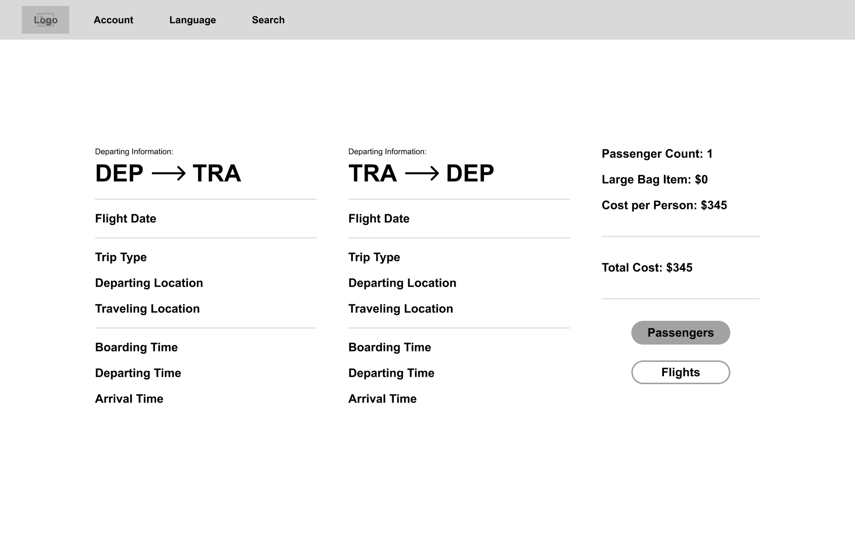
The values in the card would be filled with the information that the user entered previously like the locations names and the correct dates. Here they are able to choose flights based from the timesheet that I constructed. The timesheet provides the cards with the correct time values of the flights.
After they choose the flights they want, the user will be greeted by a summary screen providing them with the full set of information they have set thus far. Then, they have to enter their information as a passenger in order to check out.
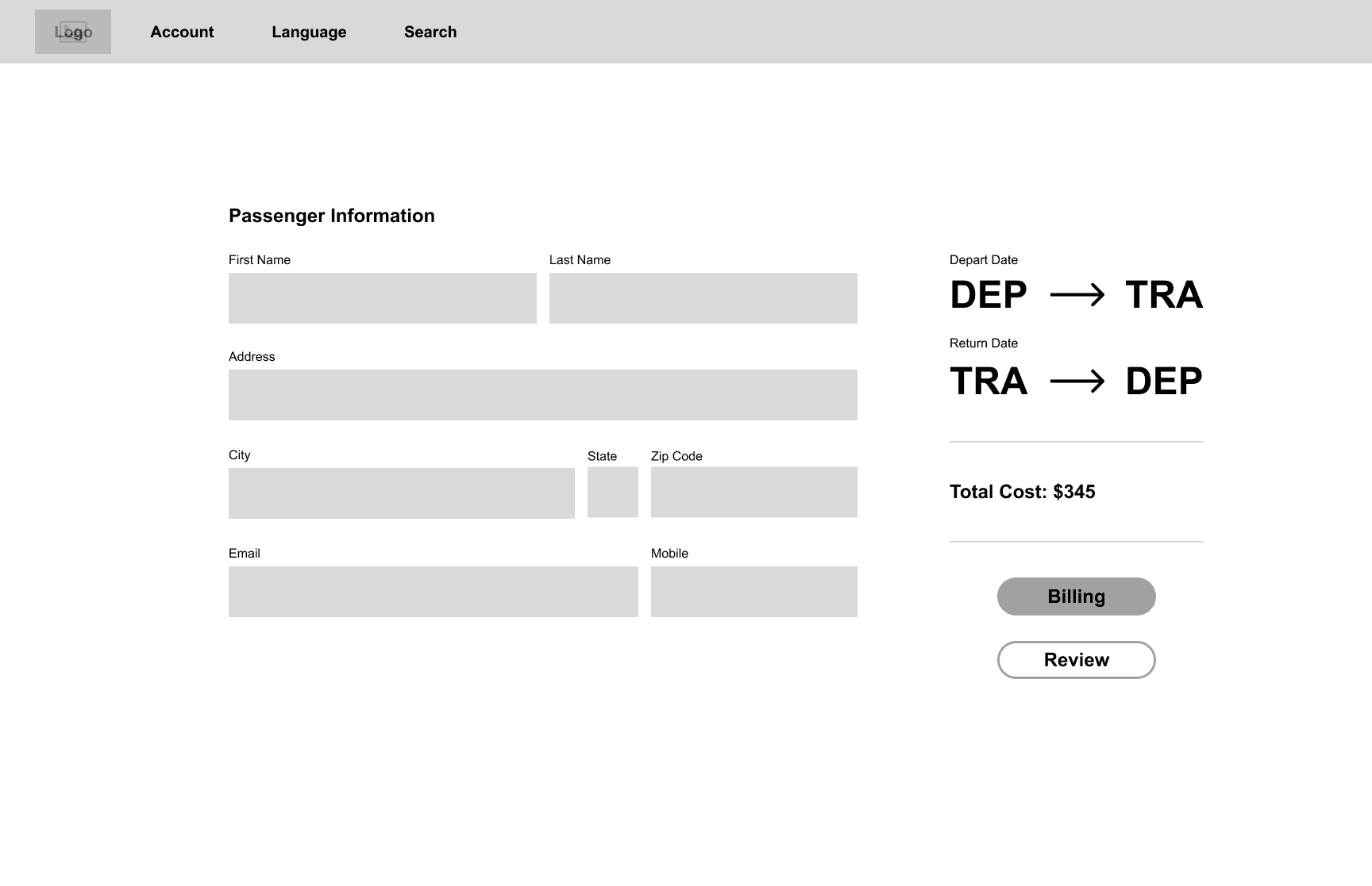
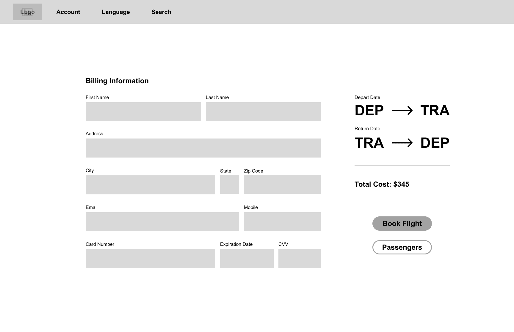
This is where a user can input any kind of name that they want with any combination of alphabetical input. They will always have to enter at least one persons name and then the names of any other passengers their bringing. In addition to that is the location information of the user which is an autofill. After this, the user has to enter their billing information which is very similar to this screen.
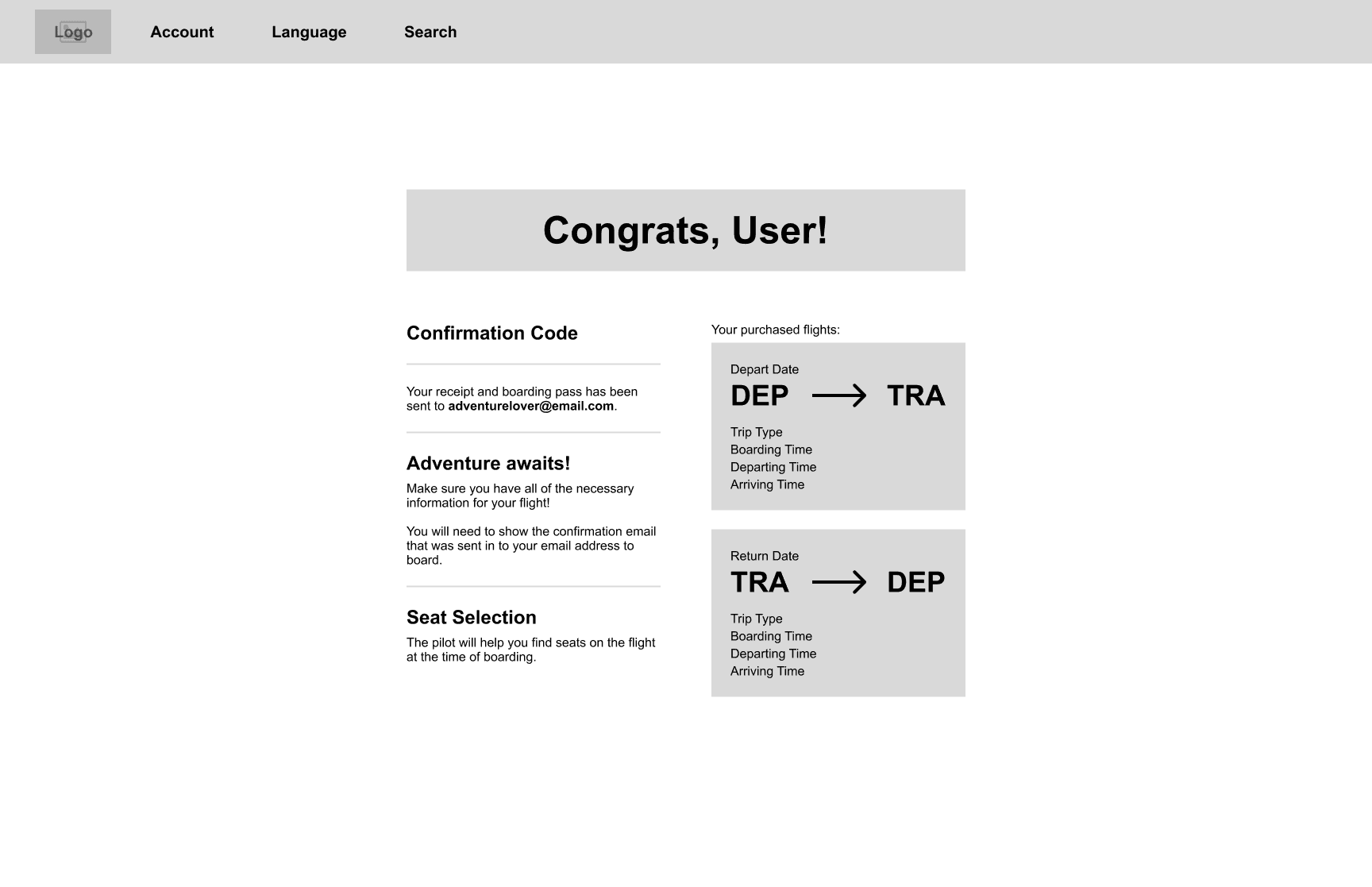
Finally, the user will be greeted by the final screen confirming their ticket purchase and providing them with an email copy and some final reviews of what they purchased. They can then return home and repeat the experience again.
Due to the high number of variables and them being set on almost every interaction, some of the time it takes for Figma to process all of this can be longer than expected. I have several loading screens between stages where behind the scenes there are tons of calculations being done to make sure that the path is catered to the user. I'm really happy about how the final look came out, all of the variables work how I intended and it feels closer to a final digital product. I plan on returning to this prototype in the future and making these interactions more seamless.
You can take this immersive prototype for a spin and try it out yourself! Please refer to the video that showcases the prototype first as some interactions are specialized to be compatible with Figma instead of a real developed product.
Now that I had a solid foundation to what the branding and style of AirJ is, I had all of the tools needed to start documenting my designs with "Blue Ice". Blue Ice is the title for my design system and is supposed to represent the nature of glacial ice and reflects the nature of that ice into the guiding principles of my system. Alaska is home to many glaciers that on the surface, are hard and rigid. However, at their core, they can be fluid, dynamic, and ever changing. I took those same aspects and derived my guiding principles that fuel the integrity of this system:
Capture the essence of the Alaskan wilderness and culture.
Maintaining a rigid structure through in depth documentation of alterations.
Allowing for dynamic changes that keep this system evolving for the better.
With these principles defined, I then went on to structure my system into four main components, Foundation, Atoms, Molecules, and Organisms. Using the Atomic Design structure helped me build out components at the smallest scale so they can be used in larger components. Below, I talk more about each section and what they contain.
Before I outlined the different component sections, I also included a section on accessibility. In this section, I did research on the Web Content Accessibility Guidelines (WCAG) developed by the W3C. In the guidelines they outline four key principles that include perceptibility, operability, comprehensibility, and robustness (P.O.U.R.). These aim to render digital content more inclusive for all individuals regardless of their capabilities or disabilities. With the outline of these principles, I thought to apply them to my design system by providing examples of the principles alongside the components of the system and potential AirJ products.
For a more in-depth look into my accessibility research and application, you can refer to the full design system link at the bottom of this page.
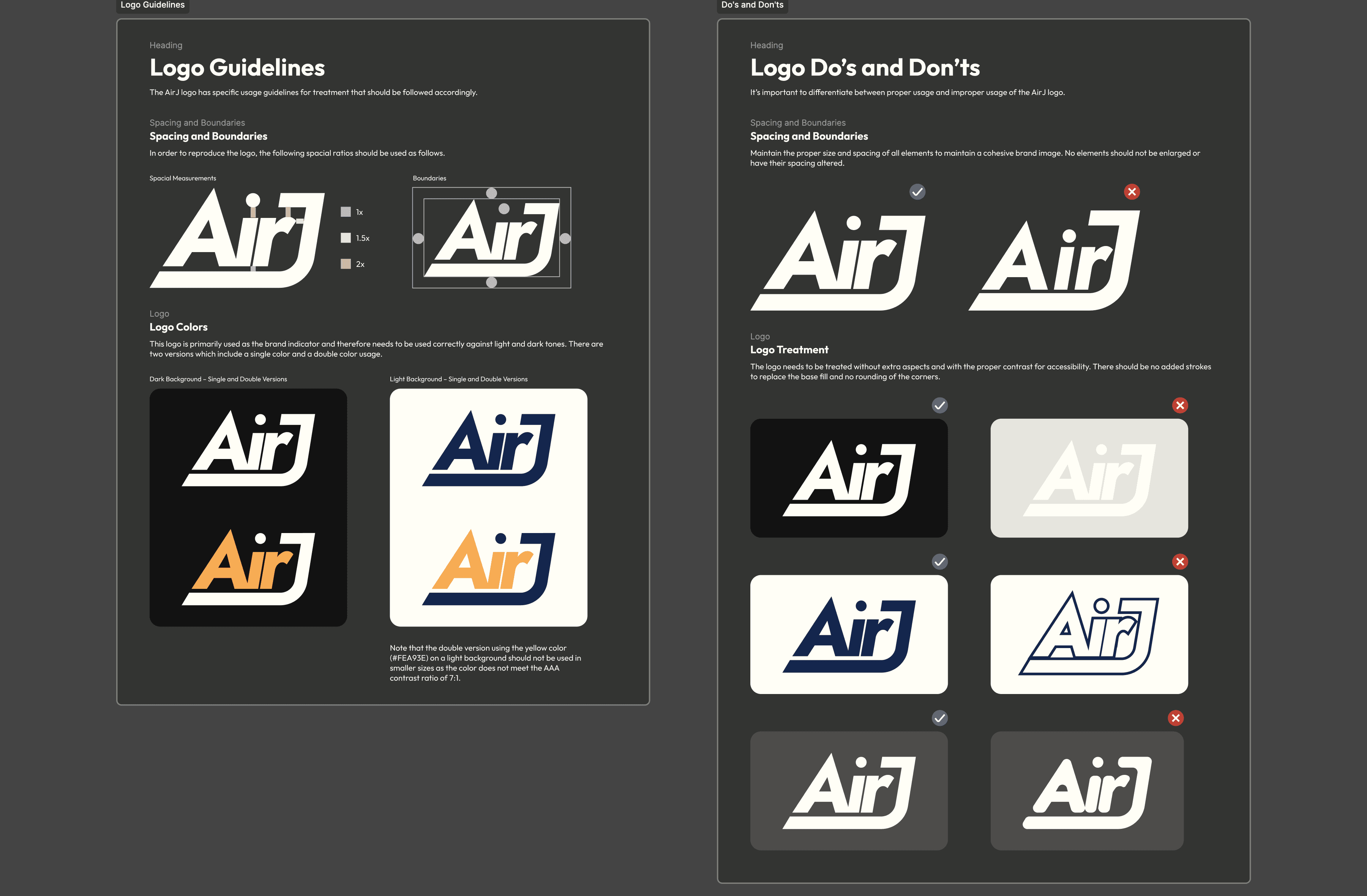
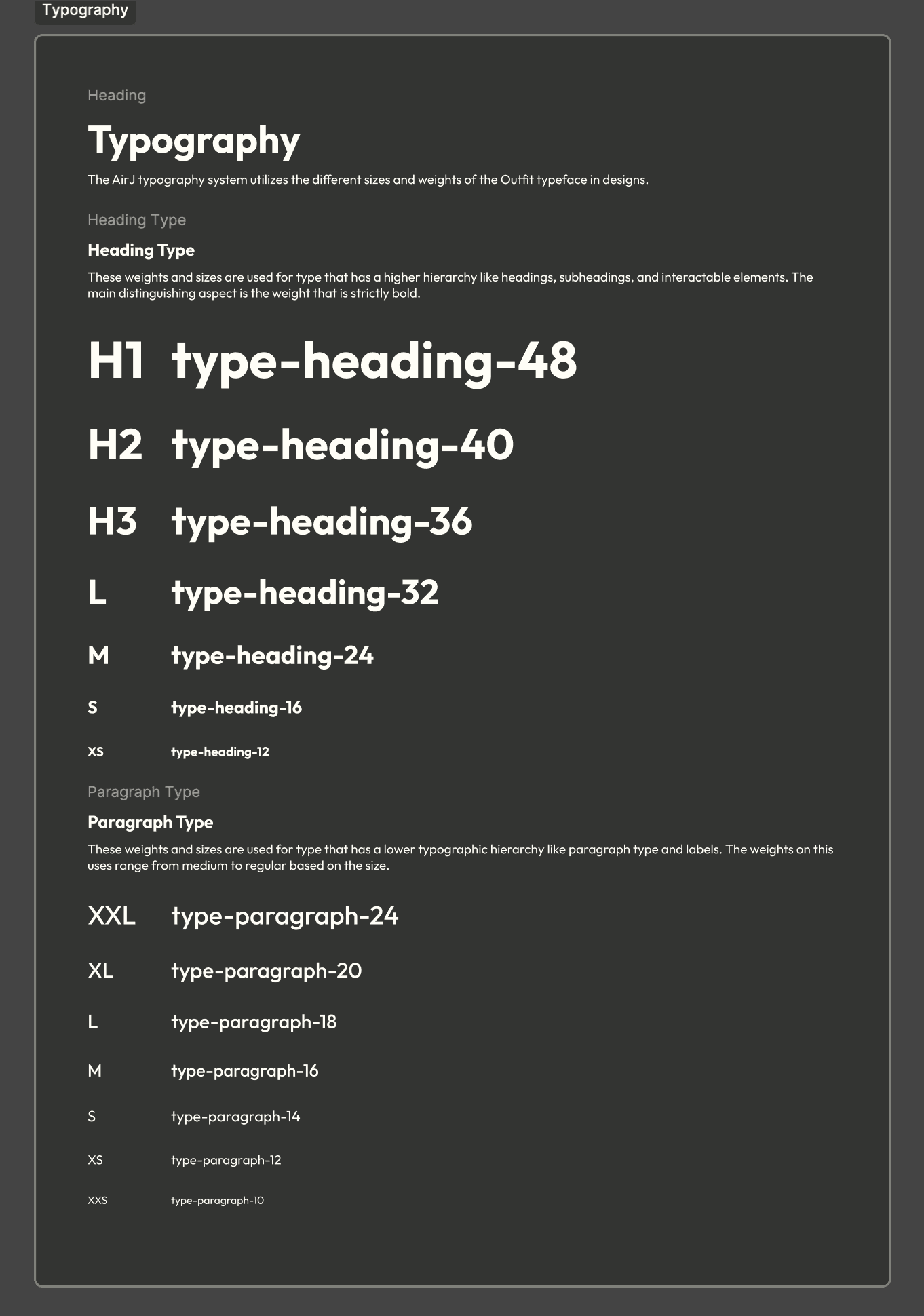
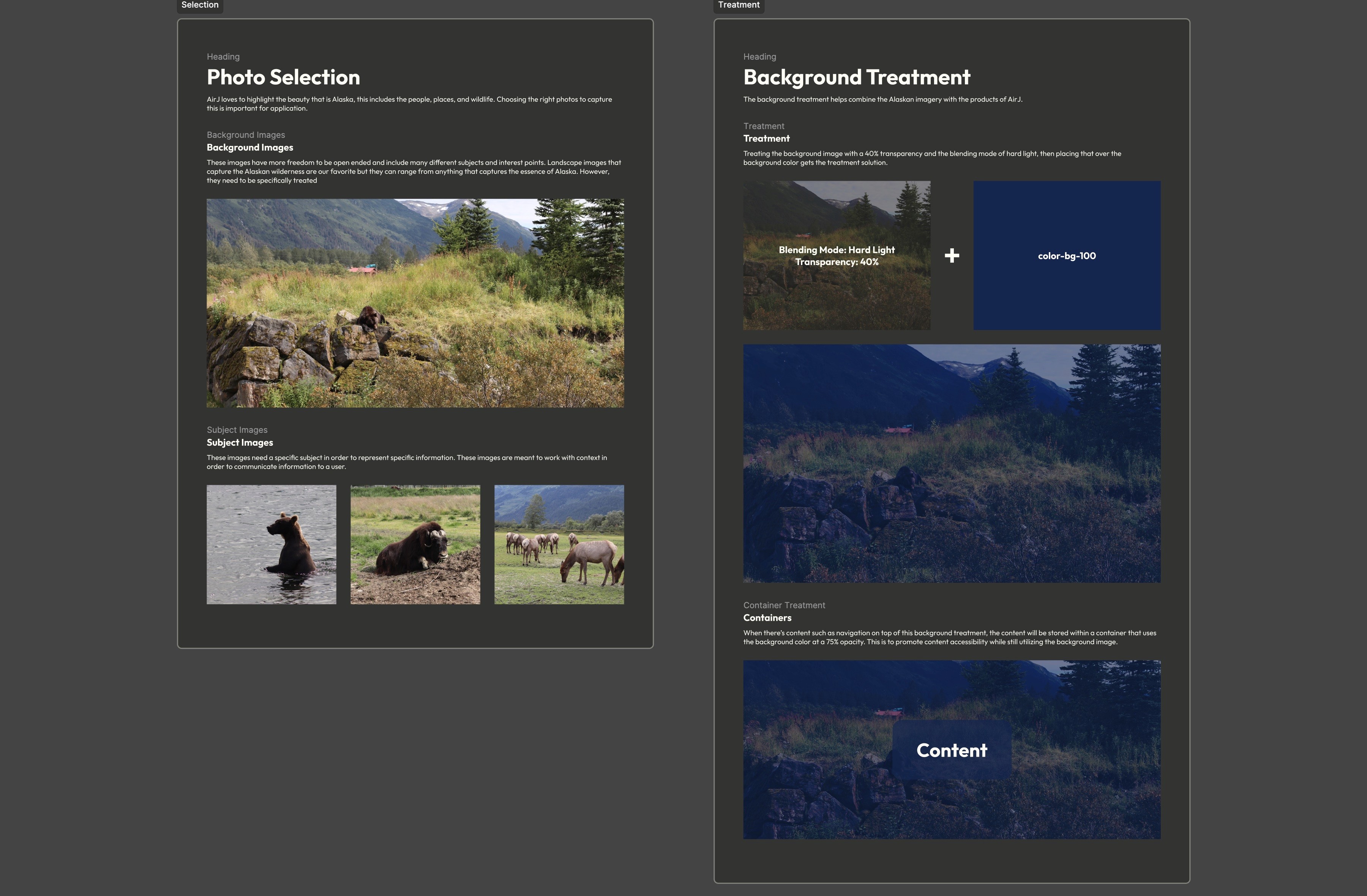
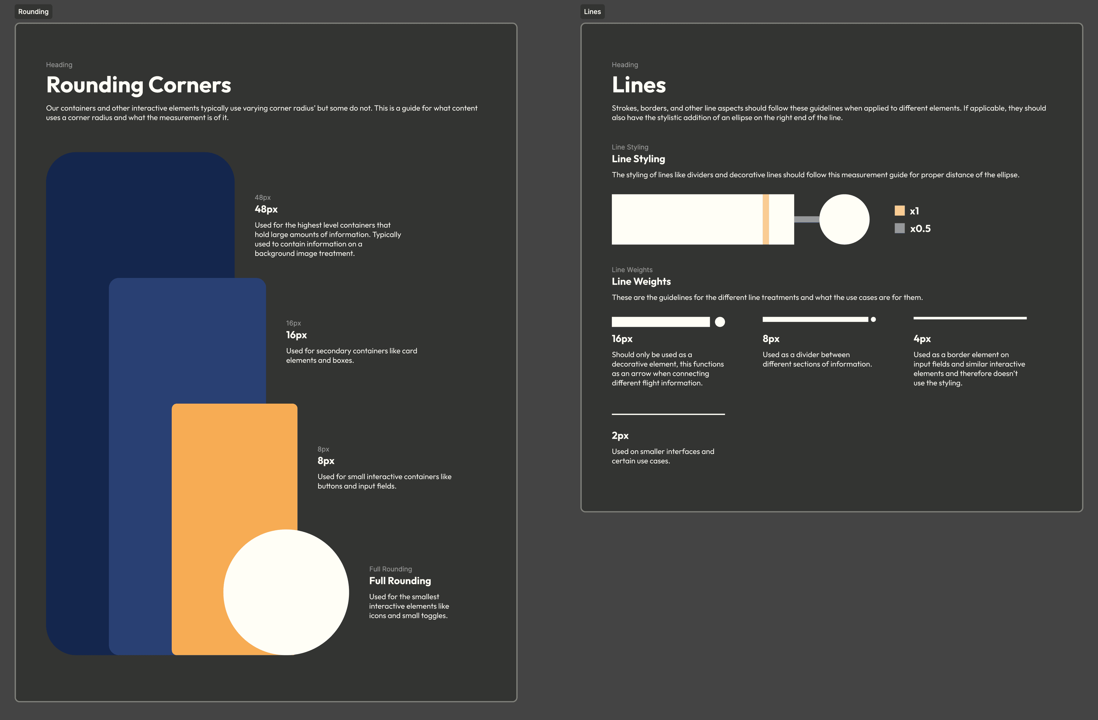
This first section contains the overall structure that guides the rest of the design system. The first of these subsections is the branding guidelines where I go into more detail about how the branding of AirJ should be treated. Then I go into the color and typographic system I used to develop the initial prototype. Although the prototype is only for desktop, I accounted for future iterations and included mobile type settings, I also expanded on the color I used with different values. Since I used my own photos, I had to provide some guidelines on how to choose similar photos and how to treat them as background images. With my stylized rounding, lines, and strokes. I provide measurements and my thought process in constructing them and what each aspect is used for along with my grid system where I used base-8 with varying columns for both desktop and mobile.
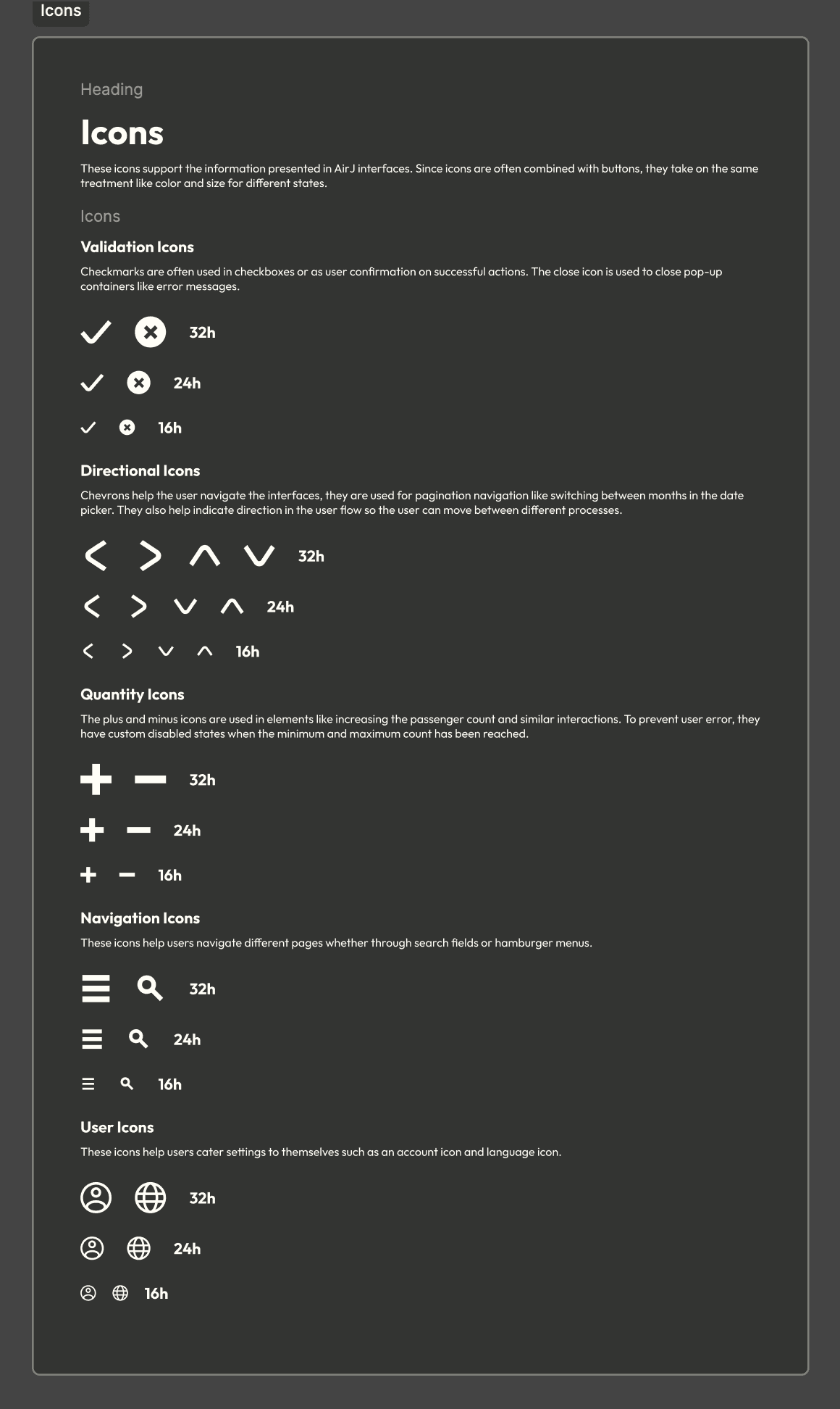
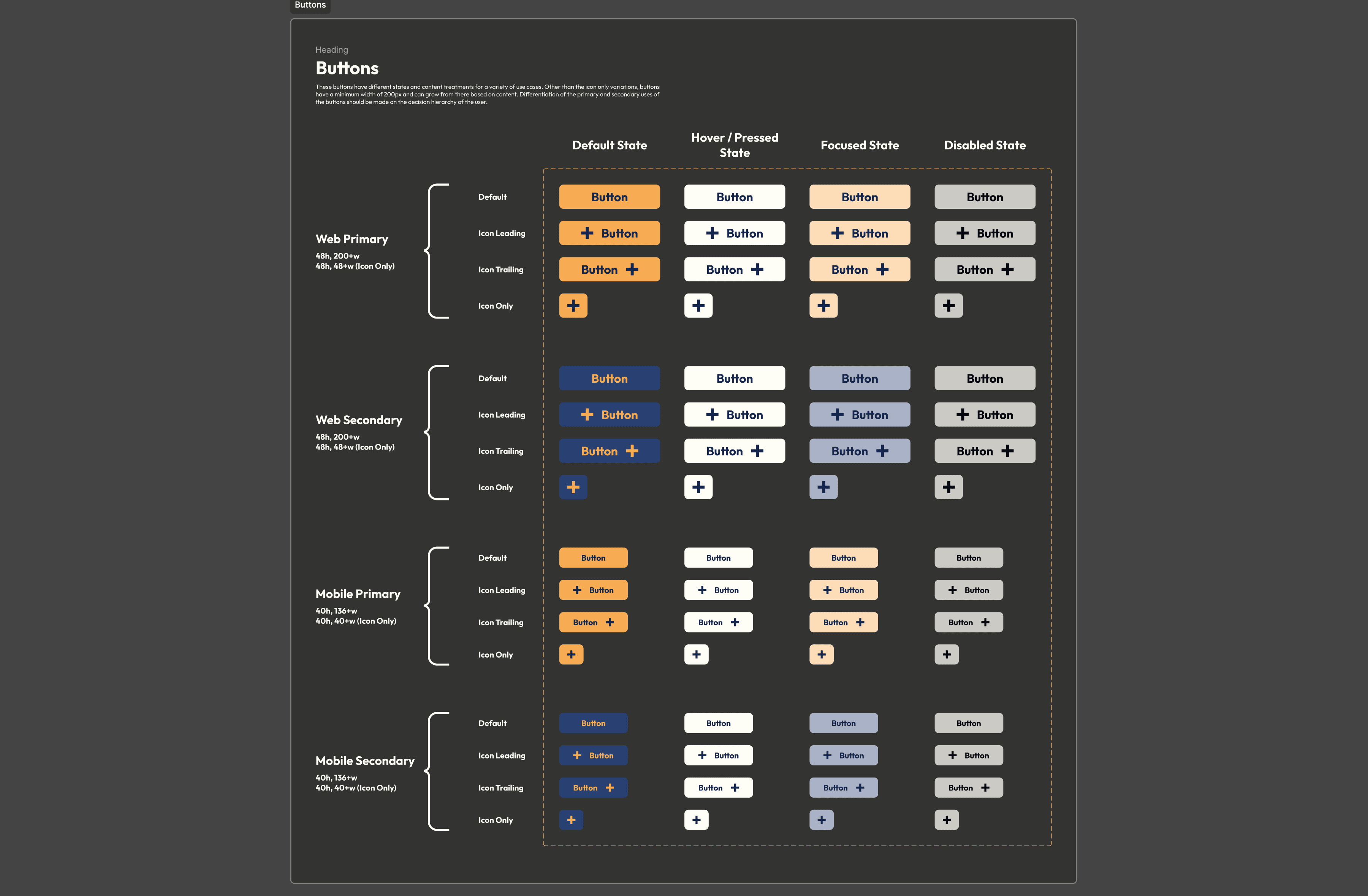
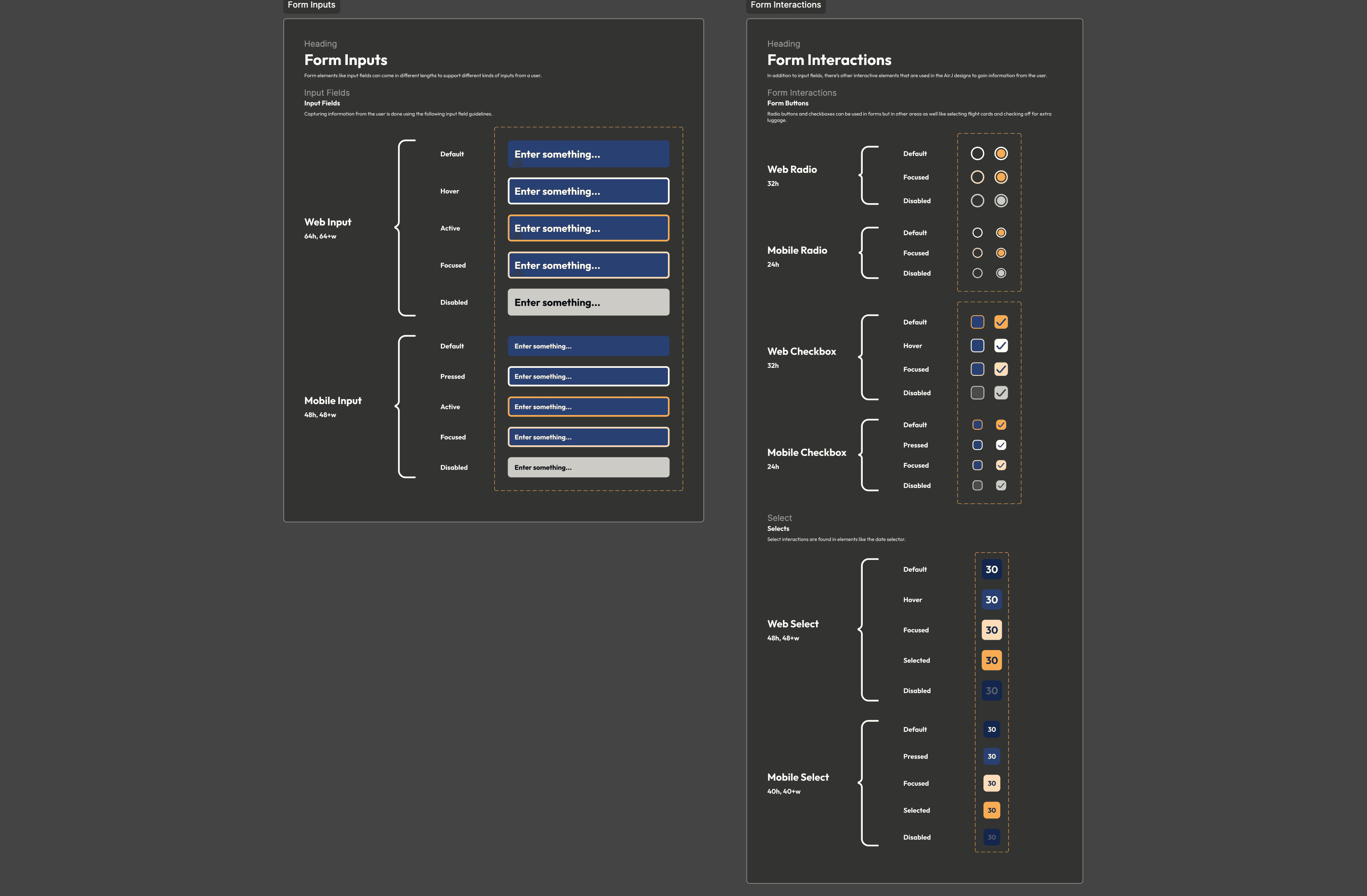
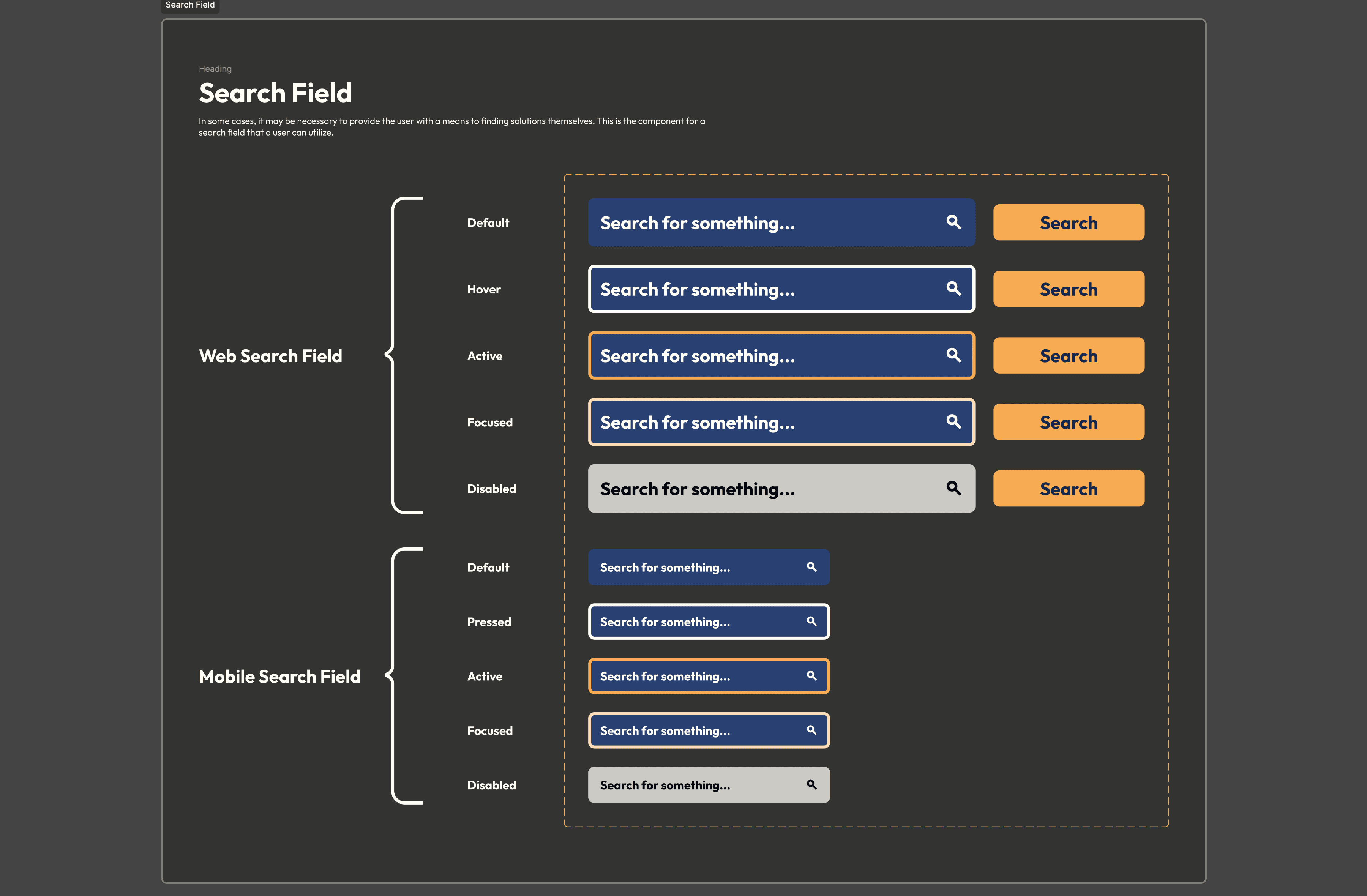
These components are the smallest pieces that are used to build more complex elements. I split up the icon subsection based on the uses for the different icons including validation, quantity, and navigation. They each come in three different sizes of 32px, 24px, and 16px for flexible usages in both web and mobile platforms. With a heavy incorporation of Figma Properties, I developed a very versatile button component that can support many different sizes, content treatment, states, and hierarchies. I used these same properties on many other components like the form inputs and interactions, these interactions include radio buttons, checkboxes, and selects.
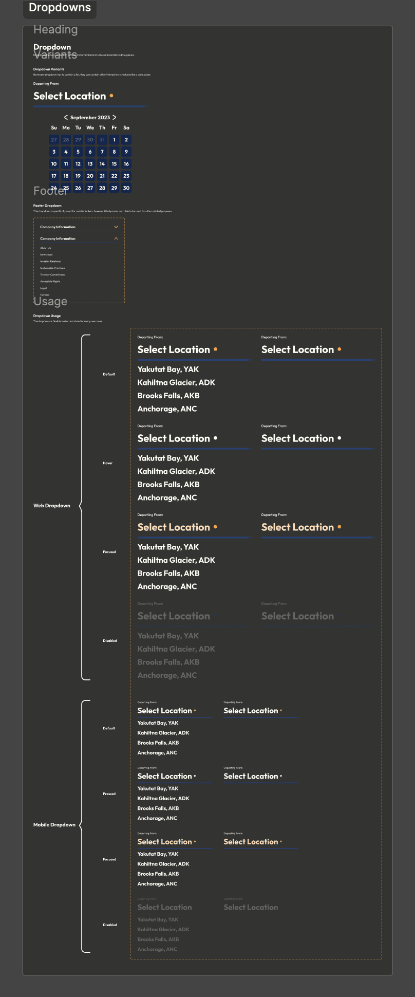
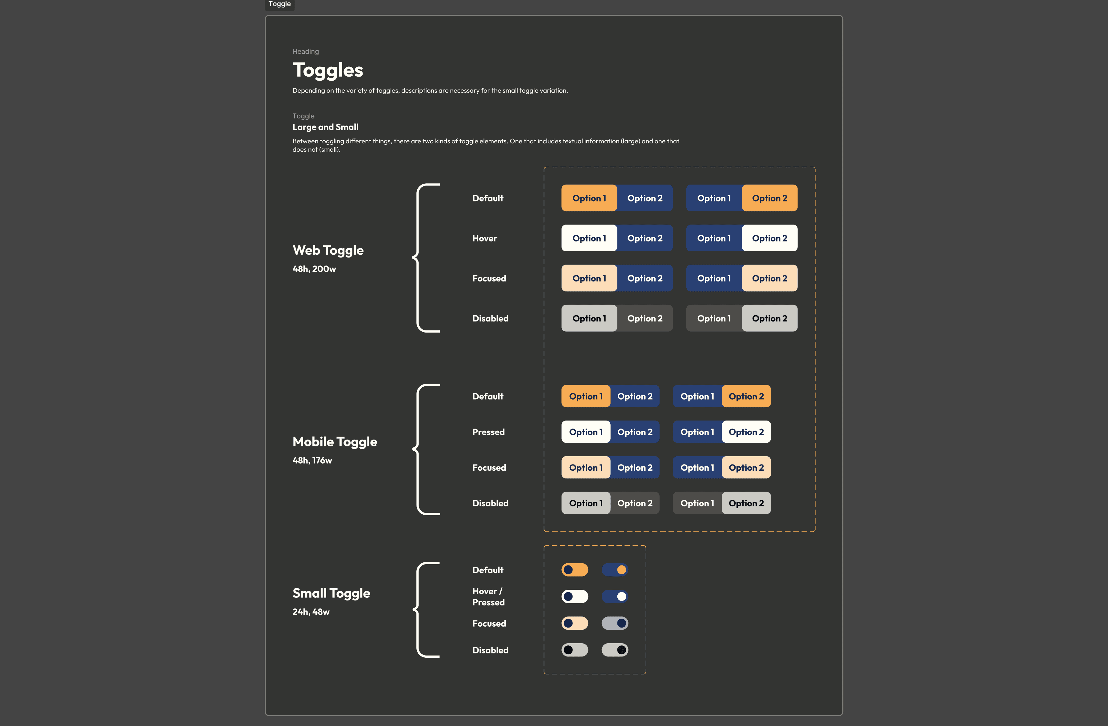
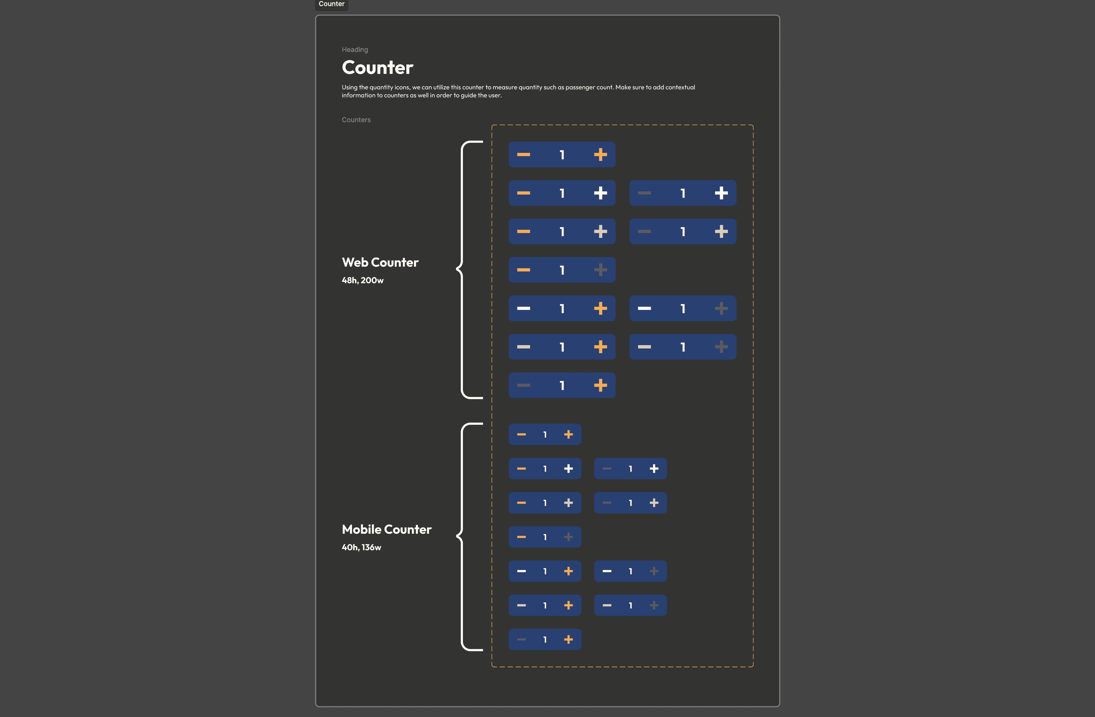
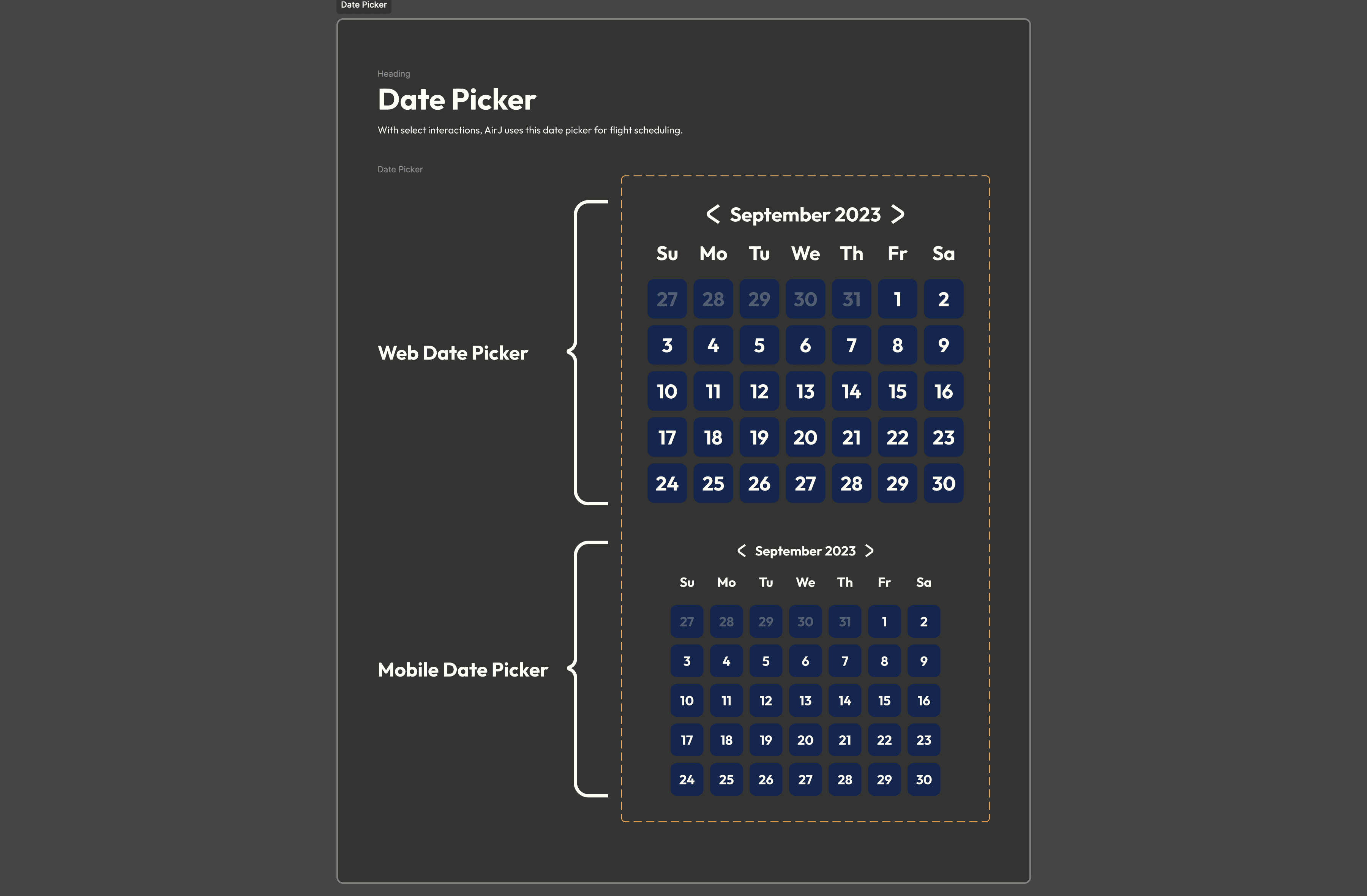
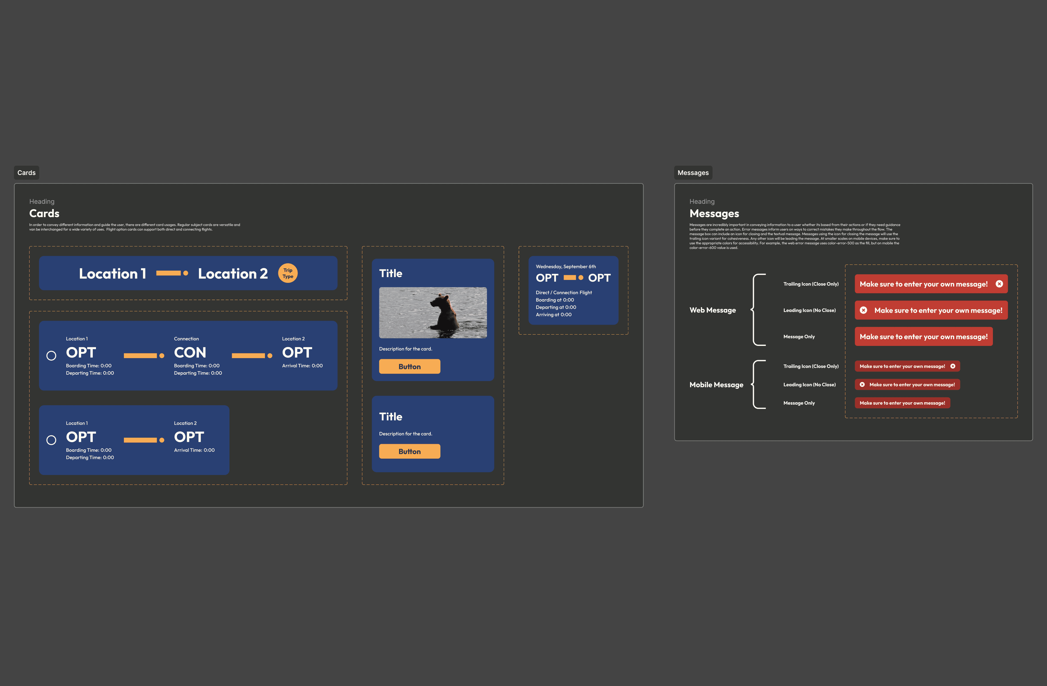
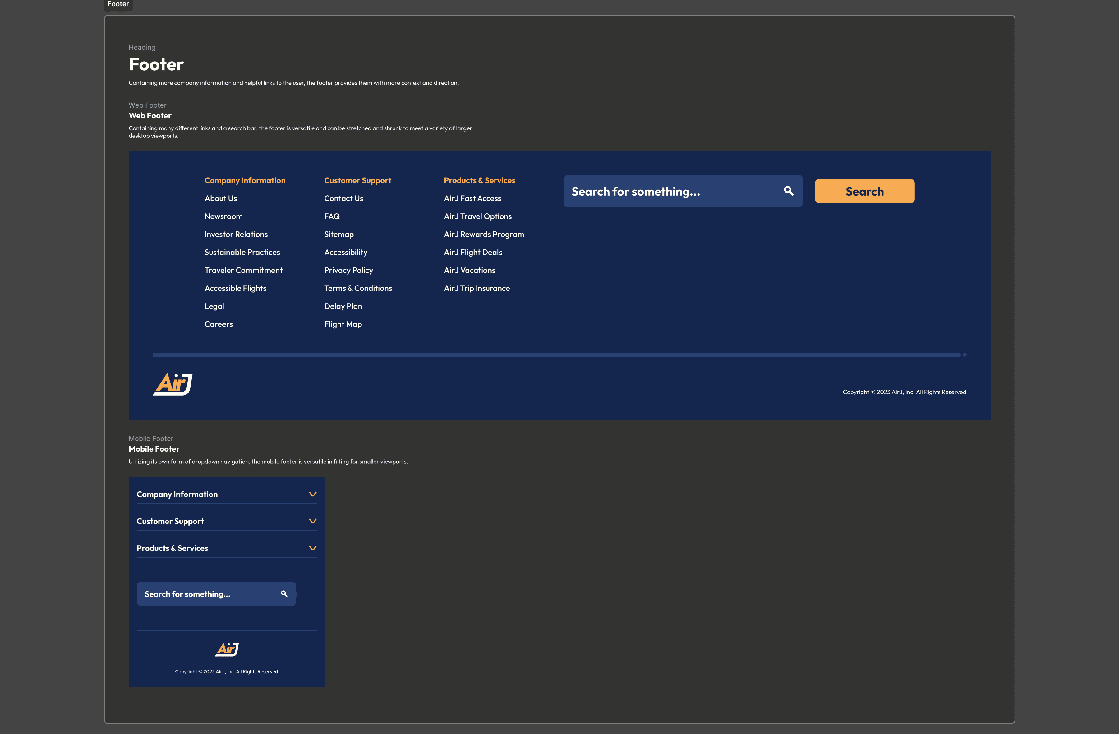
These use one or more atoms to create more complex components. I still incorporate the idea of flexibility into my properties by adding different states and sizes, and now it's even easier with nested properties from the atoms I use within the components. I have two different kinds of toggle functions, one with context and actual labels and then I made a smaller version for certain use cases. The counter has multiple different disabled states as there can either be disabling for adding quantity or subtracting. My date picker uses select atoms to create the overall structure, that same date picker can be used as a dropdown variant. There are multiple versions of dropdowns that I use, one of which is in the mobile footer.
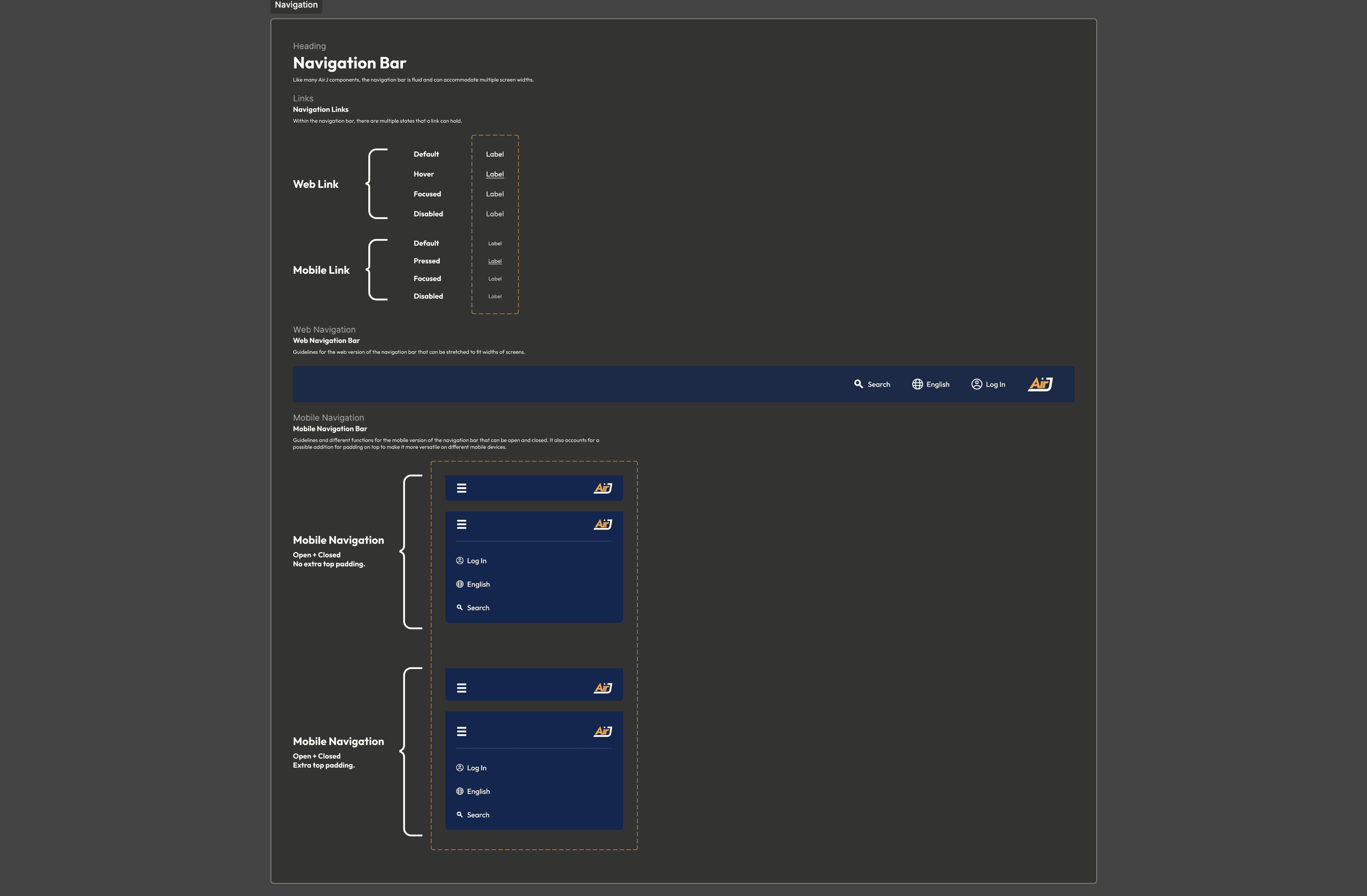
The largest components in my design system utilize both atoms and molecules to construct complex elements. The navigation bar that uses different link states is flexible for both web and mobile use cases. On mobile versions, the links are condensed into a hamburger menu that expands down. The footer also follows a similar treatment with the content being expanded on web versions and then condensed into dropdown menus for the mobile versions. The footer also utilizes the search bar that has different states and sizes to support different use cases. In the case of the footer, the search bar is larger on the web version and then condensed for the mobile version.
I found myself getting very deep into the details and design elements of both the prototype and the design system. I was able to get much more comfortable using Figma Properties than I was previously used to and learning Figma Variables was very powerful. I had a lot of personal connections to this project through my trip to Alaska making it way too easy to spend hours at a time critiquing myself and improving anywhere I could. Constructing the design system ended up being my favorite part, at times I could almost see this system supporting a living transportation service and providing them with some neat digital products. Overall, this has to be my favorite project I've worked on so far as a designer.
For access to the design system that I constructed based off of my initial prototype, click the button below. You can get a much more in depth analysis of each component constructed and the principles I outlined that guide the system.

