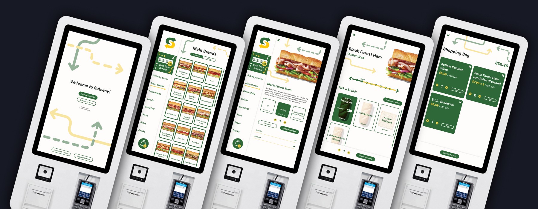
The goal of this project is to remediate the Subway brand into a potential kiosk that would be featured in Subway locations. Focusing heavily on user interaction and overall experience with the product, I researched all of the possible requirements that the kiosk needs and how that translates with what the user wants to achieve when interacting. Keeping in mind the goals of the user and the goals of the brand is important to implement in the entire design process.
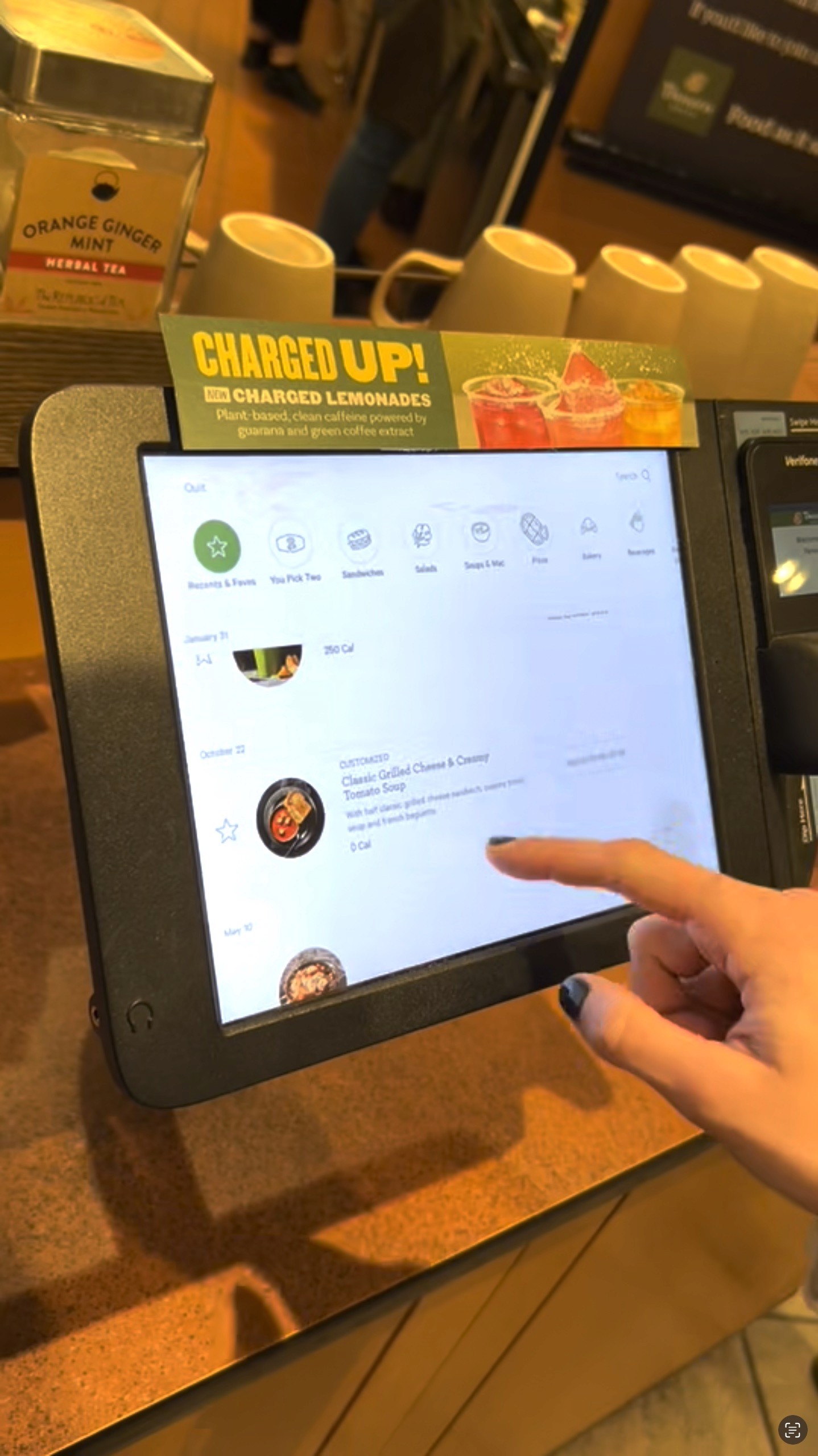
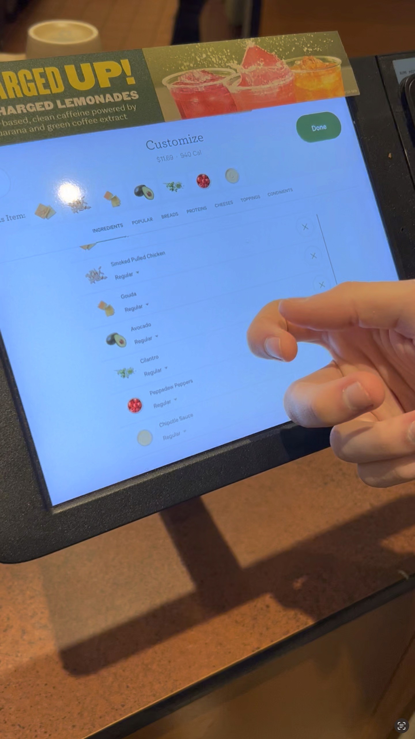
In order to get some insight in how to start thinking about my product, I took a look into Panera's kiosk and conducted an evaluation of the device. The goal of the research was to evaluate the using experience of the ordering kiosk at Panera Bread using Jakob Nielsen’s 10 Usability Heuristics to determine whether the current system is meeting expectations in terms of user experience and where they can improve the design.
Evaluation Document
If you want to look at a more in depth overview of the evaluation I conducted, there is a evaluation file linked below. There is some information about file size and page length as well.
PDF | 23 Pages | 121.2 MB
Thinking about how this design is going to be presented is crucial in understanding how it's going to look. Knowing the make and model of the kiosk device and what it's capable of doing in terms of touch, scanner and card reader components helped me understand how the design is integrated.
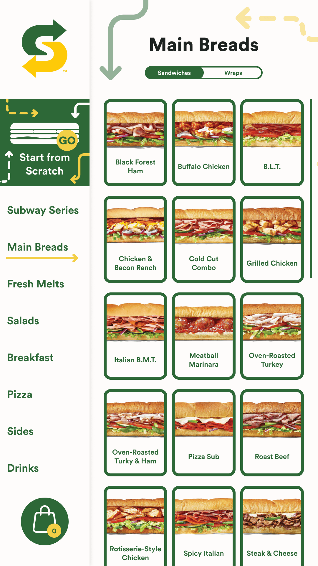
How many products does Subway sell? Right now there's roughly 138 items on their website, understanding the categories and how products are organized is important to display. Knowing the specific number of characters a title can have versus and subtitle and how you view the actual products like sandwiches and sides.
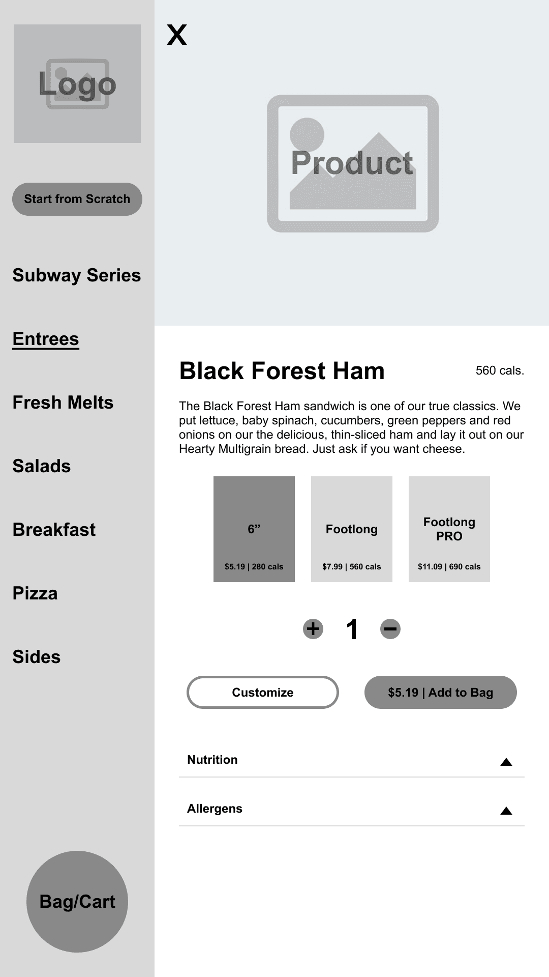
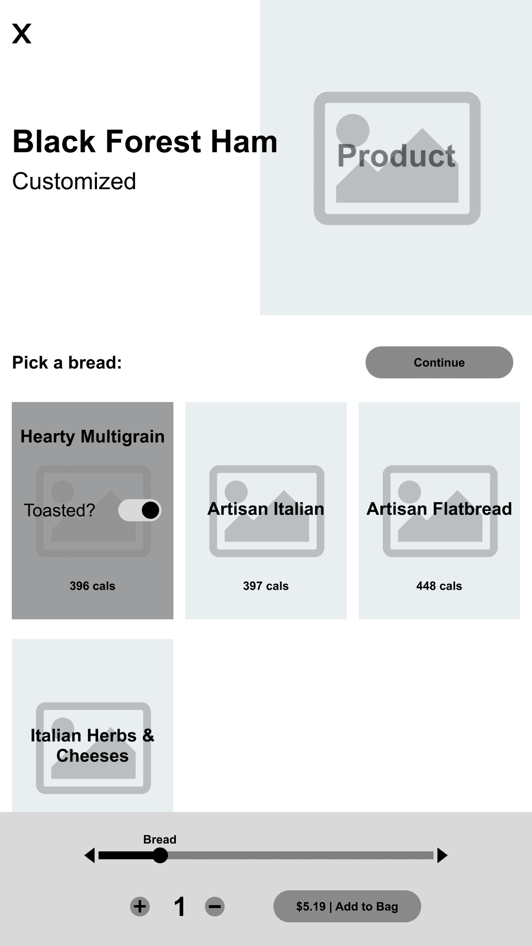
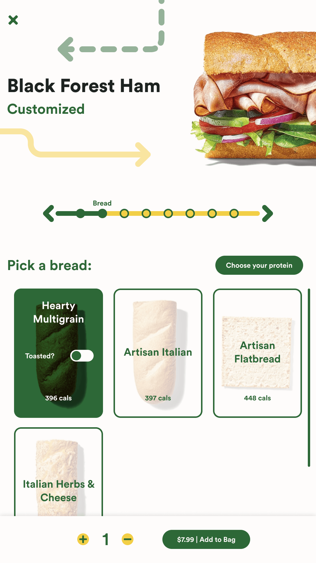
When the user is interacting with the kiosk, guiding them through the flow to reach their goal is the challenge that needs to be addressed. I thought about how a user can customize something, whether or not they're a member, how they enter the transaction area, and how the user is greeted with errors in their interactions.
The brand wants to be able to present their products in a way that is fast yet customizable to the user. To essentially put them in control of what they want from the store. The company essentially wants to harness that feeling of control that the user has and profit off of it by offering numerous different options of sandwiches that make them want to either come back for more or to keep buying.
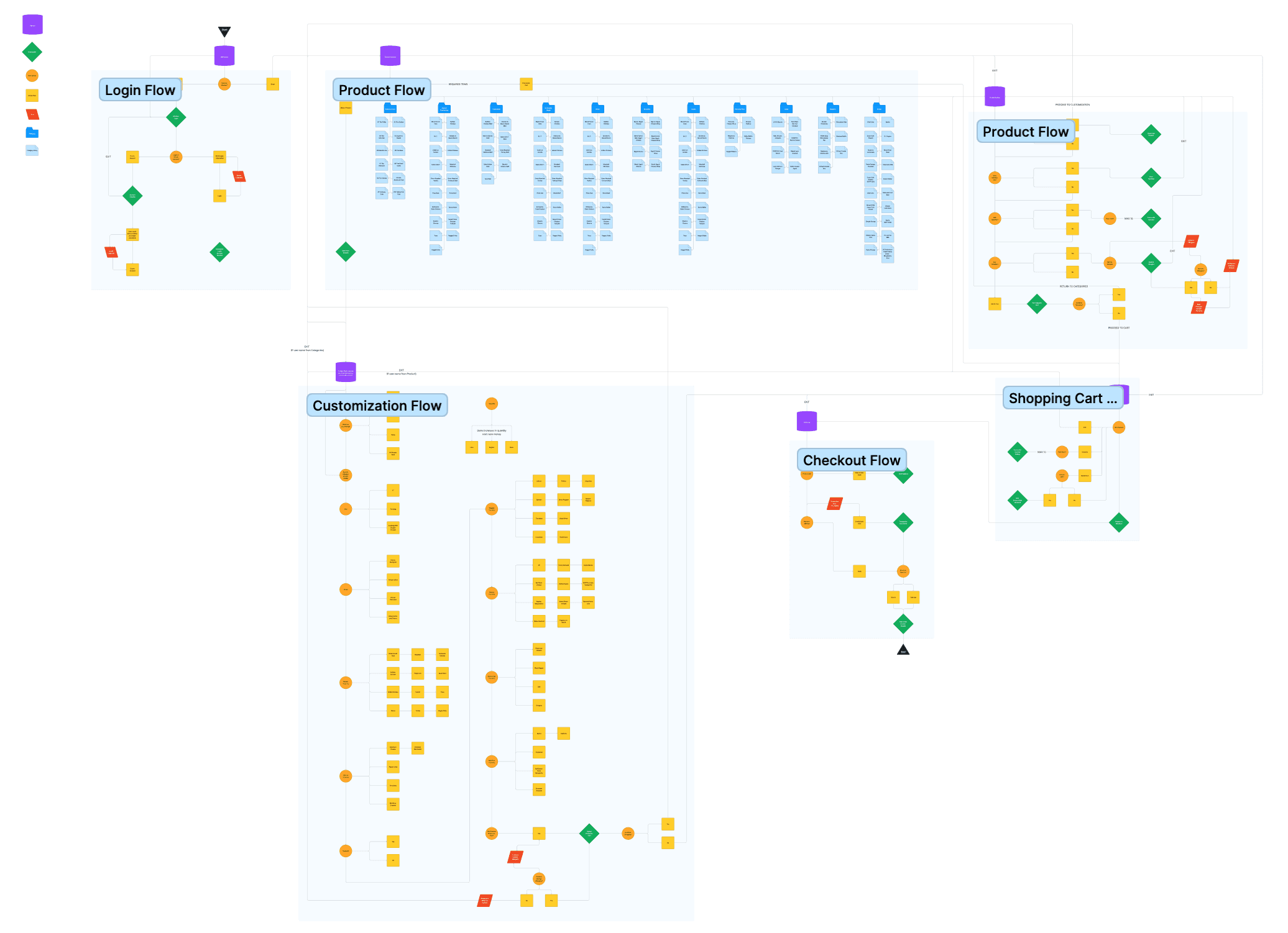
For access to the full diagram, click here to view.
Although I focus on a specific path in my prototype, I devised a basic user flow diagram to help me visualize how the different processes are addressed and where the user can be stopped with error prevention.
Section: A specific section in the flow, the flow stems from this icon.
Checkpoint: A point at which a process is completed or continues into another action.
User Action: A path or decision the user needs to make that leads to numerous of options.
Action Flow: The designated path a user takes or an option they can select (Relies on User Action).
Error: A conflict in the user flow that may send them back to a specific point in the flow.
Category: A container that holds products within the catalog.
Category Entry: The specific products within the category.
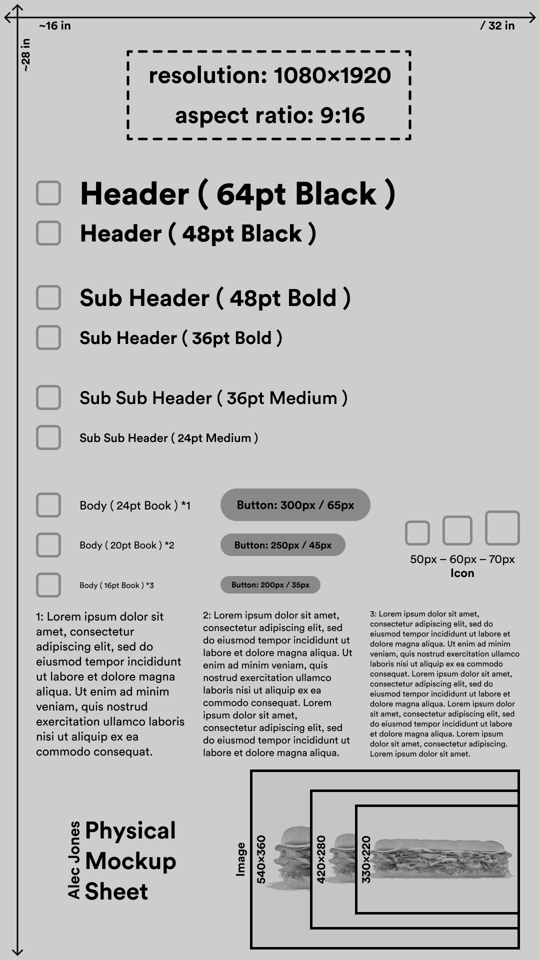
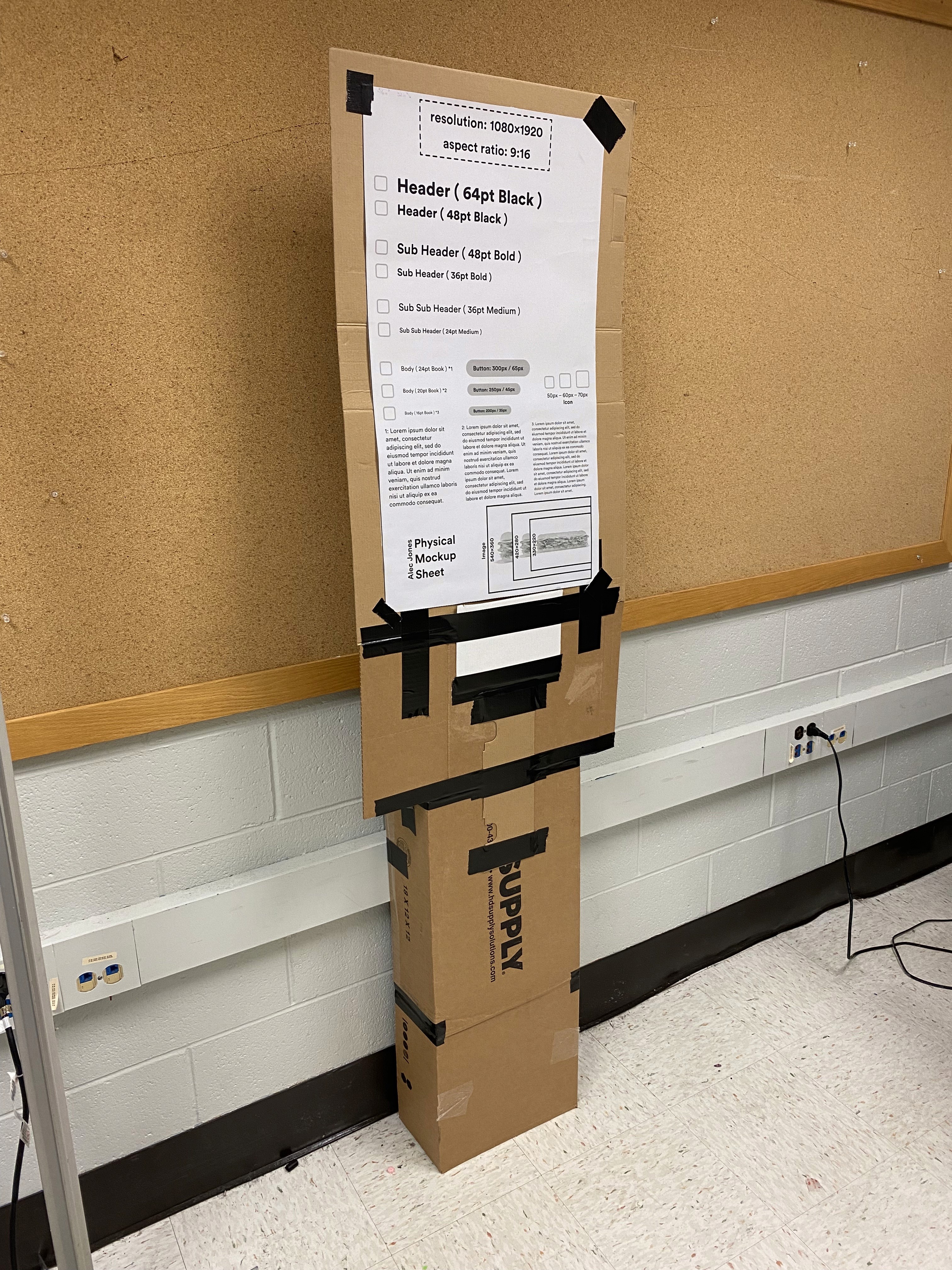
This is the mockup diagram I built in order to visualize the components of my design on a physical kiosk. This contains a series of text styling, button and icon styling, and image styling. In order to see what looks too big or small on the product, this sheet is used to test these instances.
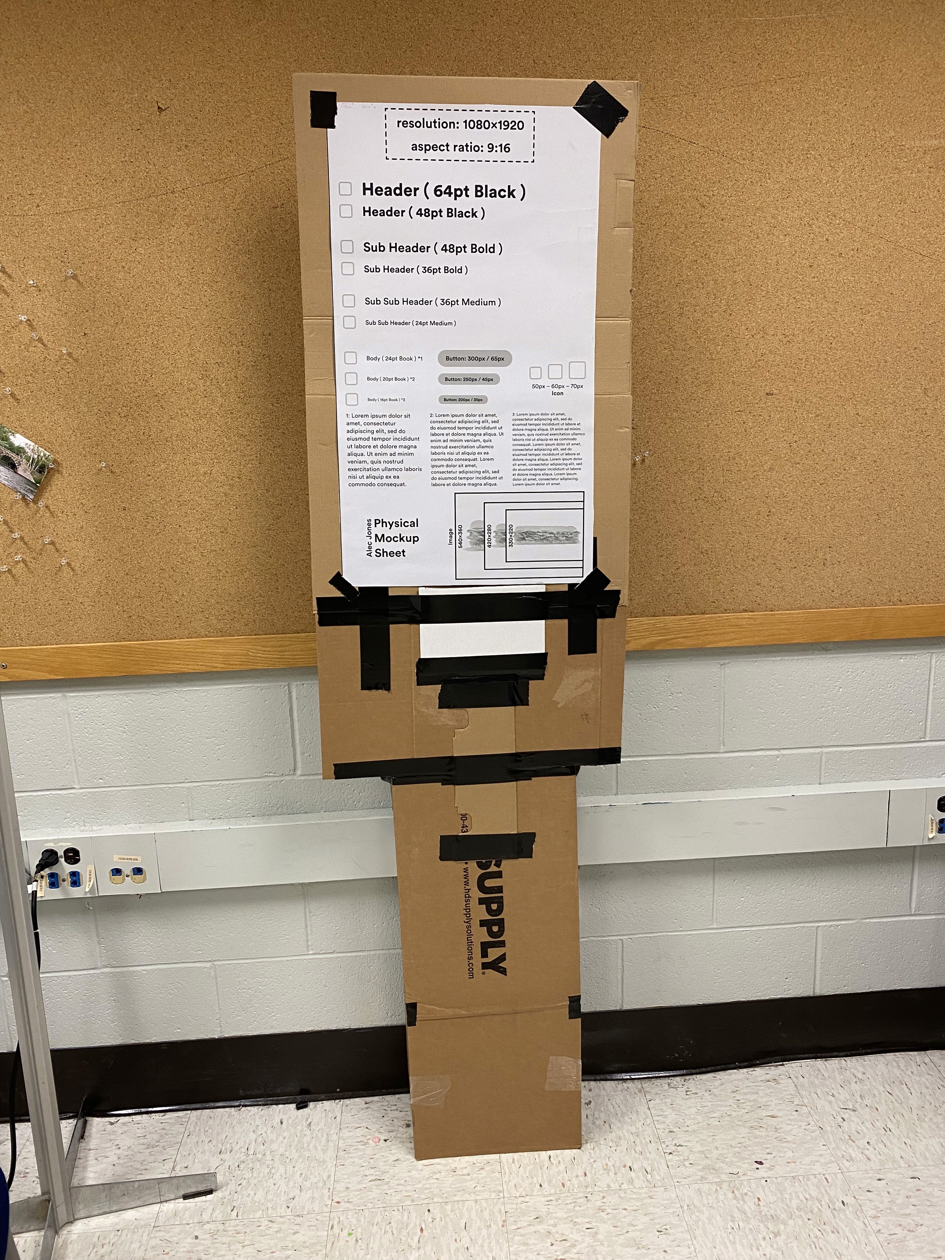
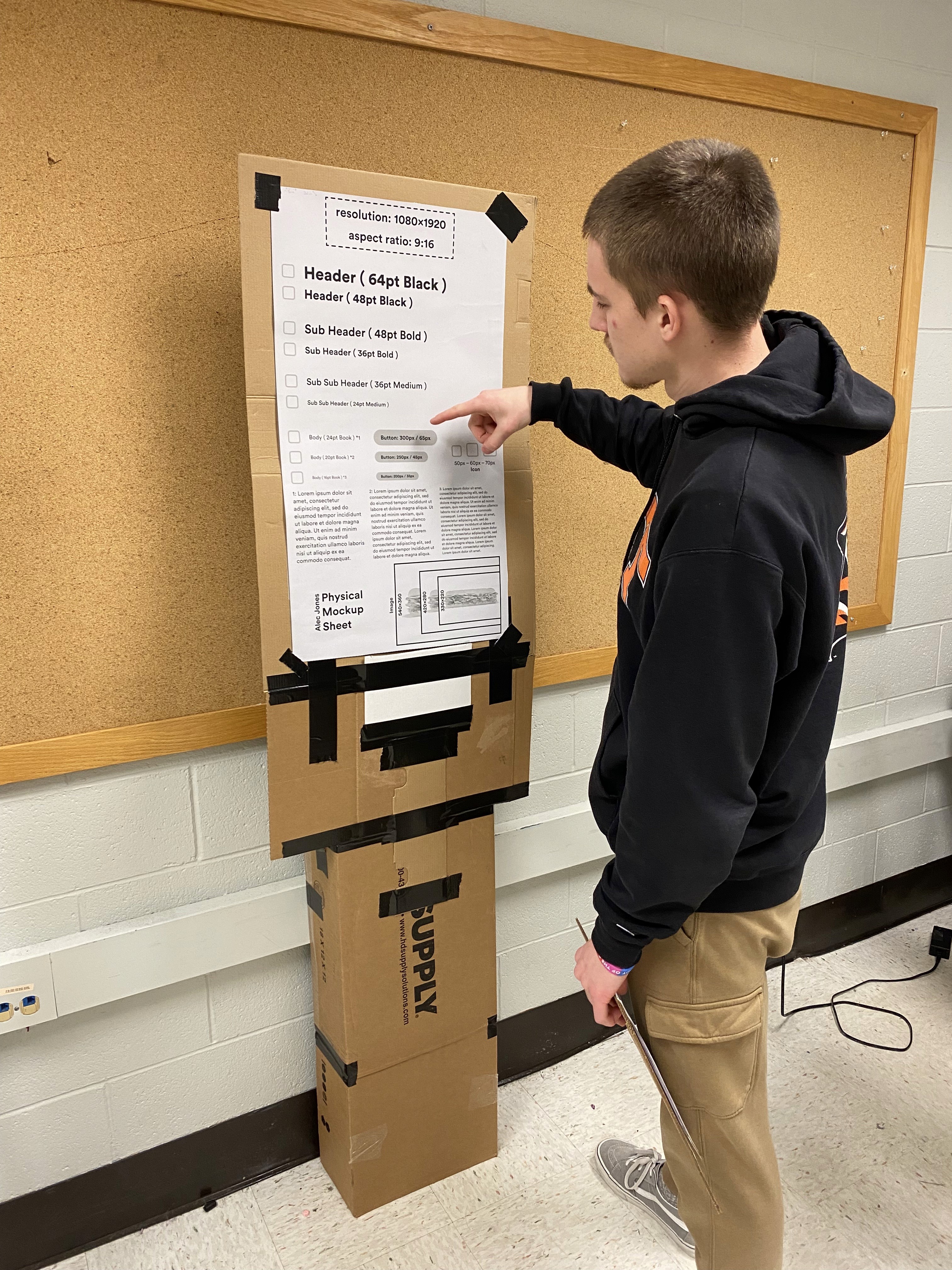
In order to do some real user testing on the mockup, I had people pretend that they were interacting with buttons and reading the text in order determine the most optimal sizing for each element for the design. I built cardboard mockup of my intended device using the dimensions online.
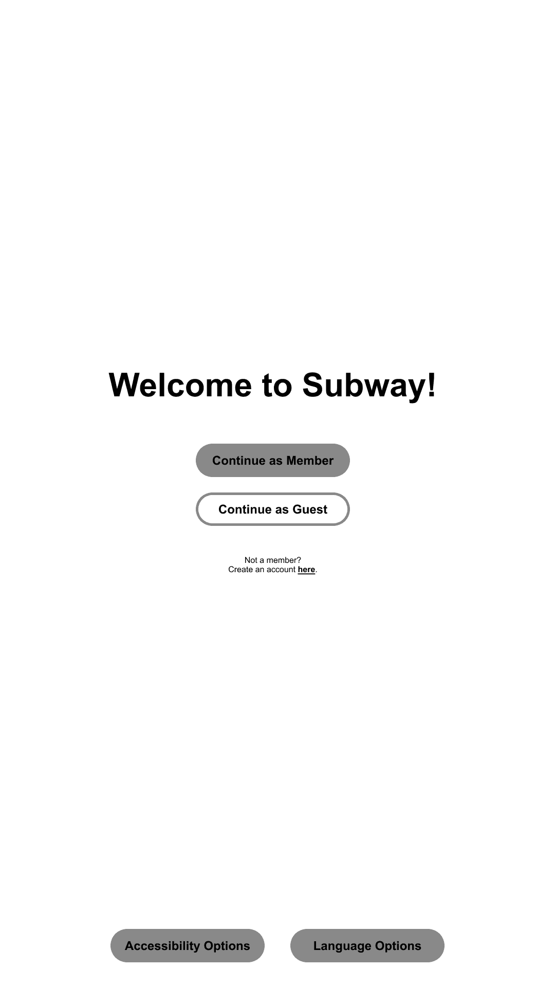
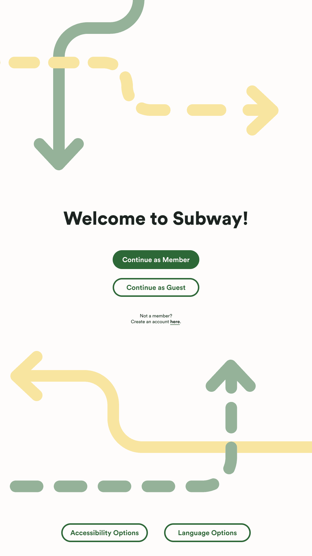
The user can login either as a member or as a guest, as well as an option to sign up on the prompt below. There are also accessibility and language options for the user to utilize should they need to.
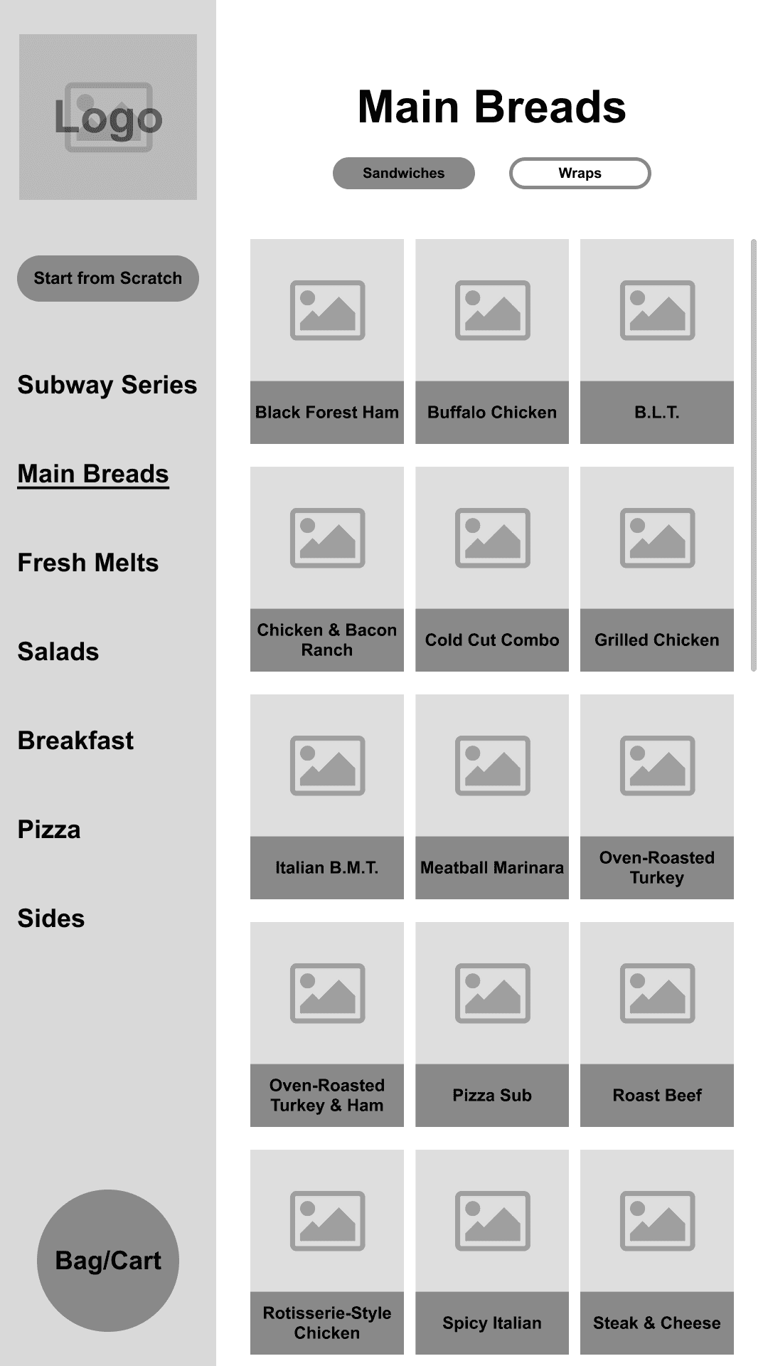
On the “main breads” page and “salads” page, the user has the option to change the navigation style to condense the menu items more thoroughly. The user can also decide to start from scratch and build a custom item. To minimize scrolling, the product items are condensed to three items per row. The bag is also accessible here if the user has items within it.
Keeping a consistent style while making everything cohesive across the page was a challenge because of my particular style of graphical elements. The final product was able to balance all the content that needed to be expressed and also have some bits of personality in the circular shapes and flowing lines.
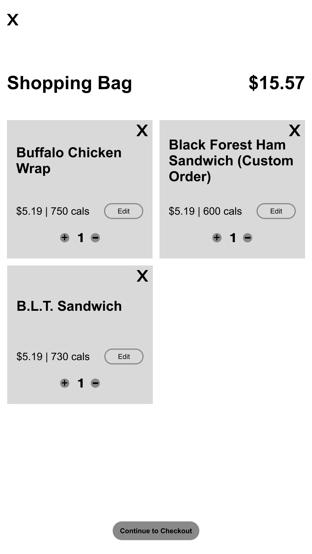
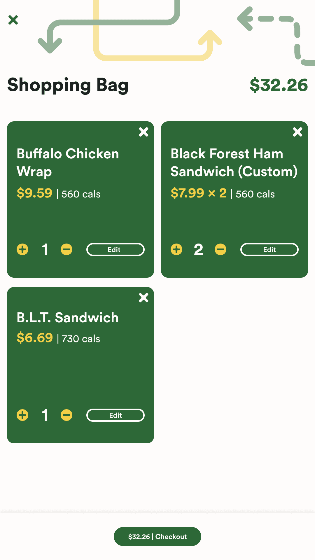
Each product within the bag will display the title of the item, the price, and number of calories. The user will also be able to adjust the quantity of the item and also make any edits that they find necessary. Then the user will be able to continue to begin the payment process.
Each product within the bag will display the title of the item, the price, and number of calories. The user will also be able to adjust the quantity of the item and also make any edits that they find necessary. Then the user will be able to continue to begin the payment process.
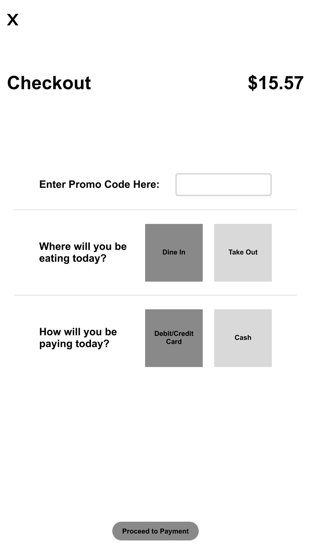
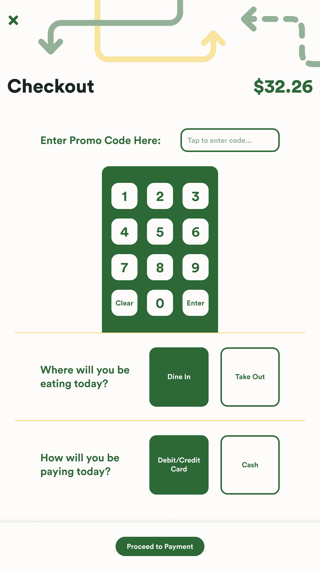
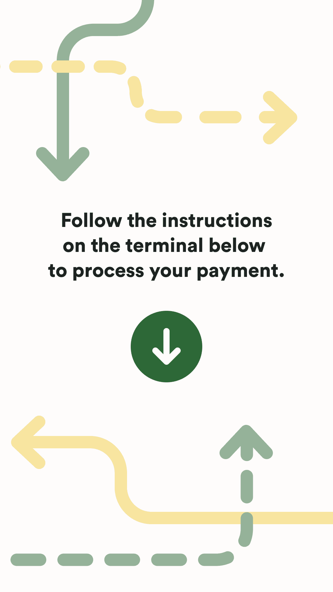
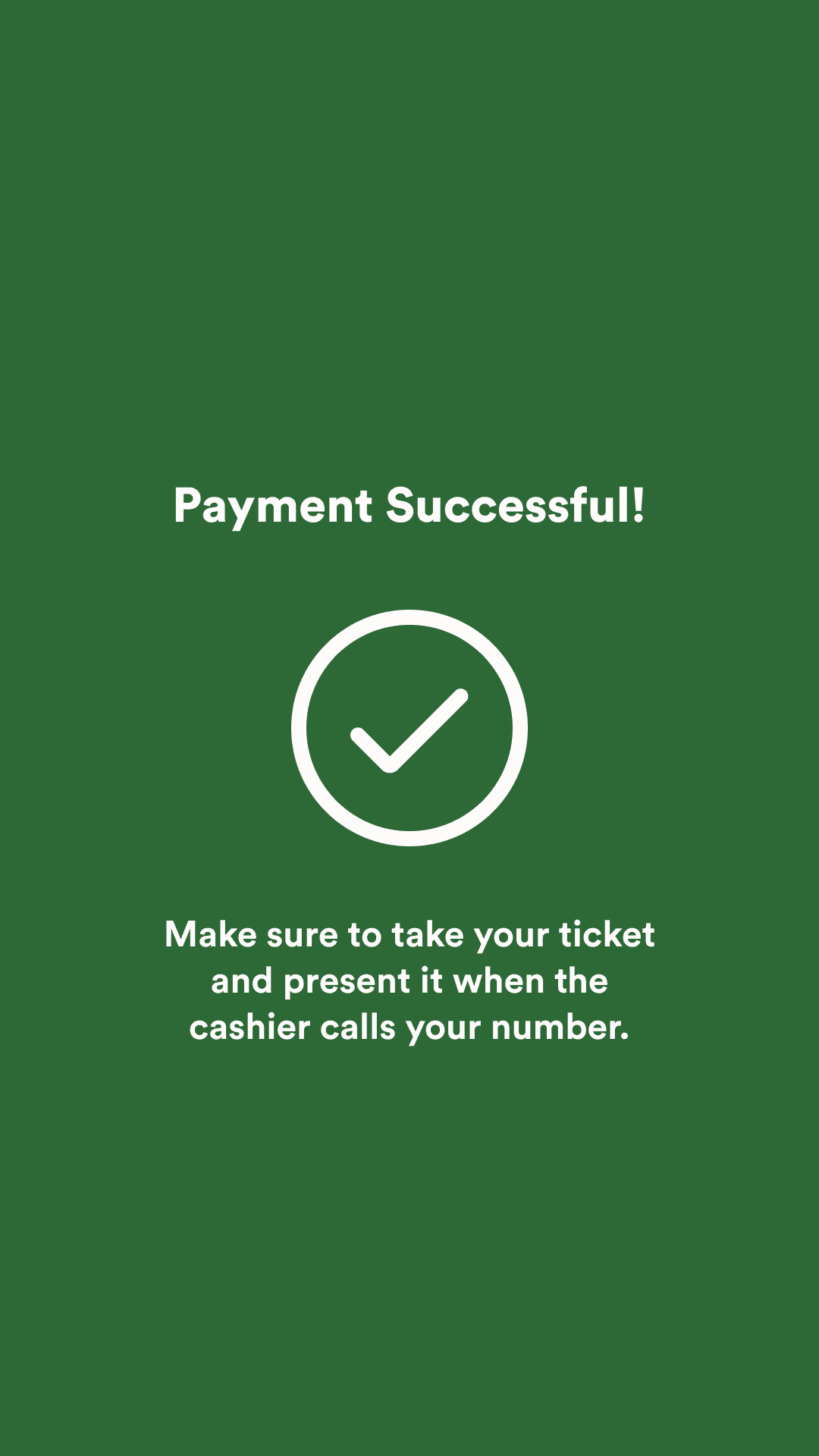
The user will be able to enter any kind of promo codes they may have to get discounts on their meal. The user will then customize how they will be receiving their meal. When proceeding to payment, the user will be given a prompt based on their decisions above. Whether that is going to the register with their ticket to pay with cash or using the input below to pay with card and receiving a paid ticket to bring.
Introduction
A more robust style guide can be found in the project deck for this case study at the bottom of this page. The Subway kiosk will be roughly 28in high and 16in wide with the diagonal being 32in. The resolution is 1080x1920 pixels and has an aspect ratio of 9:16. The kiosk will also feature a card reader as well as a receipt printer that are crucial to the operation of the ordering process. The theme of the design aligns with the Subway brand and expands on themes of the brand with design choices.
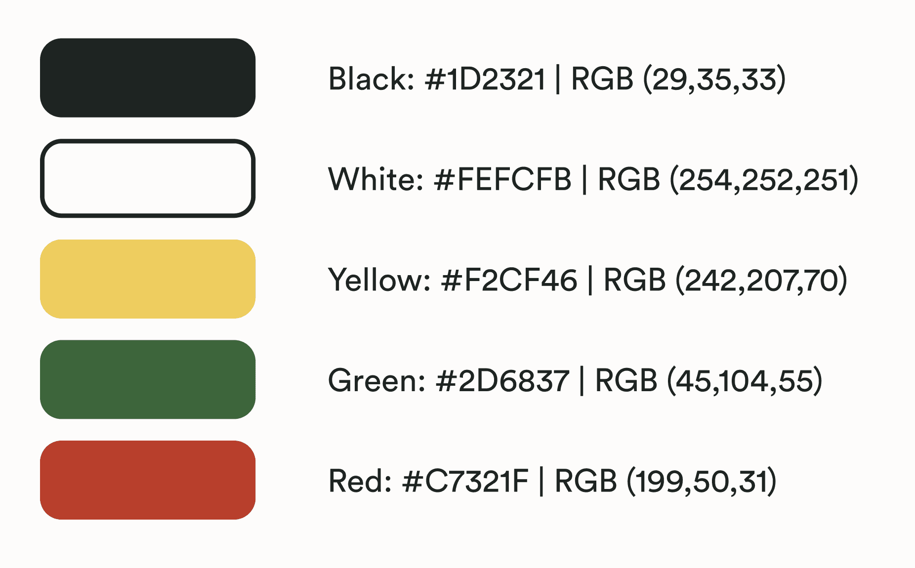
The overall design consists of a singular black, white, green, red, and yellow color. The green element is used as a structural color that defines buttons, cards, and larger containers. The yellow is used as an accent color that highlights certain interactions and information. The red is only used for error prevention and handling.
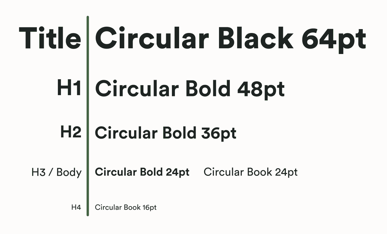
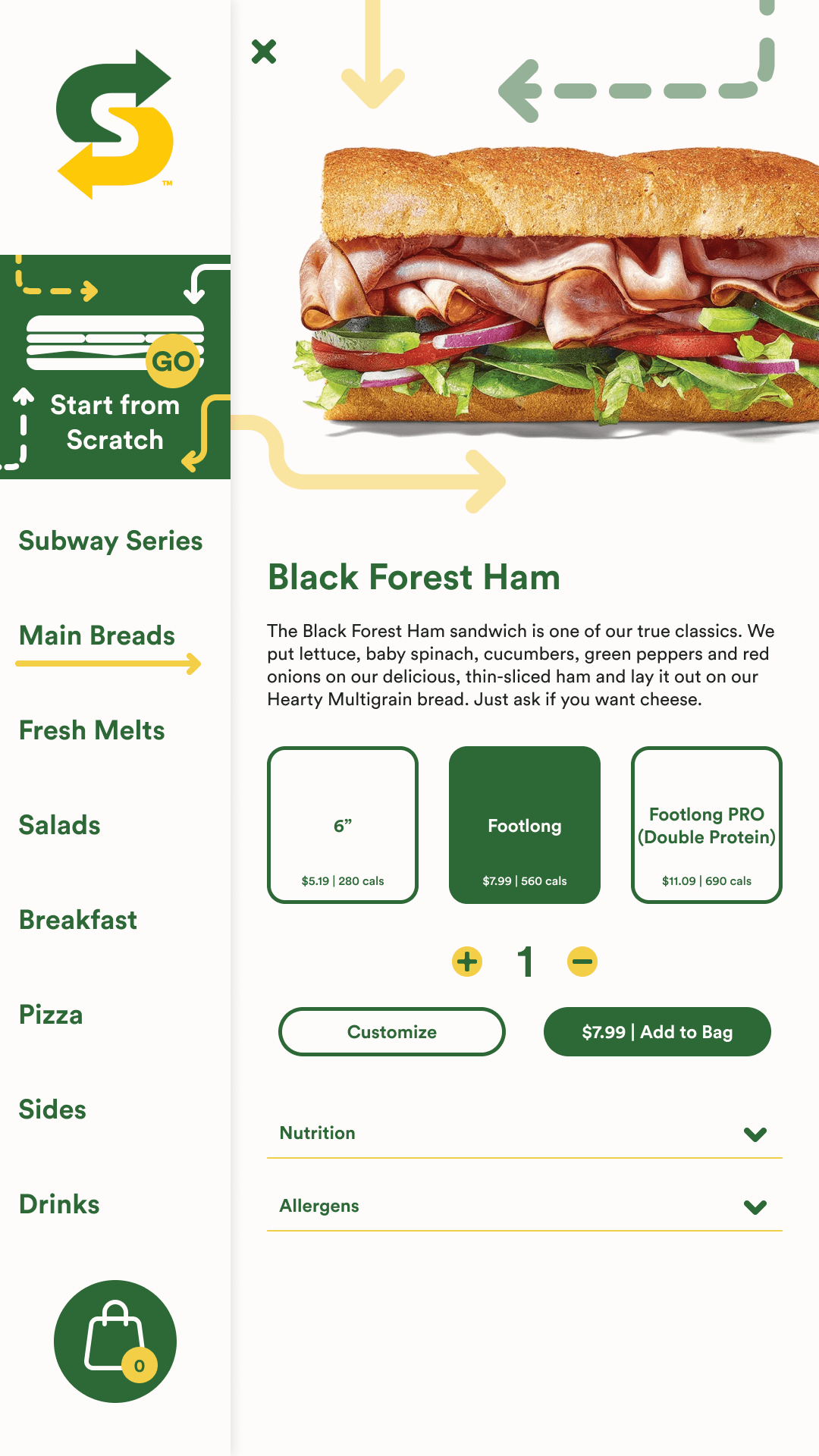
All text uses the Circular Standard typeface and the weights are varying on the type element. Title headings are the only type element that uses black. Section headers, buttons, and other high-level text use bold. Book is then used for the lower-level text and body text. While most text sizes are 64pt, 48pt, 36pt, and 24pt. There is one case where 16pt is used on product pages for displaying cost and calorie information on card containers for user customization.
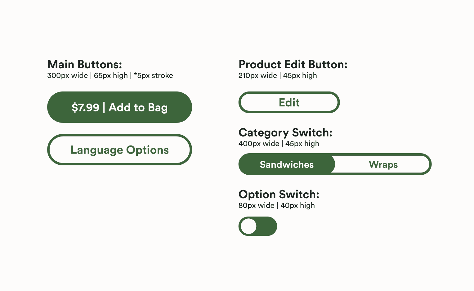
All buttons have the same scheme of being rounded on the sides with a height of 65px and a width of 300px. Some button text contains a pipe to separate different information. Primary buttons have a green fill with white text and secondary buttons have green text with a green 5px stroke. The one special case situation is the edit button for an item in the shopping bag that has a 45px height and a 210px width. The smaller button is needed to fit within the container. There is also a switch button used on the category page that is used to change between similar contents.
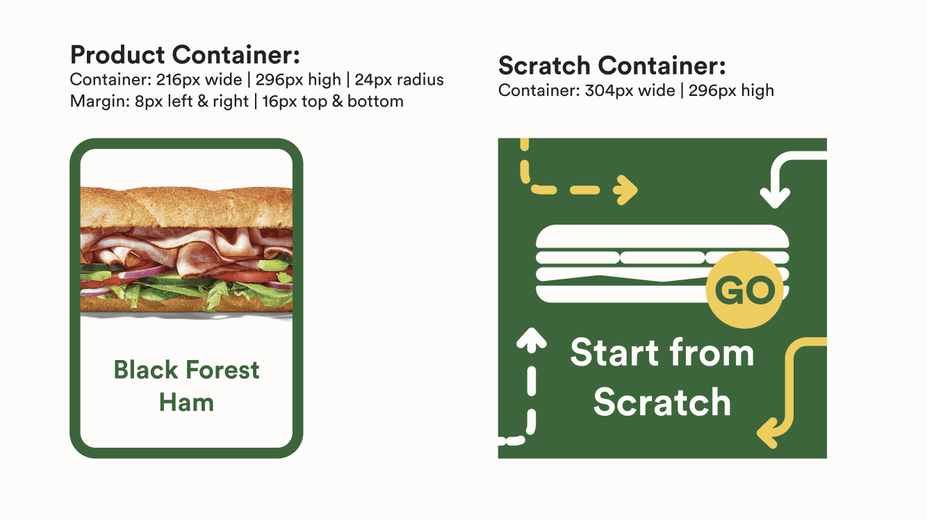
The product container is used on the product page in order to display the products. It contains an image and a title that portrays the content. The scratch container is used in the side navigation and is used to showcase the complete customization option. It has a sandwich icon and text with the arrow styling.
Conclusion
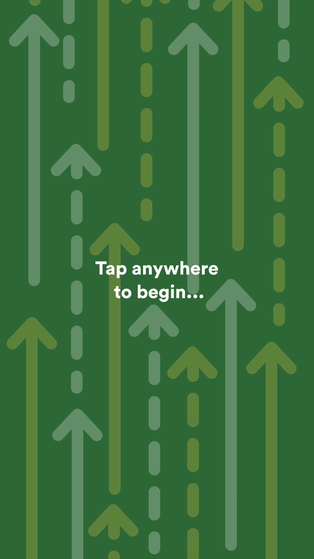
The animated prototype showcases how fluid the interactions are between the different screens. With touched states hinting as to what has been interacted with, the user can familiarize themselves with the space and is able to go through the ordering process properly. Overall, the design reflects the Subway brand image and offers an ordering alternative that can be implemented in stores.
Project Deck
If you want to look at a more in depth overview of the case study, there is a project deck linked below. There is some information about file size and page length as well.
PDF | 75 Pages | 107.4 MB
