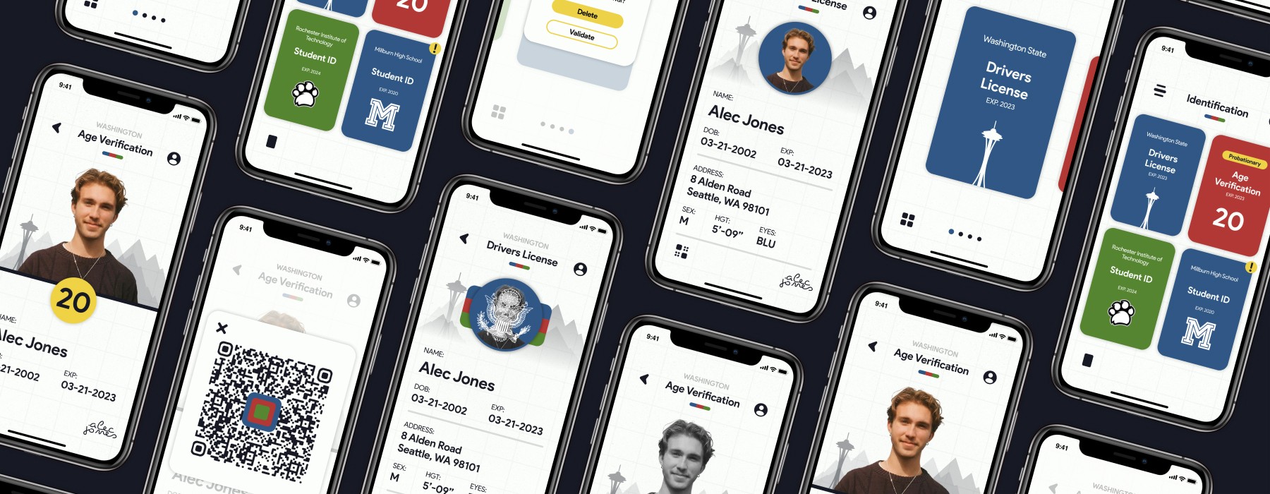
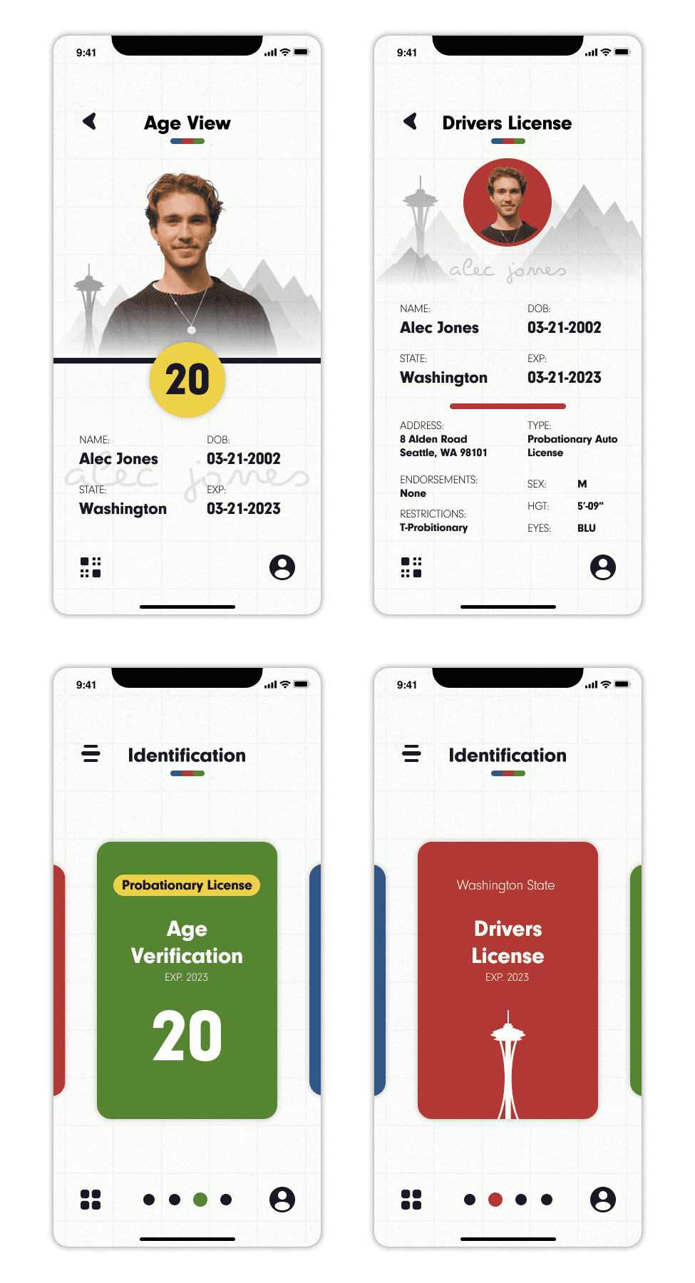
The problem I was faced with on this project was providing a digital translation of a driver license and to make it more efficient and practical than a physical copy. The project should provide a Full ID use case where a user accesses all of their license information and an Age ID use case where the user only accesses their age information. There are a number of problems and opportunities that come from this as I will focus on in my research.
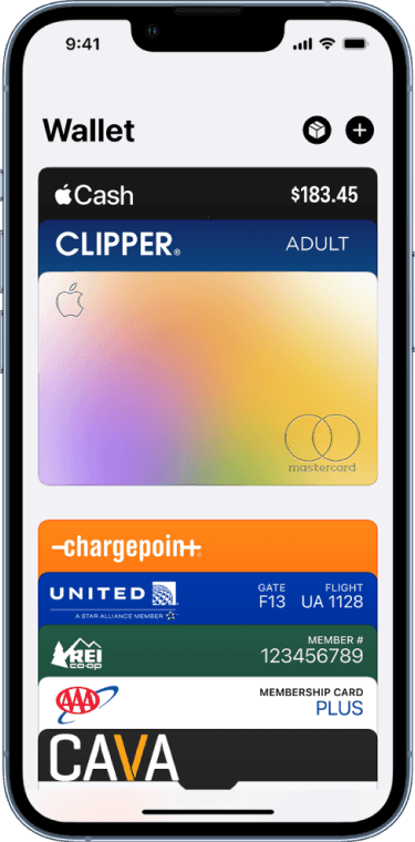
The different forms of identification and payment cards within the Apple Wallet are supposed to resemble a physical wallet. The cards themselves have very clear rectangular shapes that create a sense of depth and structure when shifting between the cards. The only problem is that now that identification is being introduced, there are some issues of organization that can arise. Just like a physical wallet, the Apple Wallet faces a problem of having a wide variety of different cards placed into one singular space. With multiple payment cards and identification cards, organization is important to keep the user efficient when accessing this wallet, especially the way the Apple Wallet is organized.
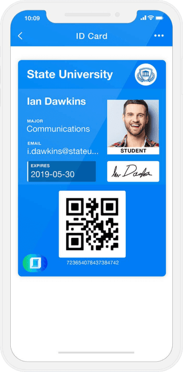
The application that ID123 developed begins to stray away from the physical representation of cards within the digital space and push the boundaries of how many forms of identification can be included besides a drivers license. Although they only seem to focus on identification rather than payment like Apple Wallet does, there still are a number of identifications a user can include and need to access while within the application. While the designs offer more in terms of information presented while looking at an identification, there doesn’t seem to be any forms of blatant security features other than a users signature. The design itself seems replicable and easily forged although it strives away from physical features.
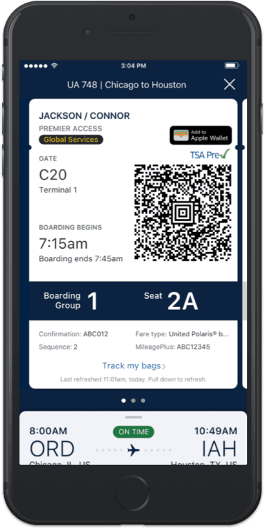
When designing a digital translation of something physical, I wanted to take a look at close similarities of other instances such as a digital boarding pass. You can have a physical boarding pass ticket and a digital one and they both do very similar things although being expressed through totally different mediums.
When it comes to the digital version of the boarding pass, the United app has some subtle elements of translating a physical boarding pass in a digital space. The slight dips at the top near the name and the card structure give off a physical aspect. But other than that, there really is no defining features that blatantly show a physical element. I feel although they found a balance between a physical and digital representation, the design is very bland and lacks a lot of personalization that can be translated through different cities for traveling and flight indications.
Measures must be in place to protect the identity of the user.
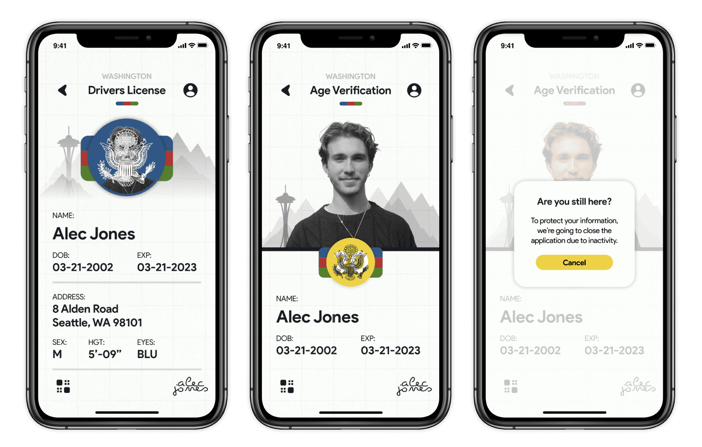
Time out alerts to prevent unwanted access with an unattended device and interactive features to prevent forgery.
User might have a hard time keeping track of different identification cards.
Creating a organization system for identification and simple ways to toggle between full ID and Age ID.
Using a physical copy needs to feel redundant to the digital.
Simple interactions to make access less complicated and QR or Barcode scanning options for easy translations.
The goal of this product is to be more efficient than a physical identification, the first reaction of the user is to go for their phone rather than their wallet when they need to present their information. With that in mind, I’m trying to create a secure and efficient way to access personal information whether that’s a drivers license, school identification, or some other form.
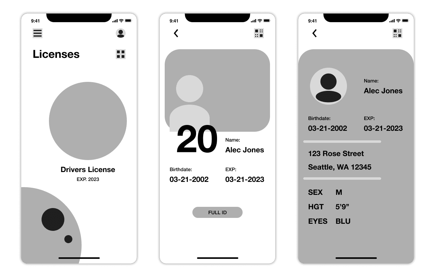
These wireframes are of the base flow for the user as they first start in their home and access their drivers license using the slider and hamburger menu. Then clicking on their icon brings up their “age” identification that can be expanded into the full identification. I thought that the wheel on the homepage would be an interesting way for the user to change between their identifications, later on in my design process I found it to be ineffective for the user and decided on something more intuitive.
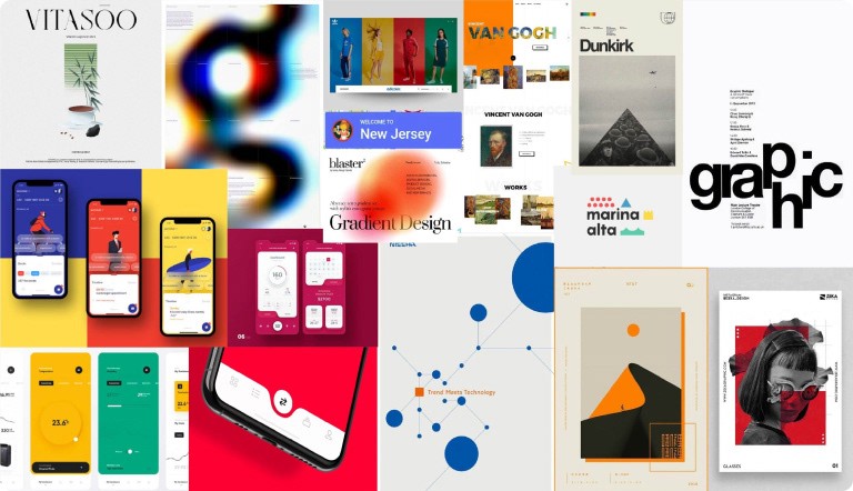
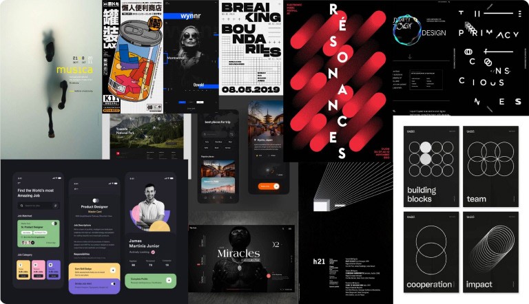
I decided to go with the Civil Direction for my design. Overall I wanted the design to resemble a simple and familiar system while also establishing a friendly connection with the user through the use of rounded type and visual elements that create an inviting environment.
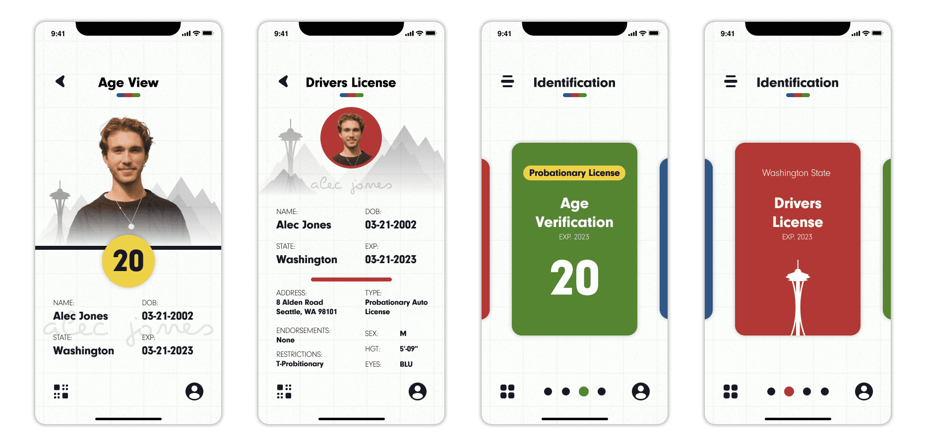
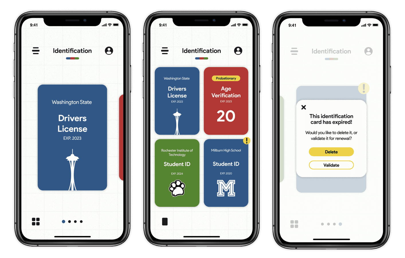
My handling of the organizational aspects can be mainly seen in my card structure that is used to contain different forms of identity.
The user can choose between the carousel or the grid for the cards to be viewed. There is also the expiration error handling that keeps the identification cards up to date for the user.
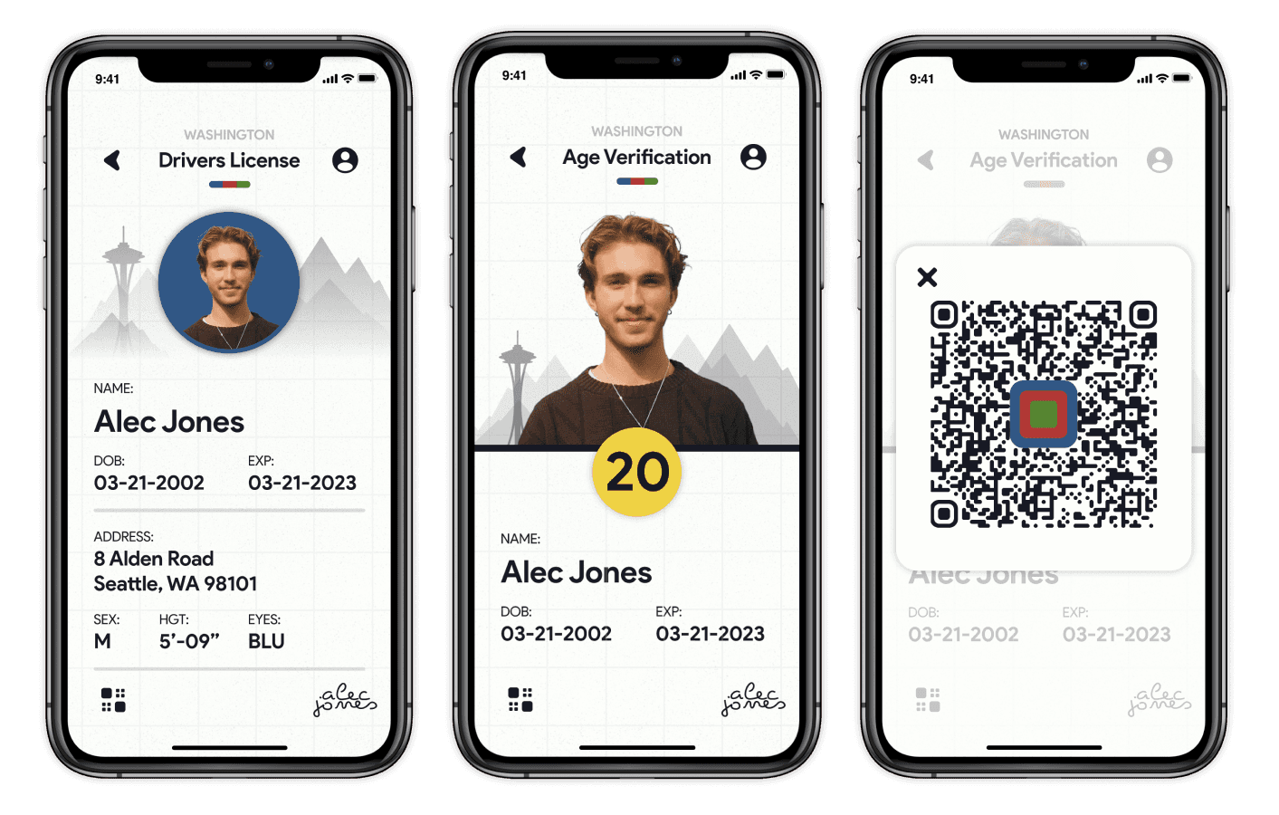
My handling of the usability aspects are apparent throughout the design but mainly within the identification cards.
The simple grid layout supports the changing between the different forms of identification. Within the cards, all of the necessary information can be seen and accessed by the user.
My handling of the security aspects can be seen within the identification cards with the authenticity protocols.
The user can tap on their age to check the authenticity of the age verification and their image of themselves on the drivers license to check the authenticity there.
Takeaways
During the project, I felt as though it was really important how much depth you can really go into when creating a translation like a physical drivers license. I feel like it was fun to open up all of these doors towards design opportunities like having more purpose than one singular identification card. Overall, I became more comfortable handling typography and understanding the different ways to use color not only as a visual element but as a structural element.
Project Deck
If you want to look at a more in depth overview of the case study, there is a project deck linked below. There is some information about file size and page length as well.
PDF | 30 Pages | 80.7 MB

