


The objective of the redesign of the town website was to essentially improve the existing homepage functions and to chose one user flow and make it more effective for the residents of the town. I chose to redesign my hometown website and focus on a user flow that relates to how a commuter would look for parking within the town in order to have easy access to the transit. I started my research by analyzing the existing homepage and highlighting the points in which the design fails and points in which it is successful but could still use some editing.
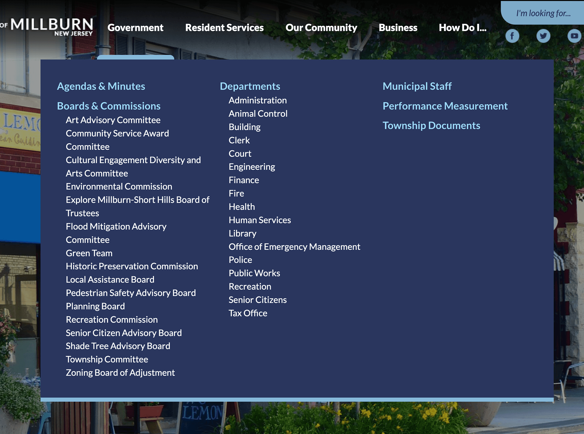
Although the overall design is littered with failing aspects, I wanted to highlight how the dropdown menus are full of sections that can easily be reorganized to serve the user better. Within secondary and tertiary pages is where the user can get more specific to what they are looking for and serve them better.
The application that ID123 developed begins to stray away from the physical representation of cards within the digital space and push the boundaries of how many forms of identification can be included besides a drivers license. Although they only seem to focus on identification rather than payment like Apple Wallet does, there still are a number of identifications a user can include and need to access while within the application. While the designs offer more in terms of information presented while looking at an identification, there doesn’t seem to be any forms of blatant security features other than a users signature. The design itself seems replicable and easily forged although it strives away from physical features.
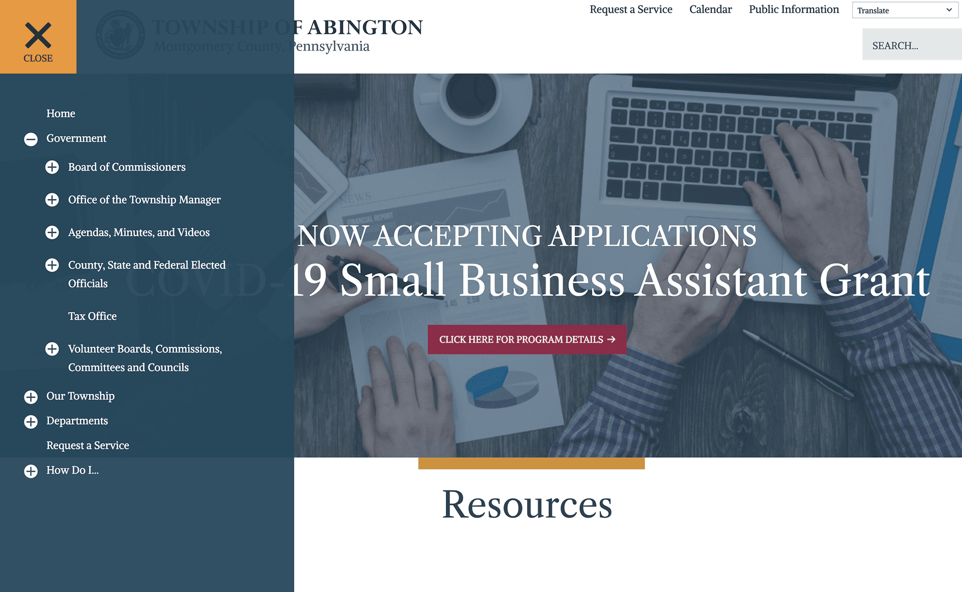
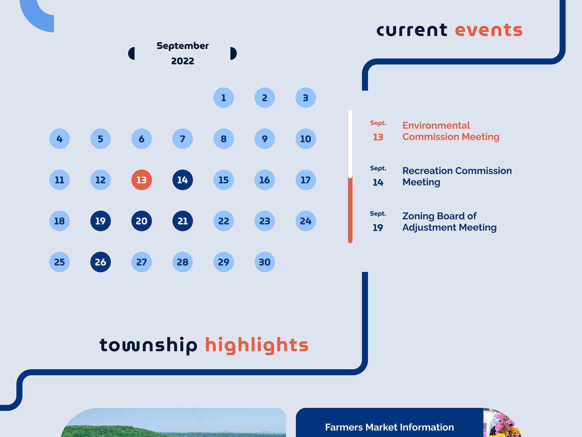
The website uses a hamburger menu that contains collapsible sections that is perfect for organizing loads of information. It also uses cards to display their events that could be useful for designing and structured current events section.
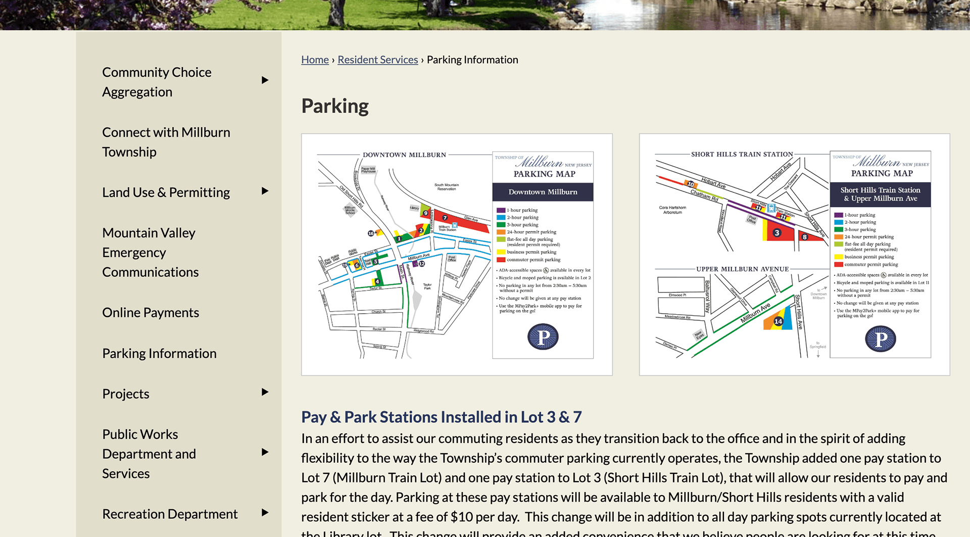
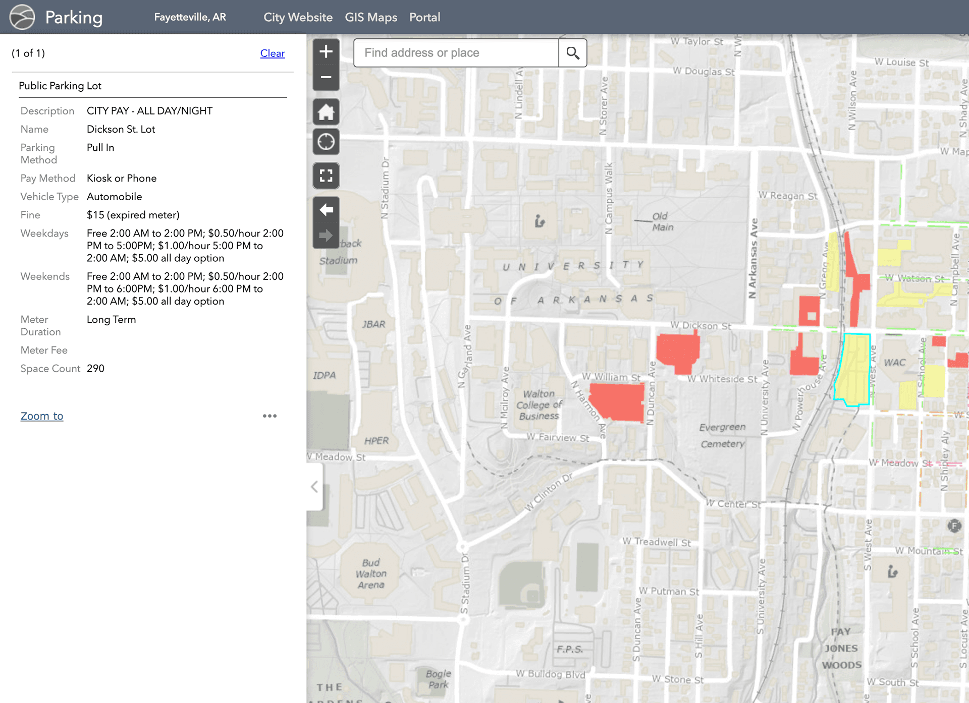
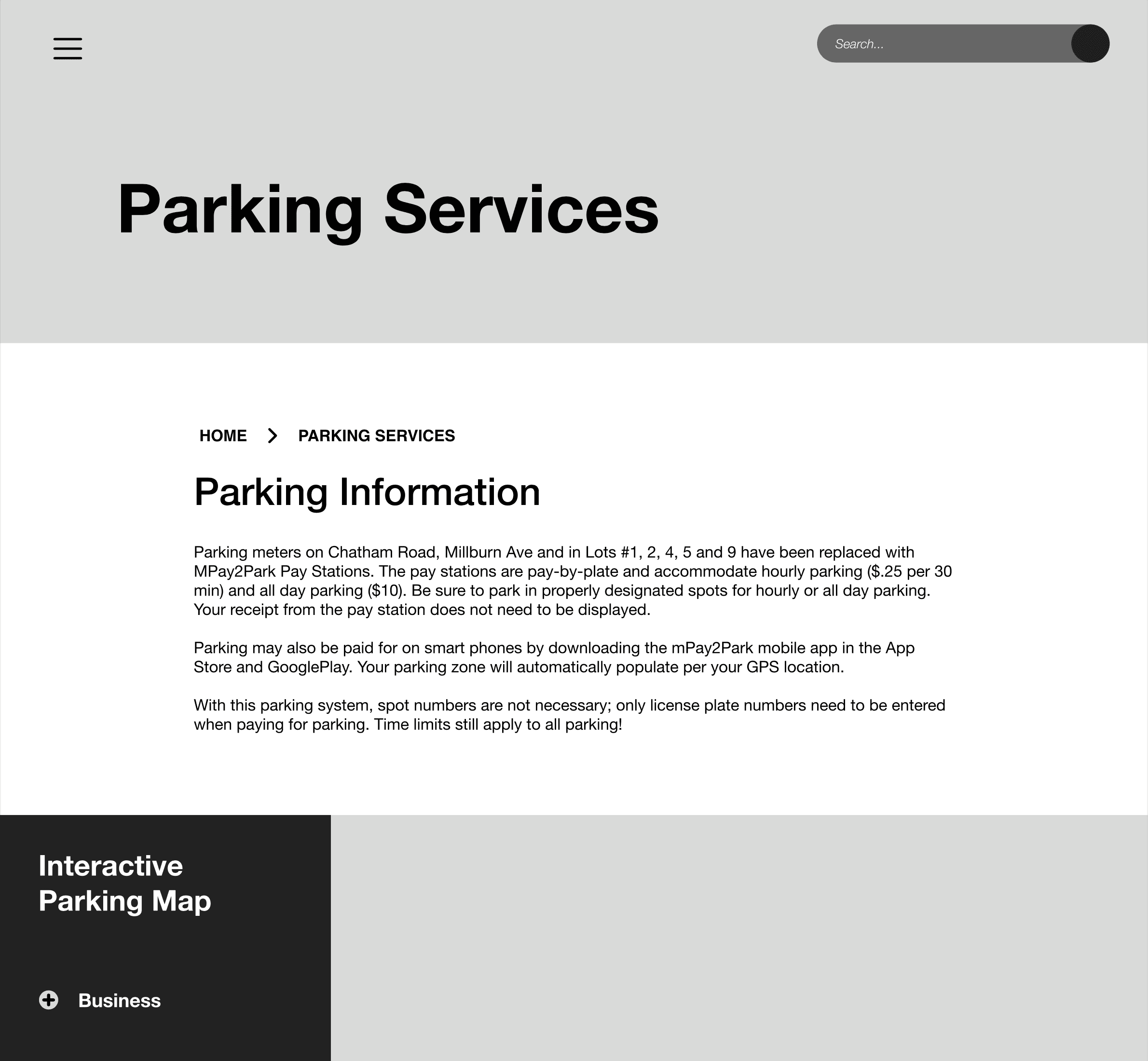
This website contains a section for parking where a user can interact with a virtual map to find parking spaces and even check to see the price and availability. Although it still needs design work, I believe that this is a good template for my user flow.
This website uses well understood hierarchy in their sections and contains interesting design elements within them. The information within the secondary and tertiary pages have strong hierarchy.
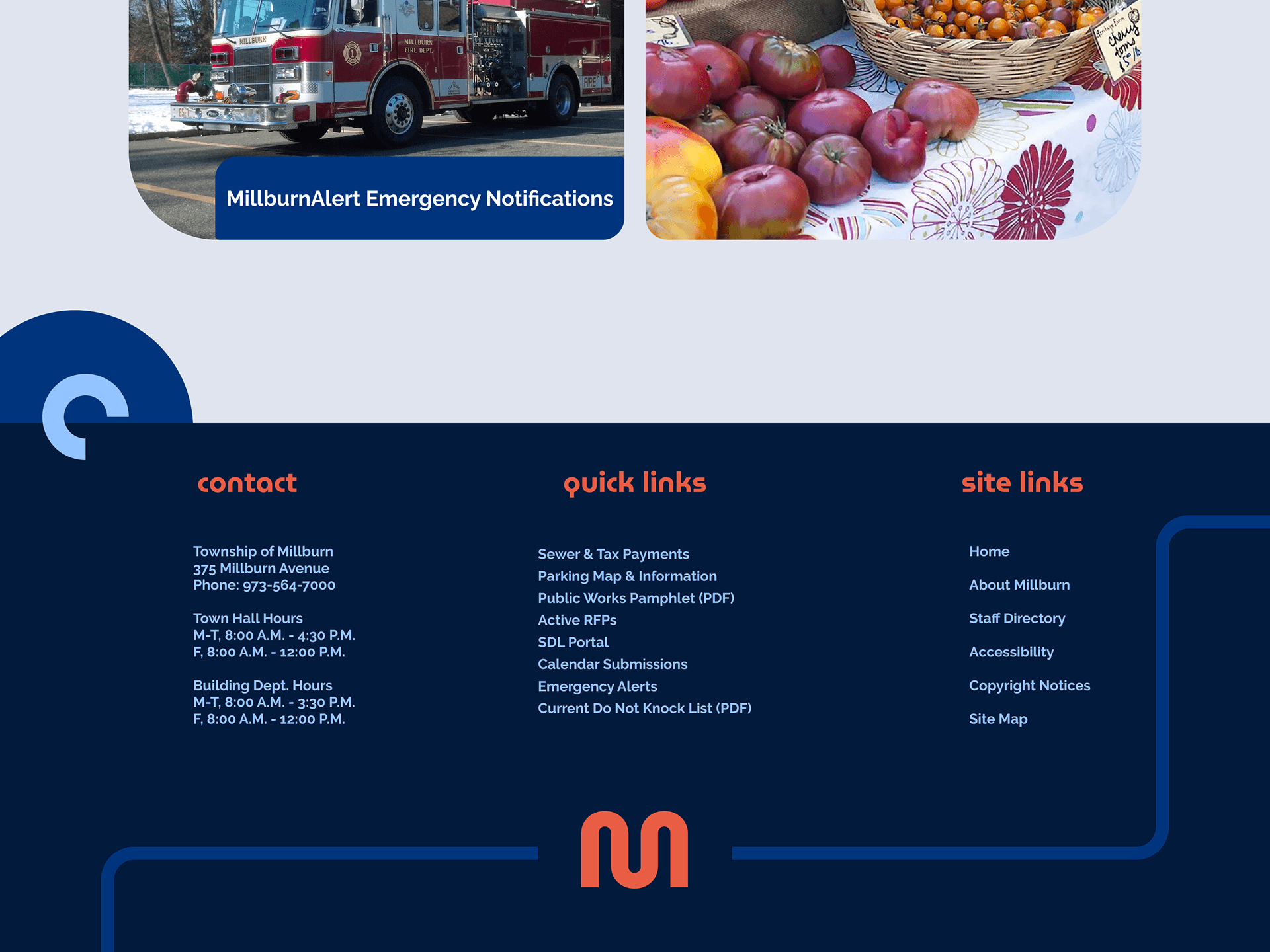
This website utilizes white space well between their sections of information without the feeling of disconnection. This could be useful when structuring the homepage to contain a strong connection of graphical elements.
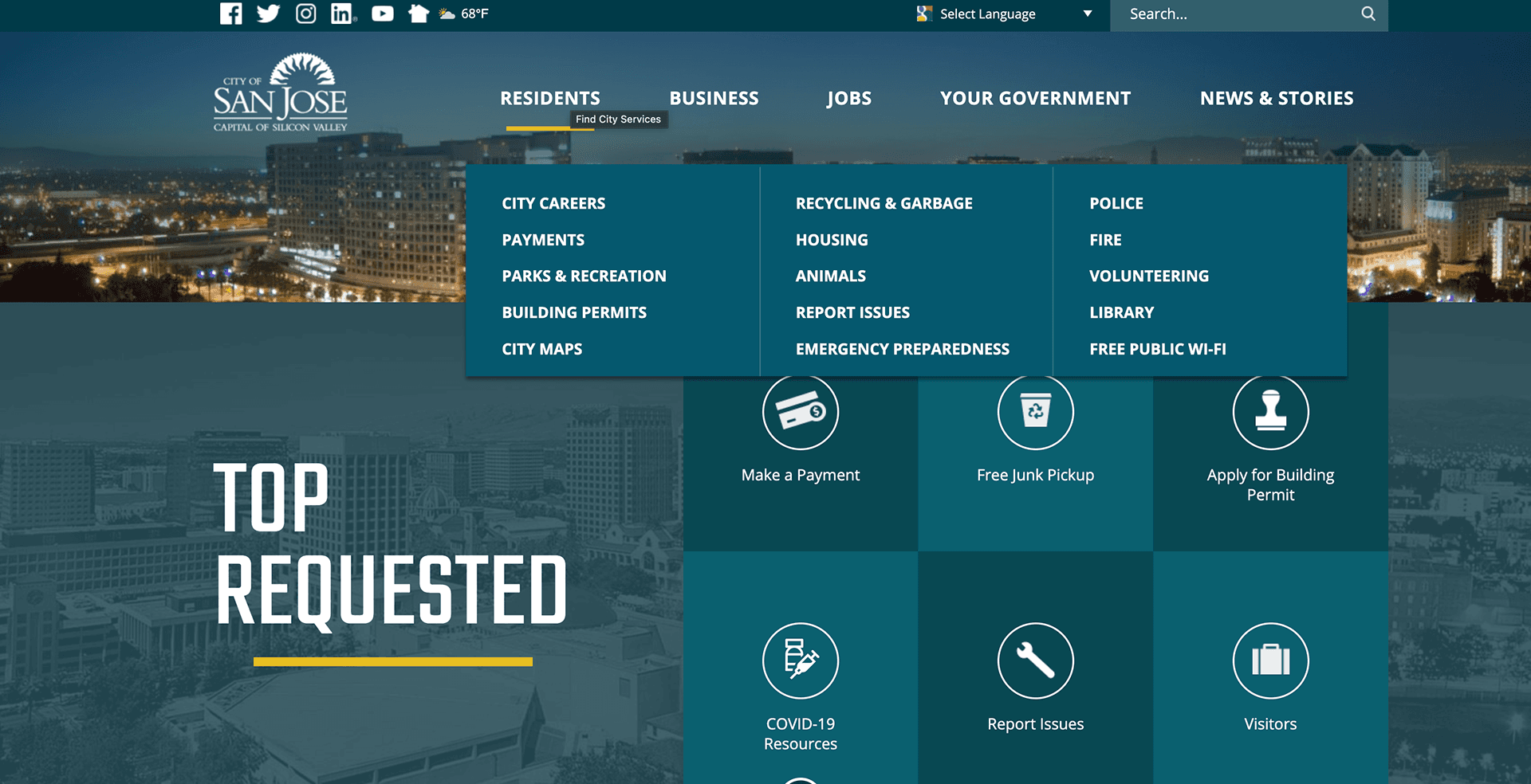
The government website utilizes icons to represent their top requests, and they do it in a simple and clean way. The sections themselves are very rigid and lack any style and feels just like a government website.
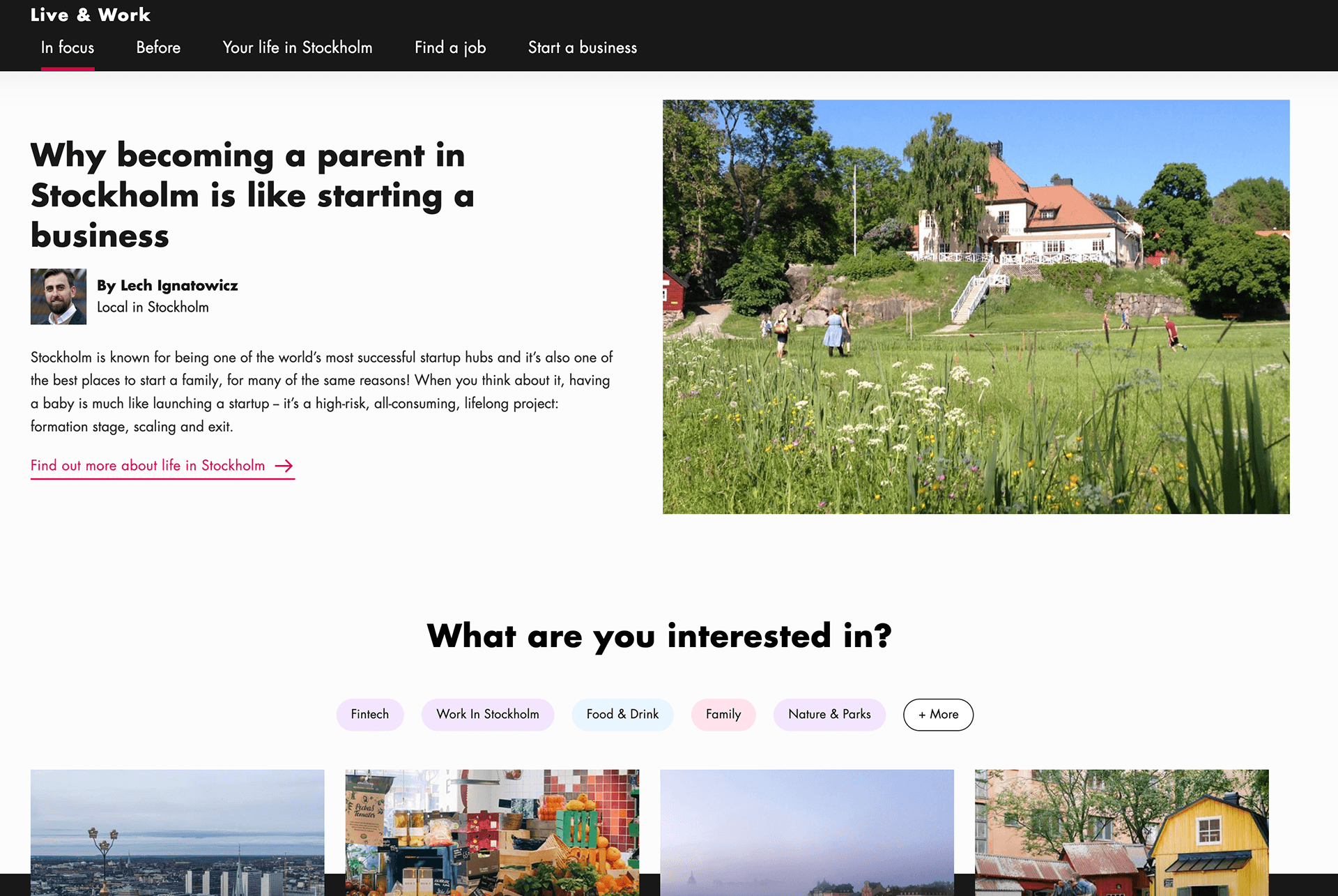
The tourist website has sections that feel welcoming and add a layer of personality to the website that should be included in the redesign.
Based on the flow that is centered around a commuter within the town, I derived two personas to have in mind when designing the flow. The first one being a long term commuter who travels quite frequently into the city and requires permits for their car. Another persona is a short term commuter who rarely travels and would prefer not to have a permit because of it. These two personas will play a role in how I make decisions in the design to suit both of their needs.
For a commuter that’s new to Millburn, the parking options have to be easily accessible and more informative due to the differing train stations you can commute from within the town.
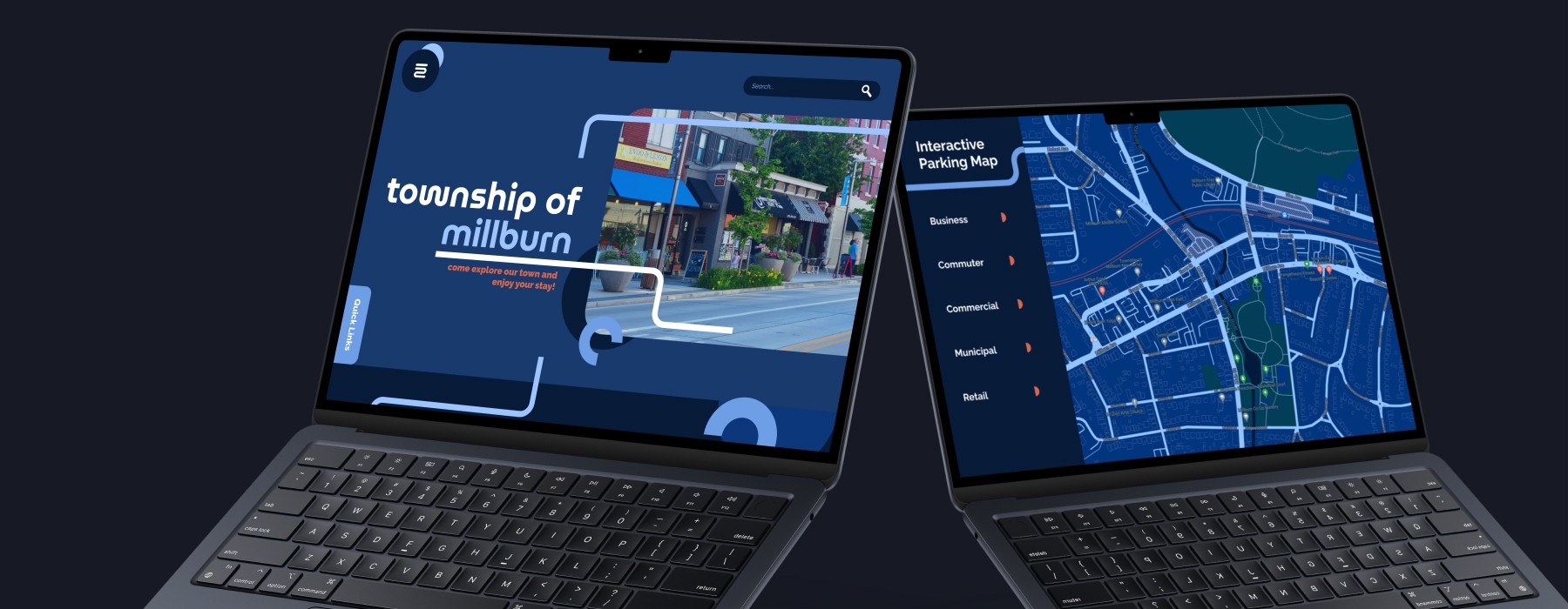
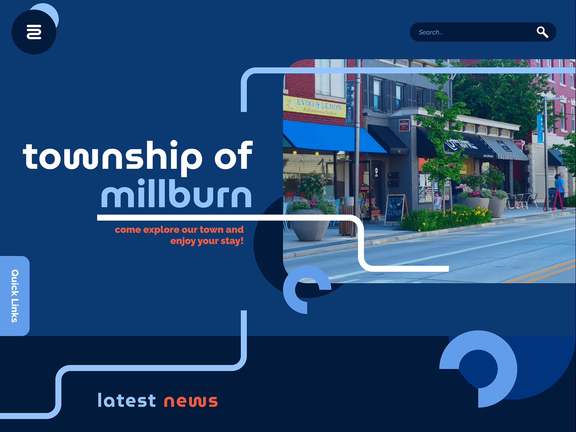
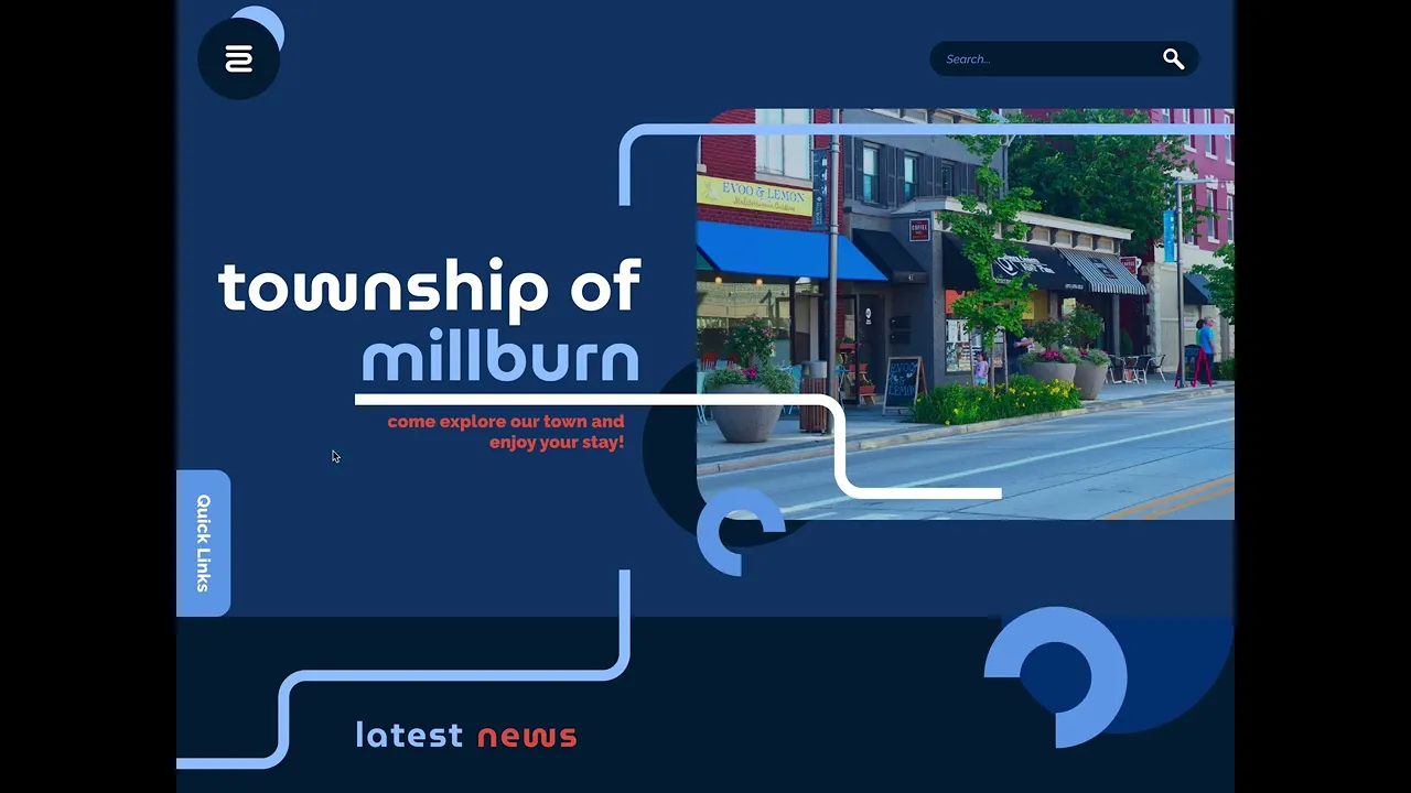
Following a similar design as the original design, I wanted my page to open with a hero image that introduces the user to what the town has to offer. Although I'm designing the flow for a user that is looking for commuter parking, I wanted to also cater to possible tourists. There will also be some navigational elements like a hamburger menu for the sections and a search bar for the user. The original design also included some quick links that I decided to store within a container that can be accessed quickly by the user. The idea was to keep the design less cluttered and yet offer more in terms of functionality.
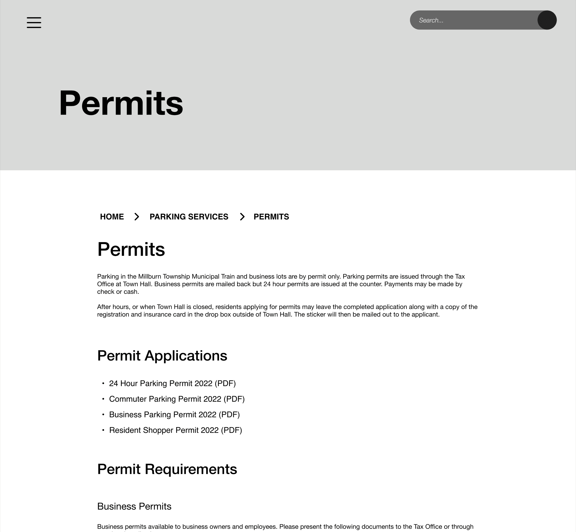
After the user looks for parking through the navigational elements, they would be brought to either the parking services page or something more specific under that category such as parking permits. The general parking services page will come with an interactive map for the user to access and be able to help in their search. The user will be able to the bread crumb navigation as well to move around the inner pages.
Keeping a consistent style while making everything cohesive across the page was a challenge because of my particular style of graphical elements. The final product was able to balance all the content that needed to be expressed and also have some bits of personality in the circular shapes and flowing lines.
Although the interactive parking map is the strongest aspect of this page, I wanted to make sure that other elements of text can live alongside it so that the page itself serves as a broader section that can be explored further by the user to locate specific things that they need.
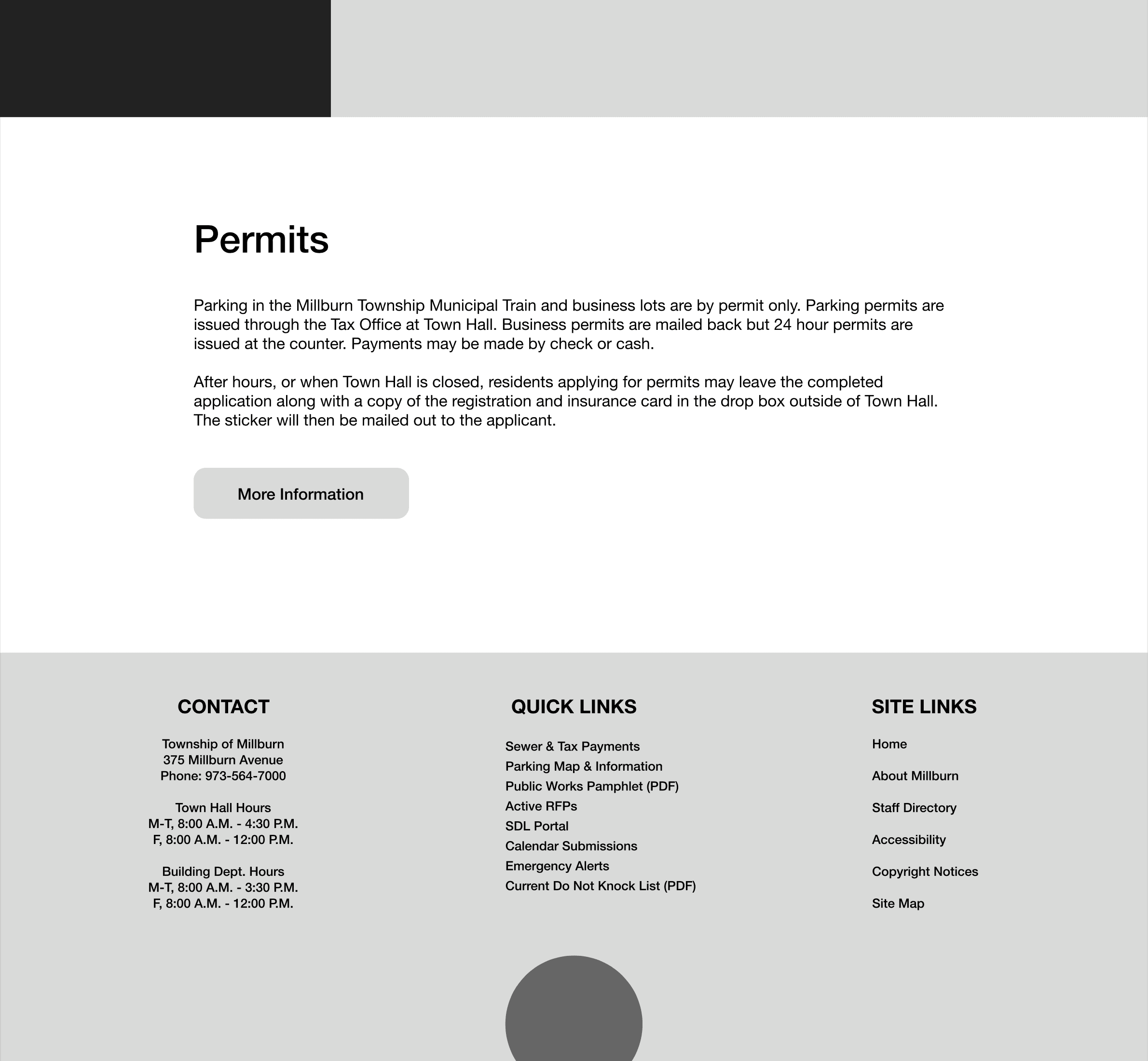
Having the permit page most text heavy section of the flow allowed for some creative liberty in how the content is organized and whether a user can specify the way they scan the content by being allowed to collapse certain content.
User Testing
After the prototype was complete, it was time to put the design to the test against the original and see what was working well and what could still be improved. I opened my research to commuters within the town as well as regular residents and asked them to find information about 24 hour parking permits in both versions of the website and to take notes on their experience. The testing is still in progress and I will update this section of my study accordingly.
Project Deck
If you want to look at a more in depth overview of the case study, there is a project deck linked below. There is some information about file size and page length as well.
PDF | 58 Pages | 251.3 MB